 Each Friday, we meet you with four of the most interesting data-based projects we’ve just come across. Here’s what recently created visualizations we are glad to tell you about this time on DataViz Weekly:
- Why Workers Without College Degrees Are Fleeing Big Cities — The New York Times
- Where Democrats And Republicans Live In Your City — FiveThirtyEight
- Cost of College — FlowingData
- The Romanovs’ Twilight — TASS
New Interesting Created Visualizations in Data Visualization Weekly: May 17, 2019 — May 24, 2019
Find Out Why Big Cities Lose People to Other Places in U.S.
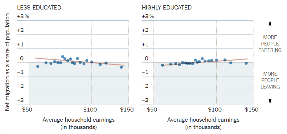
New data published by the U.S. Census Bureau in April confirmed that the largest cities in the United States are losing people to other counties. For The New York Times, Eduardo Porter and Guilbert Gates take a look into what causes this confounding trend. Check out their story accompanied by interesting charts to find out why workers without college degrees are currently fleeing America’s “superstar cities, economic powerhouses, hotbeds of opportunity” and more.
Reveal Political Divide in America’s Cities
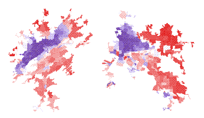
Democrats and Republicans appear not to live side-by-side. Check out the results of an interesting research conducted by FiveThirtyEight‘s Rachael Dottle based on data from the U.S. Census Bureau. Start with looking exactly where Republican and Democrat voters live in each America’s city populated by no less than 250,000 people. Stay with the author further down the piece after playing with the dedicated interactive map, to learn more about political segregation in the largest U.S. urban areas.
Track Rising Cost of College Education in U.S.
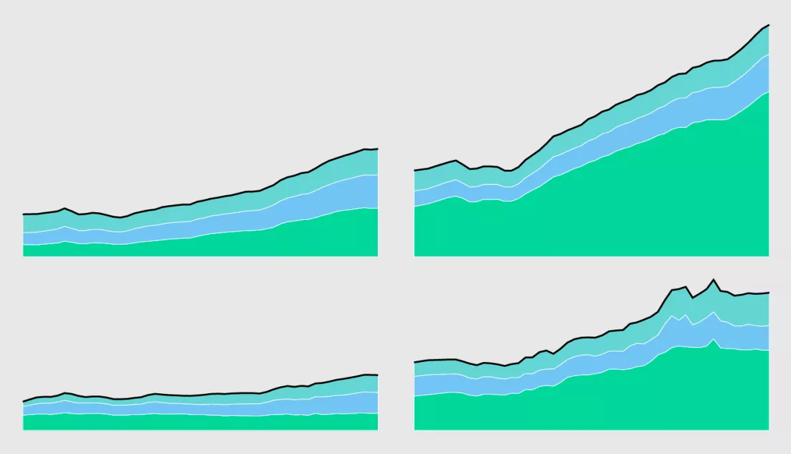
In the United States of America, the cost of college — including tuition, board, and room — has significantly increased over the last few decades. And it continues to grow. Nathan Yau created visualizations of data from the National Center for Education Statistics in order to show how costs of earning a degree from a college has grown since 1967. Track the change with the help of the charts, on Nathan’s data visualization blog FlowingData.
Explore Paths of Romanovs After 1917
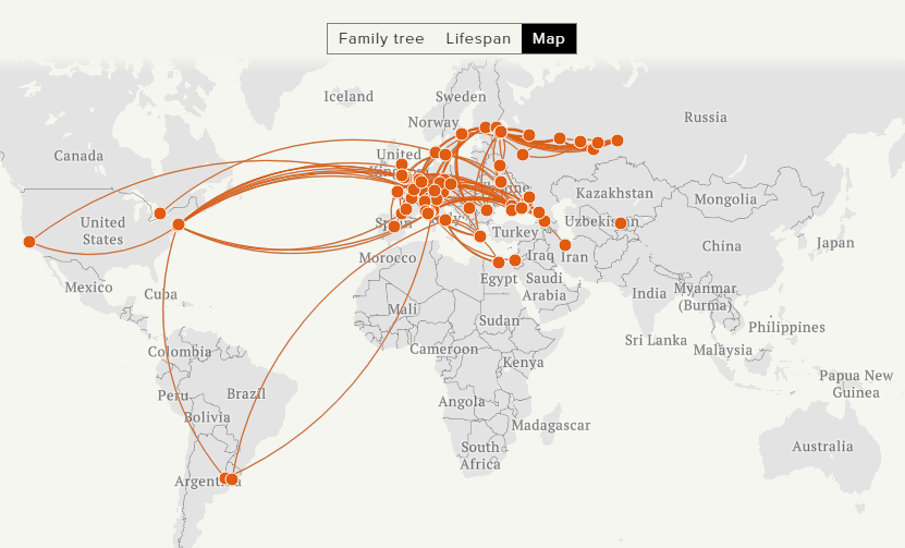
TASS, a major Russian news agency, launched a cool visualization project named The Romanovs’ Twilight last fall. But we came across it just a few days ago and decided to feature it on DataViz Weekly as it looks really interesting. Look where the members of the dynasty of Romanovs, the last reigning royal family in Russia (ruled from 1613 to 1917), moved after the 1917 revolution through the present. Check out the Family Tree as well as the Lifespan and Map visualizations for different views.
***
Created visualizations worth seeing or found one? Ping us on Twitter or Facebook and we may well feature your suggested projects in the DataViz Weekly series on our blog.
Thanks for staying tuned!
- Categories: Data Visualization Weekly
- No Comments »