 The new cool interesting data visualization projects we praise today on DataViz Weekly are helpful in analyzing Trump speech regarding the U.S.-Mexico wall, green infrastructure in London, rise and downfall of General Electrics, and traffic collisions in New York City. Take a quick look.
Data Visualization Weekly: February 8, 2019 — February 15, 2019
Analyzing Trump Speech About U.S.-Mexico Wall, 2015-2019
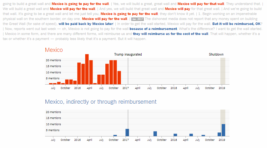
The Upshot published another interesting visual story in which Kevin Quealy, a graphics editor at The New York Times, analyzes the words that U.S. President Donald Trump used to say in his speeches and promise about the wall between the United States and Mexico, revealing how that changed over the period from summer 2015 through January 2019.
The first question in focus is who will pay for the wall — Mexico directly or not. Then, the author provides a look at how (and when) Trump called it — a “wall,” “barrier,” “fence,” or “whatever.” Finally, you’ve got the same approach applied to the question of how it will be made of or look — concrete, with a “beautiful door,” transparent, or steel slats. Look at the patterns.
Rise and Downfall of General Electric
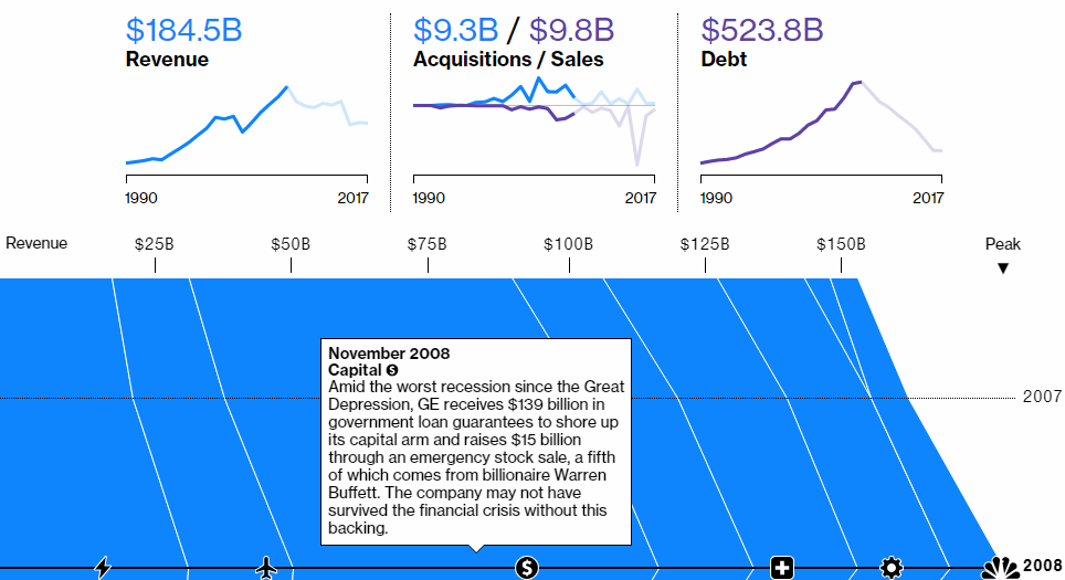
The Bloomberg Graphics team offers a look into what happened to General Electric. GE had always been an icon of the U.S. industry. But last year appeared to be disastrous for the company as it’s when GE was excluded from the Dow Jones Industrial Average and its market value and stock price continued to sharply decrease to historical minimums.
Check out the visual story to see how GE grew and fell over time, exactly where it currently is, and what future it’s likely to have.
Traffic Collisions Across NYC
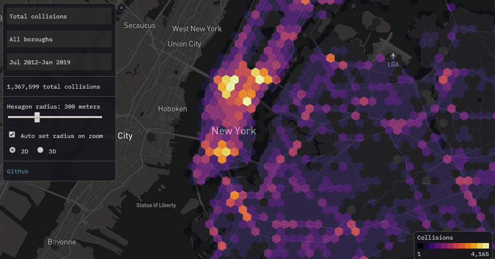
Software engineer Todd W. Schneider mapped all 1.4 million motor vehicle collisions that took place in New York City between July 2012 and January 2019. For this visualization, he took official traffic collision data from the New York Police Department (NYPD).
Look at statistics about injuries, fatalities, change the view from 2D to 3D, and so on — find the most dangerous places across the NYC boroughs. Learn more and check out some other charts in the article.
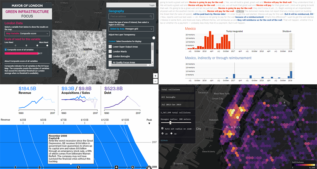
Green Infrastructure in London
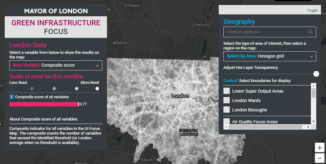
The Mayor of London’s environment team launched the Green Infrastructure Focus Map project that shows the current state of the green infrastructure all over the city. It is expected to facilitate decision-making on where best to focus green infrastructure investment in London and what types of issues should be addressed in one or another location. Take a look.
***
Thank you for your attention! Stay tuned for Data Visualization Weekly on the AnyChart blog!
- Categories: Data Visualization Weekly
- No Comments »