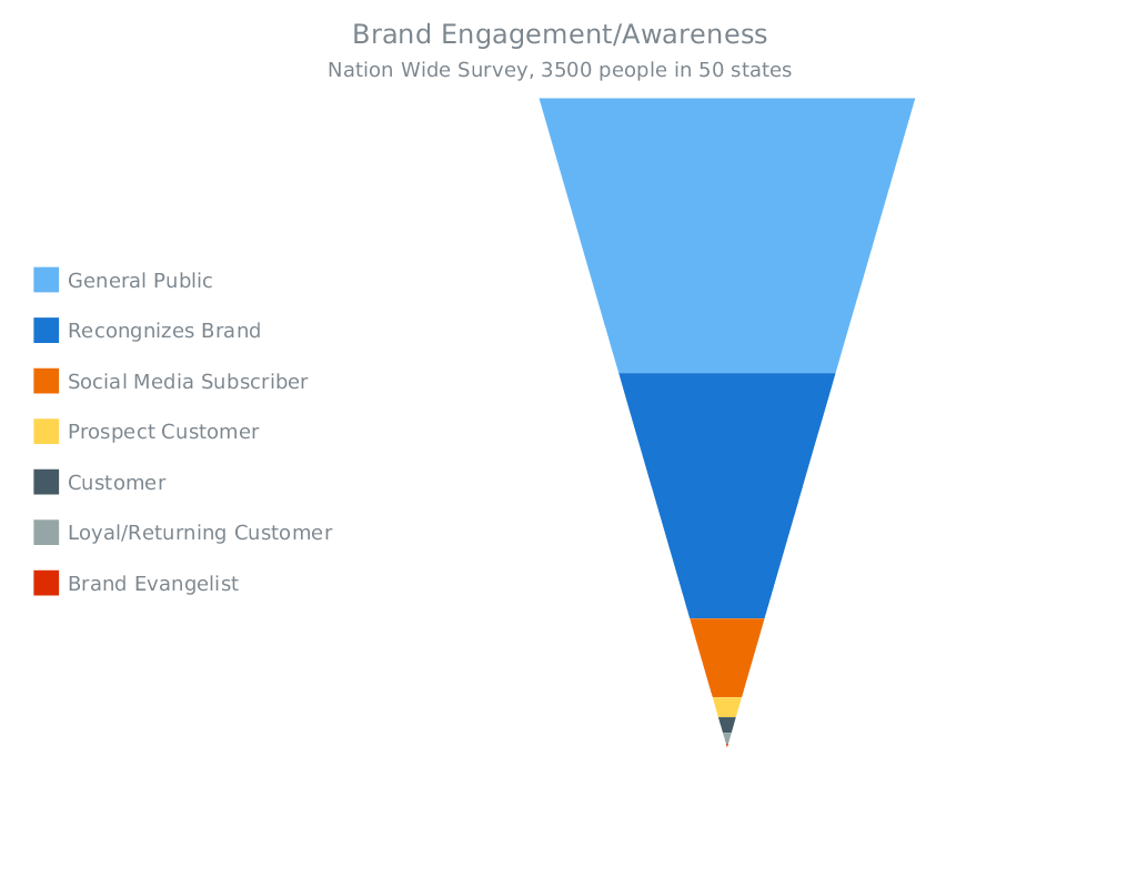
This week we have shared with you on AnyChart Facebook Page and in Twitter a few cool data visualizations, including a JavaScript Funnel Chart by AnyChart. Here is a quick recap:
- Is Sushi ‘Healthy’? What About Granola? Where Americans and Nutritionists Disagree
(an infographic by The Upshot) – Is popcorn good for you? What about pizza, orange juice or sushi? Or frozen yogurt, pork chops or quinoa? Which foods are healthy? In principle, it’s a simple enough question, and a person who wishes to eat more healthily should reasonably expect to know which foods to choose at the supermarket and which to avoid. Unfortunately, the answer is anything but simple. - Game of Thrones: the most Googled characters – This visualization by The Guardian shows the most googled characters from Game of Thrones, episode by episode. See and find out which events in the show had the biggest effect on search traffic. (Spoiler alert: It reveals significant plot points of seasons one through to five.)
- FiveThirtyEight 2016 Election Forecast – Hillary Clinton vs. Donald Trump: who will win the 2016 presidential elections? Here is a forecast by Nate Silver (FiveThirtyEight), showing how the 538 Electoral College votes could break down in the presidential election – it is explained in 7 data visualizations. The forecast will be continually updated through Election Day on Nov. 8.
- Brand Engagement (JavaScript Funnel Chart by AnyChart) – On this interactive Funnel Chart, you can see a visualization of a Nation Wide survey on a Brand recognition. Funnel Charts are mostly used to represent stages in a sales process and show the amount of potential revenue for each stage. They can also be useful in identifying potential problem areas in an organization’s sales processes. A Funnel Chart is similar to a Stacked Percent Column Chart.
- Categories: AnyChart Charting Component, HTML5, JavaScript, News
- No Comments »
