Data has stories to tell. Visualization helps them reach us. Continuing our regular DataViz Weekly feature, we are here to share new examples of how that works in the real world. Here’s what caught our attention these days:
- Strait of Hormuz oil and gas flows — The New York Times
- Rural hospital crisis in the United States — Reuters
- Arrests of immigrant parents of U.S. citizen children — ProPublica
- U.S. state-to-state migration flows — Will Sigal

Data Visualization Weekly: March 20–27, 2026
Strait of Hormuz Oil and Gas Flows
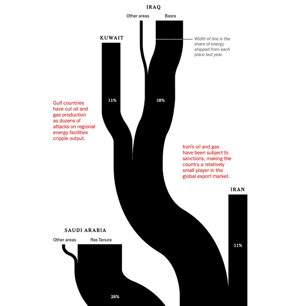
The Strait of Hormuz connects the Persian Gulf to the rest of the world. Before fighting began in late February 2026, around 80 oil and gas tankers passed through it daily, carrying roughly a quarter of the world’s seaborne oil and a fifth of its gas.
The New York Times visualized the supply chain that conflict has since upended using a Sankey diagram. It opens with origin ports and producing countries — Iraq, Saudi Arabia, Qatar, the UAE, and others — sized by their share of energy exported through the strait. Flows converge at the strait itself, showing the full combined volume, then branch outward to destination regions. Asia receives roughly 80% of the total. Annotations mark disruptions, and callouts on the receiving end describe specific consequences country by country: gasoline price increases in the United States, factory shutdowns in Bangladesh, fuel shortfalls forcing changes in India and Southeast Asia, and rising costs across Europe.
See the piece on The New York Times, by Lazaro Gamio, Blacki Migliozzi, and River Akira Davis.
Rural Hospital Crisis in U.S.
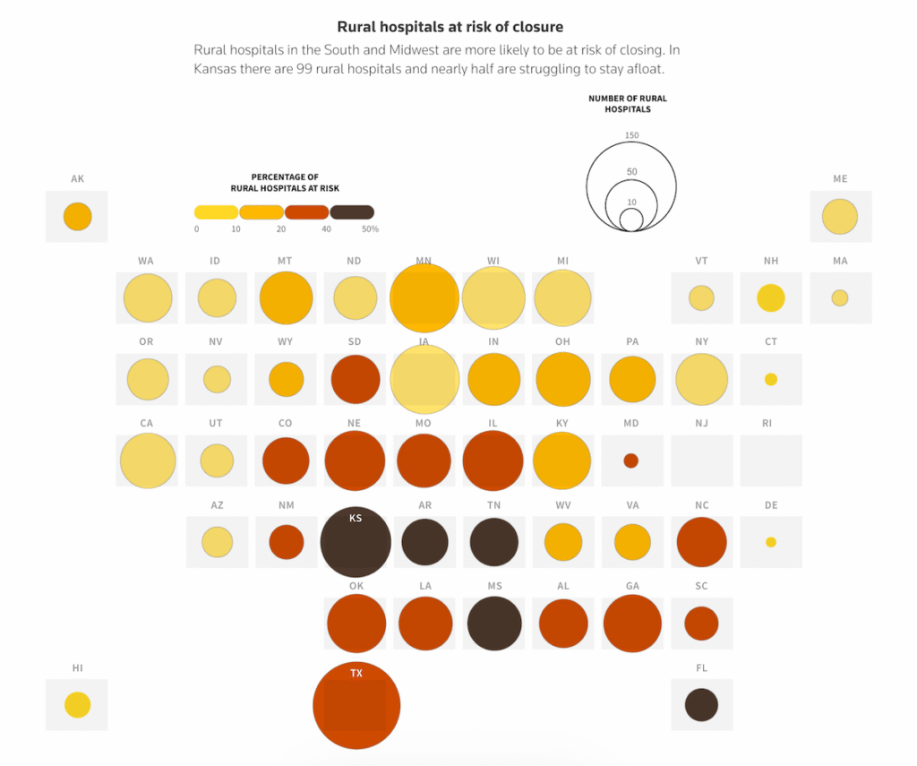
More than 40 percent of rural hospitals in the United States operate at a loss. Hundreds are considered vulnerable to closure, and demographic and policy pressures are compounding the strain.
Reuters built a data story grounding the crisis in numbers, presented through a variety of visualizations. A cartogram, pictured above, uses bubbles to show the share of rural hospitals at risk of closure by state. The concentration across the South and Midwest immediately clear. Using more charts and maps, the article also looks at the health profile of rural communities, the gap in services and revenue between rural and metro hospitals, and how Medicaid enrollment has shifted across administrations and shaped the landscape. Kansas runs through it as a concrete example.
Take a look at the story on Reuters, by Sarah Slobin.
Arrests of Immigrant Parents of U.S. Citizen Children
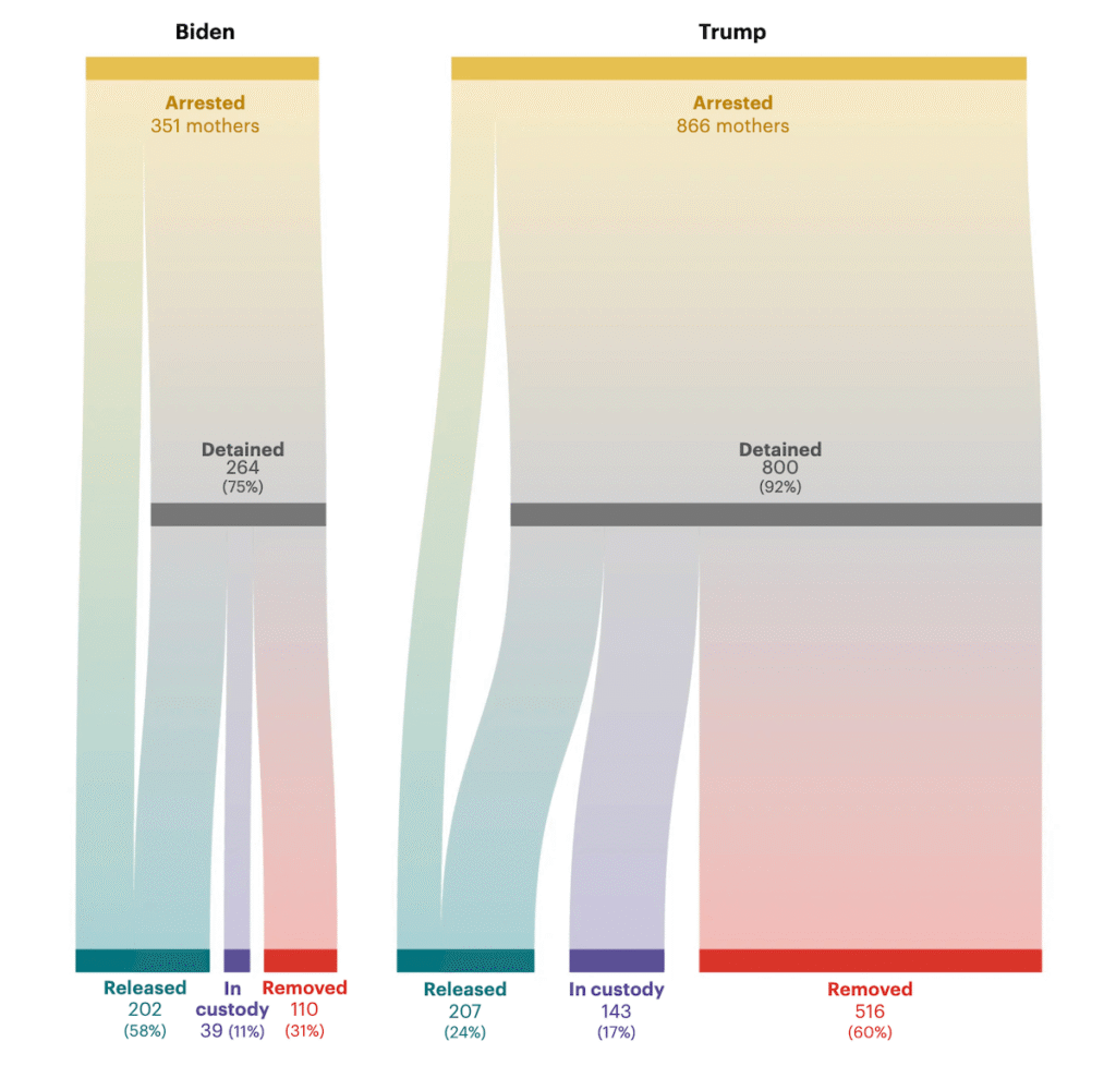
New data shows that immigrant parents of at least 11,000 U.S. citizen children were arrested and detained in the first seven months of Trump’s second term. That is roughly double the rate under the previous administration.
ProPublica analyzed an exclusive ICE dataset covering arrests from late 2021 through mid-2025. A stepped area chart tracks monthly arrests of parents of U.S.-born children, distinguishing the Biden and Trump periods. The rise after January 2025 is immediately visible. A Sankey diagram then traces what happened to arrested mothers during equivalent seven-month windows under each administration: from arrest into detention, then splitting into those released, remaining in custody, or deported.
Check out the article on ProPublica, by Jeff Ernsthausen, Mario Ariza, McKenzie Funk, Mica Rosenberg, and Gabriel Sandoval, with graphics by Chris Alcantara and data reporting contribution by Al Shaw.
Internal Migration Flows in U.S.
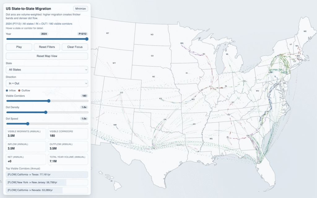
Millions of Americans move between states every year. The patterns of where people go — and in what volume — shift over time.
Will Sigal built an animated flow map based on U.S. Census data, representing internal migration corridors as continuous streams of moving dots from origin to destination. Dot density and band width are volume-weighted: busy corridors produce denser, more active flows, while quieter ones run sparse. A playback control steps through the data year by year, revealing how patterns shift over time. You can also control what gets visible on the map, such as selecting a specific state, switching between inflows, outflows, or both, or highlighting a top corridor.
Explore the map here.
Wrapping Up
The data in each of these projects had a story to tell: energy flows, healthcare economics, enforcement numbers, and migration patterns. The visualization is what made it possible to hear it. We will be back with more great examples next time in DataViz Weekly.
- Categories: Data Visualization Weekly
- No Comments »