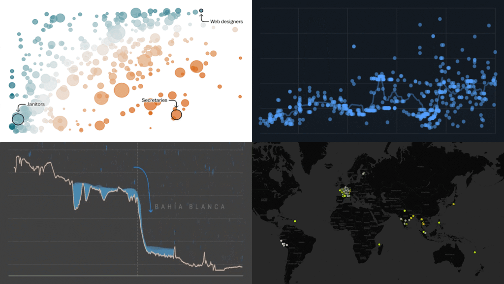
Data is everywhere, but what it means is rarely obvious on its own. DataViz Weekly is back with four projects that illustrate how good visuals help close that gap. Featured today:
- 25 years of egg prices — John Rush
- Jobs most at risk from AI — The Washington Post
- Bahía Blanca flood reconstruction — LA NACION
- Global data center expansion — Dirty Data / Environmental Reporting Collective

Data Visualization Weekly: March 13–20, 2026
25 Years of Egg Prices
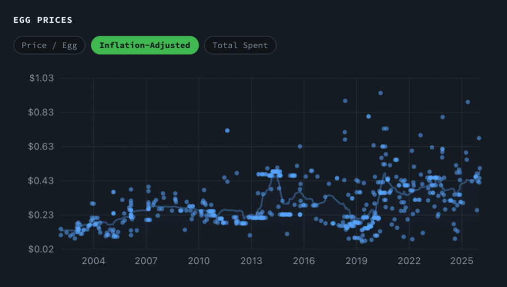
Some people collect receipts. John Rush has been scanning every one of his since 2001 — never typing in a single price, just keeping the images, waiting for the technology to catch up.
This year it did. He extracted 25 years of egg purchase data using two AI coding agents and presented the results on his blog. A dot scatter chart tracks price per egg across the full span, with tabs switching between nominal and inflation-adjusted prices, and one more for cumulative spend. An animated map traces every purchase location year by year across the Pacific Northwest. A line chart measures year-over-year price swings under the label “Personal Egg-flation.”
A calendar chart then lays out every single purchase week by week from 2001 to 2026, the full archive visible at once. The rest of the piece documents how the pipeline was built — what broke, what replaced it, and how each problem got fixed.
Look at the post on John Rush’s website.
Jobs Most at Risk from AI
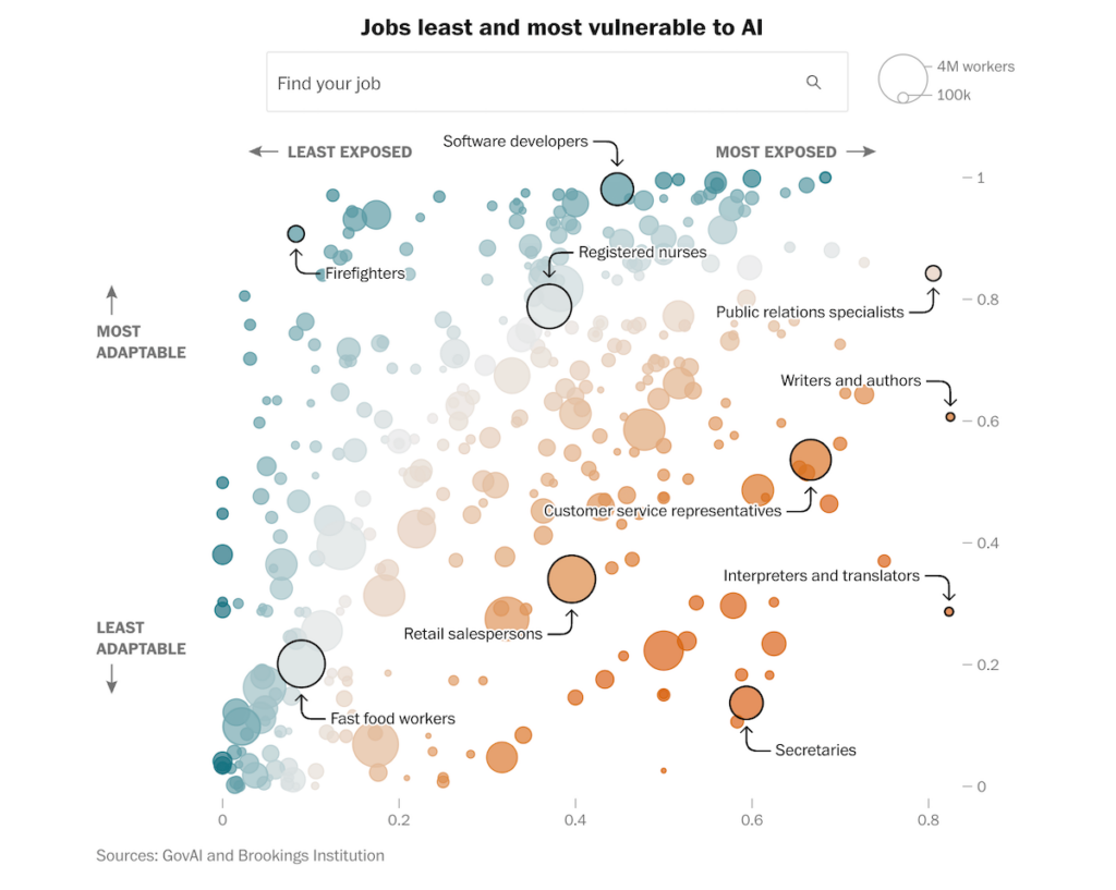
Which workers are most exposed to AI, and which ones will find it hardest to adapt if their jobs change? Researchers at GovAI and the Brookings Institution analyzed more than 350 occupations across both dimensions.
The Washington Post built an interactive scatter plot placing each occupation on two axes: AI exposure running horizontally from least to most, and adaptability running vertically. Bubble size reflects the number of workers in each occupation. A search box lets you locate specific job titles directly on the chart.
A second view of the same chart colors each bubble by the gender makeup of the occupation, making the concentration of female-dominated roles in the high-exposure, low-adaptability corner immediately visible.
See the article on The Washington Post, by Kevin Schaul and Shira Ovide.
Bahía Blanca Flood Reconstruction
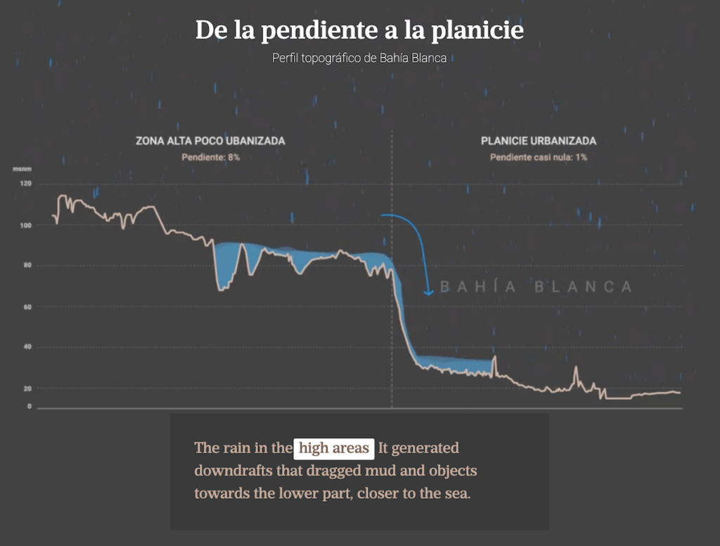
On March 7, 2025, catastrophic flooding struck Bahía Blanca, Argentina, leaving 18 people dead and more than 1,400 temporarily displaced. A combination of extreme rainfall and structural drainage failures turned the city’s streets into channels.
LA NACION reconstructed the disaster in a scroll-driven piece built on data from the National University of the South and the National Water Institute. The elevation profile pictured above uses an animated water fill to show the flood’s movement across the city’s terrain — how water built up on the steep upper slope and poured into the flat urbanized plain below, where the near-zero gradient trapped it. The piece also includes a rain-styled bar chart tracking hourly precipitation across the day and a map with embedded video footage showing water levels across different parts of the city.
Check out the story on LA NACION, by Pablo Loscri, Florencia Fernández Blanco, Nicolás Cassese, Miguel Bevacqua, Gabriel Podestá, Alejandro Bogado, Valentina Ravera, Candela Heredia, and Florencia Abd.
Global Data Center Expansion
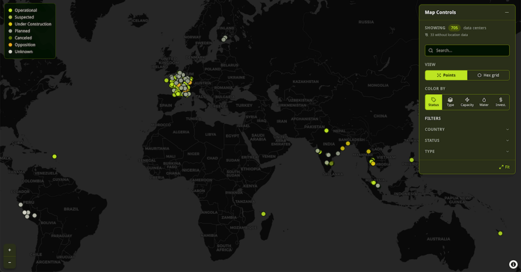
Data centers are proliferating rapidly around the world, driven by demand for AI computing power. The energy, water, and land they consume have put them in direct conflict with the communities where they land.
Dirty Data, a collaborative investigation by the Environmental Reporting Collective, built an interactive world map tracking this expansion, compiled by journalists working across Asia, Latin America, and Europe. Each data center appears as a point on the map, with a toggle to switch to a hex grid view that aggregates density. A color-by selector changes what the map encodes: operational status, facility type, capacity, water use, or investment level. Country and status filters let you narrow the view.
The map anchors a series of reported stories covering communities displaced, water supplies strained, and legal challenges brought by residents against governments and developers.
Explore the map at Dirty Data, developed by Yan Naung Oak.
Wrapping Up
A personal archive, a labor market model, a flood record, and a map of global infrastructure — this week’s picks are as different as data projects get. What they share is a commitment to making the data they’re built on easier to engage with directly. More charts and maps next week in DataViz Weekly.
- Categories: Data Visualization Weekly
- No Comments »