 Welcome back to DataViz Weekly! This is our regular roundup of data graphics we think are worth opening and looking at closely. Here is what made the cut this week:
- Bluesky following clusters — Theo Sanderson
- Quadruple axel in figure skating — The New York Times
- Winter sports access across the United States — The Washington Post
- Climate vulnerability vs. social protection — SNRD AP, GIZ, and Revisual Labs

Data Visualization Weekly: February 6–13, 2026
Bluesky Following Clusters

Bluesky began as a Twitter initiative and has since grown into an independent social network with millions of accounts. At that scale, patterns in who people choose to follow tend to form visible clusters.
Theo Sanderson created an interactive map of about 3.4 million Bluesky users positioned by their following patterns. The placement is based on who follows whom, using a recommendation-style model and then compressing the result into a dot map layout, so accounts that are followed by similar kinds of people tend to appear near each other. You can search by handle to find specific accounts, and optional cluster labels can be turned on or off. The labels are generated from a small sample of bios from each cluster, so they are meant as rough summaries rather than descriptions that fit everyone in the group.
See the map on Theo Sanderson’s website. We also recently created an AnyChart account on Bluesky, so feel free to follow us there.
Quadruple Axel in Figure Skating
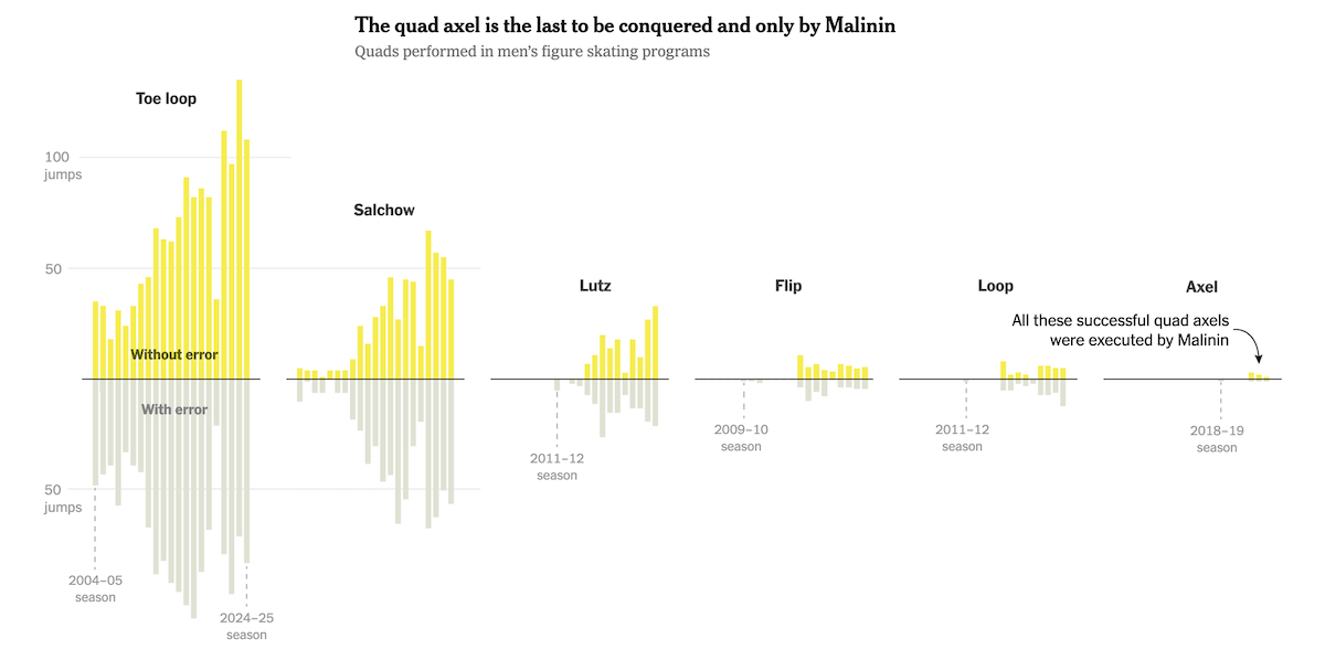
Men’s figure skating keeps pushing its technical ceiling, but some jumps still sit in a category of their own. Going into the Olympic free skate scheduled for today, Ilia Malinin stands out as the only skater to have landed a quadruple axel in competition.
The New York Times breaks down why Malinin’s quad axel is so hard using high-speed footage and step-by-step comparisons with a triple lutz. The story walks through the split-second mechanics that make the jump unique, emphasizing the forward takeoff and the extra half-turn that raise the difficulty. Alongside the explainer, small-multiple diverging bar charts show how often different quadruple jumps appear in men’s programs by season, separating attempts with and without errors.
See the article on The New York Times, by Weiyi Cai, Joe Ward, Jeremy White, and Bedel Saget.
Winter Sports Access Across U.S.
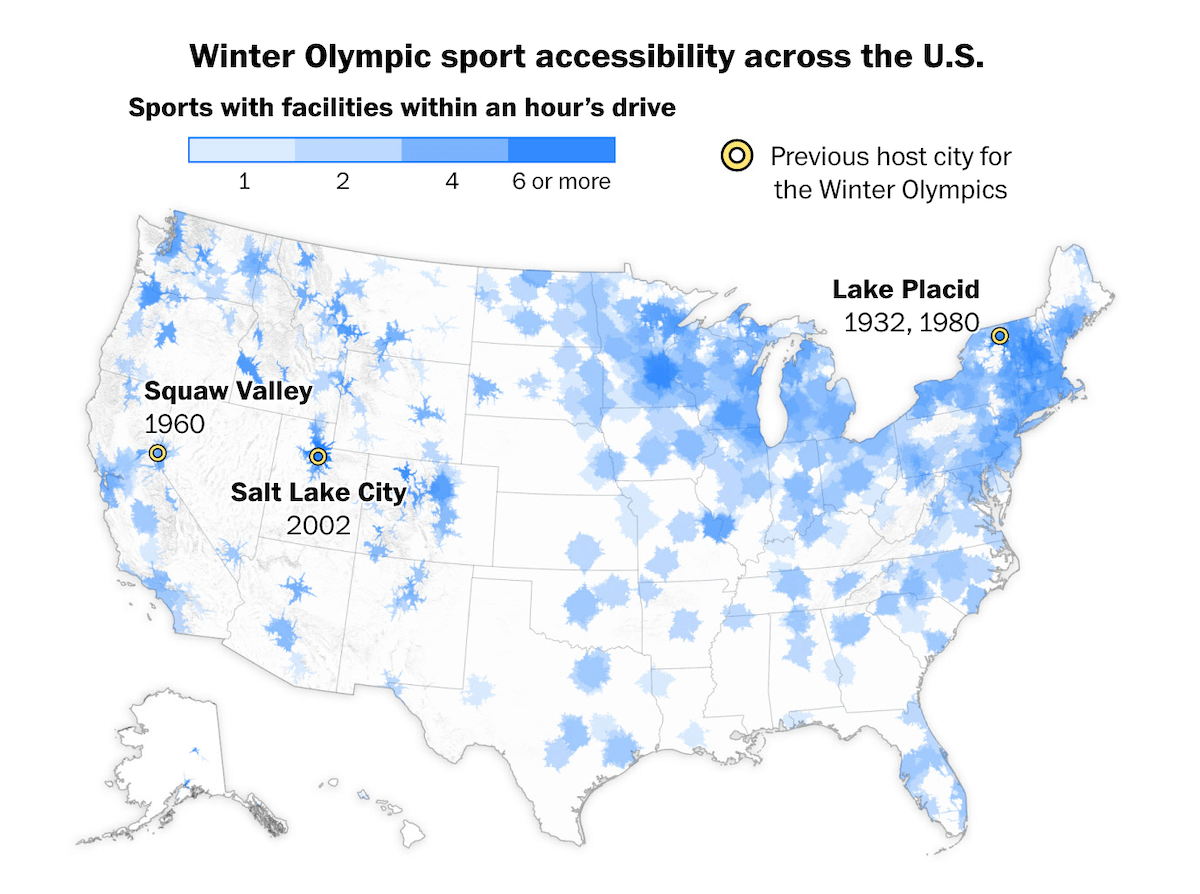
Winter Olympic sports can feel distant if you live far from snow, mountains, or specialized venues. Still, opportunities to try some of these sports can be closer than many people expect, especially the more common indoor ones.
The Washington Post maps access using locations of more than 2,500 training facilities compiled from U.S. winter sport governing bodies. Areas are shaded by how many sports have a facility within an hour’s drive, with darker blue meaning more options nearby. You can also search by city to see which sports are within an hour versus farther away, plus quick state-level stats such as how many U.S. Olympians the state has produced and how many athletes are on the 2026 U.S. roster. The story then breaks out sport-specific views and ends with a cartogram of winter Olympians per capita by state.
See the piece on The Washington Post, by Emily Giambalvo, Dylan Moriarty, and Kati Perry.
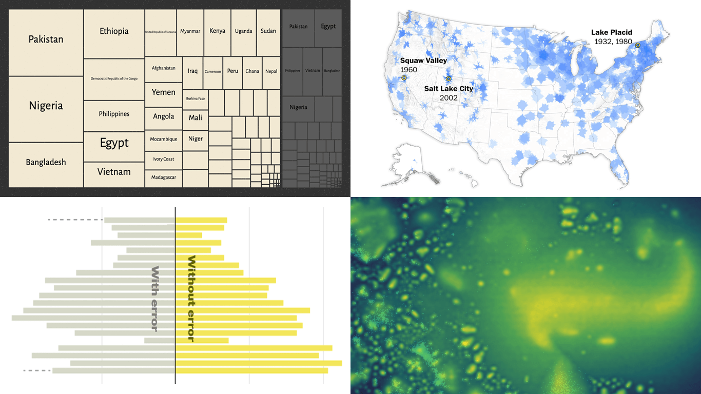
Climate Vulnerability vs. Social Protection
Some countries are highly exposed to climate shocks, which can quickly turn a bad season into a financial crisis for households. At the same time, billions of people still have no social protection at all, leaving them with little to fall back on when disasters hit.
The Sector Network Natural Resources and Rural Development Asia and the Pacific (SNRD AP) published a scroll-driven story, supported by the Deutsche Gesellschaft für Internationale Zusammenarbeit (GIZ) GmbH, that links climate vulnerability ratings from the University of Notre Dame with social protection coverage data from the International Labor Organization (ILO).
Animated transitions move between views, including a scatter plot that highlights countries in the high-vulnerability, low-coverage quadrant and an interactive treemap that splits each country into people covered versus not covered by at least one benefit. A choropleth map adds geographic context, and a short illustrated scenario of a farmer shows how Adaptive Social Protection connects climate adaptation, social protection, and disaster risk reduction in practice. The story also includes a Venn diagram and country-level profiles.
See the story on the SNRD AP website, created by Revisual Labs.
Wrapping Up
That wraps up this week’s roundup. Hope these graphics sparked a few ideas for how data can be shown clearly and memorably. Check back soon for the next DataViz Weekly.
- Categories: Data Visualization Weekly
- No Comments »