 Visualizing data can help tell a story by making trends and patterns easier to see and letting insights land faster. Here are a few recent projects we are glad to share in DataViz Weekly this time that work as clear examples of visual storytelling in action.
- 2025 heat in the global warming trend — The Economist
- Circular AI deals network — The Big Take
- Births versus deaths across France — Le Monde
- 2025 year in Reuters graphics — Reuters

Data Visualization Weekly: January 23, 2026
2025 Heat in Global Warming Trend
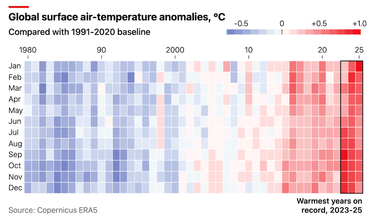
A year that should have been relatively cooler still ended up near the top of the global heat rankings. New reports for 2025 from major climate and weather tracking groups point in the same direction: the warming trend is still pushing upward.
The Economist explains this with a heatmap chart of global surface air temperature anomalies compared with a 1991 to 2020 baseline. Months are displayed along the vertical axis from January to December, years run horizontally across from 1980 to 2025, and each cell is colored on a blue-to-red scale to show cooler or warmer anomalies. The warmest stretch stands out visually, with 2023 to 2025 outlined and labeled as the warmest years on record, making the recent run of heat easy to spot at a glance.
After that, the article shifts into a broader explanation of what might be behind the recent heat and what it could mean next, using a few additional charts to zoom in on polar temperatures, wildfire-related emissions, and month-by-month global patterns.
Check out the article on The Economist.
Circular AI Deals Network
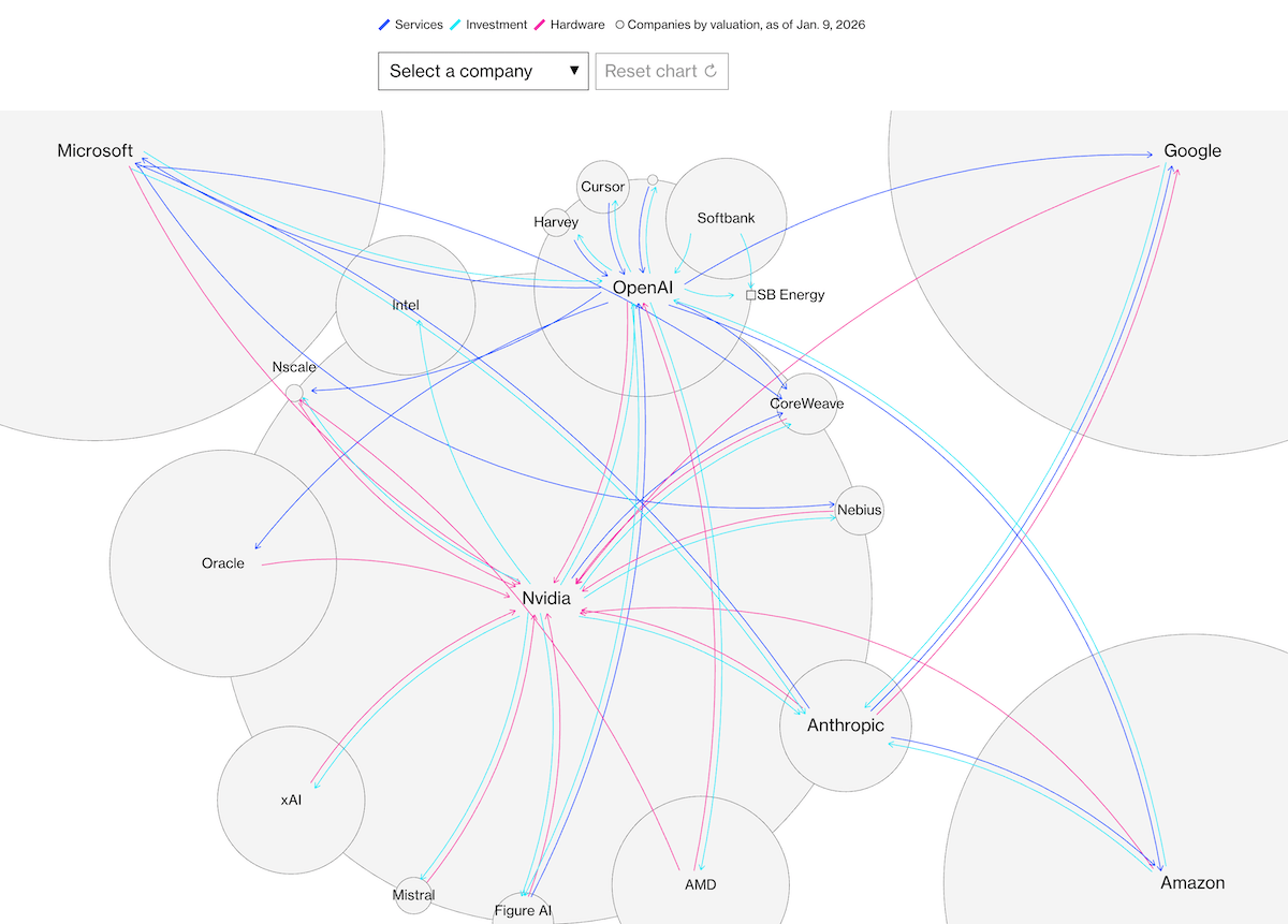
The AI boom grew quickly, and money started flowing through partnerships and big supply deals. Over time, many of the same companies ended up funding each other and also buying from each other, creating a circular web of connections.
Bloomberg’s The Big Take maps this system in a story built around a network diagram. The scrollytelling section uses a series of steps to introduce the web over time, revealing how the links build up, and then the article shifts into explaining why this structure could be risky. In the diagram, each circle is a company, sized by its valuation as of January 9, 2026. Lines show deal relationships, and colors separate deal types: blue for services, cyan for investment, and red for hardware.
At the end, the full network becomes interactive, so you can explore the connections yourself.
Explore the feature on The Big Take, by Cedric Sam, Rachael Dottle, Agnee Ghosh, and Kyle Kim.
Births Versus Deaths Across France
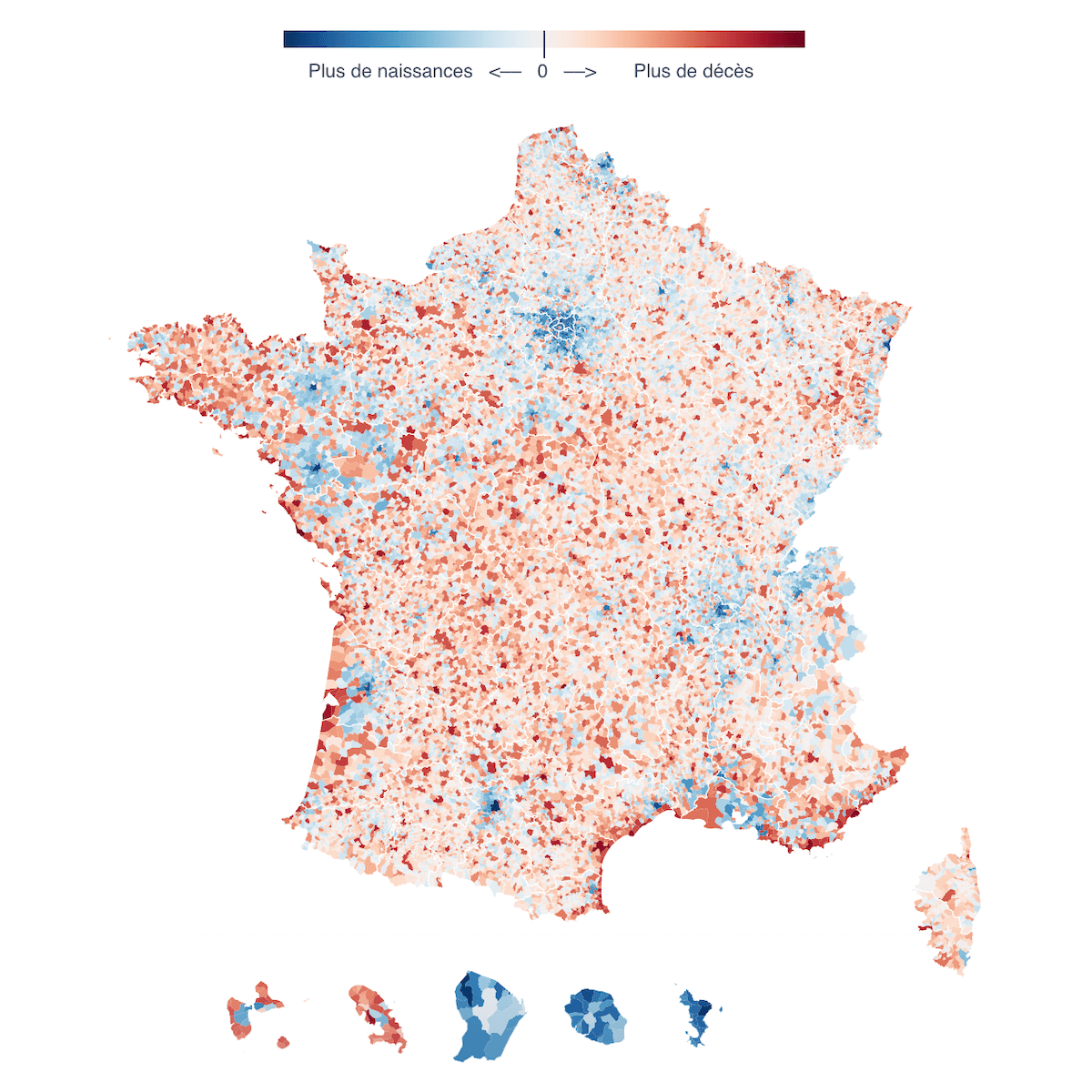
In 2025, France recorded more deaths than births at the national level, a symbolic turning point after decades of natural increase. Local trends do not move in lockstep, so the national total can hide very different patterns across the country.
Le Monde explains the situation with interactive visualizations. First is a difference chart that plots births in blue and deaths in red, with the area between the lines filled to show when the natural balance turns positive or negative over time, plus an option to look up a specific commune or department. A choropleth map then shows the difference between births and deaths across France’s communes, using a blue-to-red scale to distinguish places with more births versus more deaths.
Take a look at the article in Le Monde, by Romain Imbach.
2025 Year in Reuters Graphics

Earlier this month, we created our Best Data Visualizations of 2025 roundup that links to standout year-end collections, including newsroom graphics retrospectives.
On Wednesday, Reuters published its own 2025 graphics roundup, bringing together a curated selection of its own visual stories from the year. It is structured as a month-by-month index, where each month gets a short editorial note and links out to the full articles.
Overall, the selection spans breaking news, conflicts, disasters, politics, public health, and investigations, with a few lighter culture pieces in the mix. Across the months, Reuters points readers to topics like major fires, an aviation tragedy, elections and policy shifts, wars, disease spread, migration, and climate and energy coverage, using formats such as maps, quizzes, and illustrated explainers.
See the Reuters 2025 Year in Graphics feature.
Wrapping Up
That wraps up this edition of Data Visualization Weekly. These picks cover different ways visuals can carry a story: a long-run climate view, a network that explains a system, an interactive look at local demographic change, and a year-end collection that is useful for browsing formats and ideas across many topics. Stay tuned for next editions, where we will round up more visual projects worth exploring.
- Categories: Data Visualization Weekly
- No Comments »