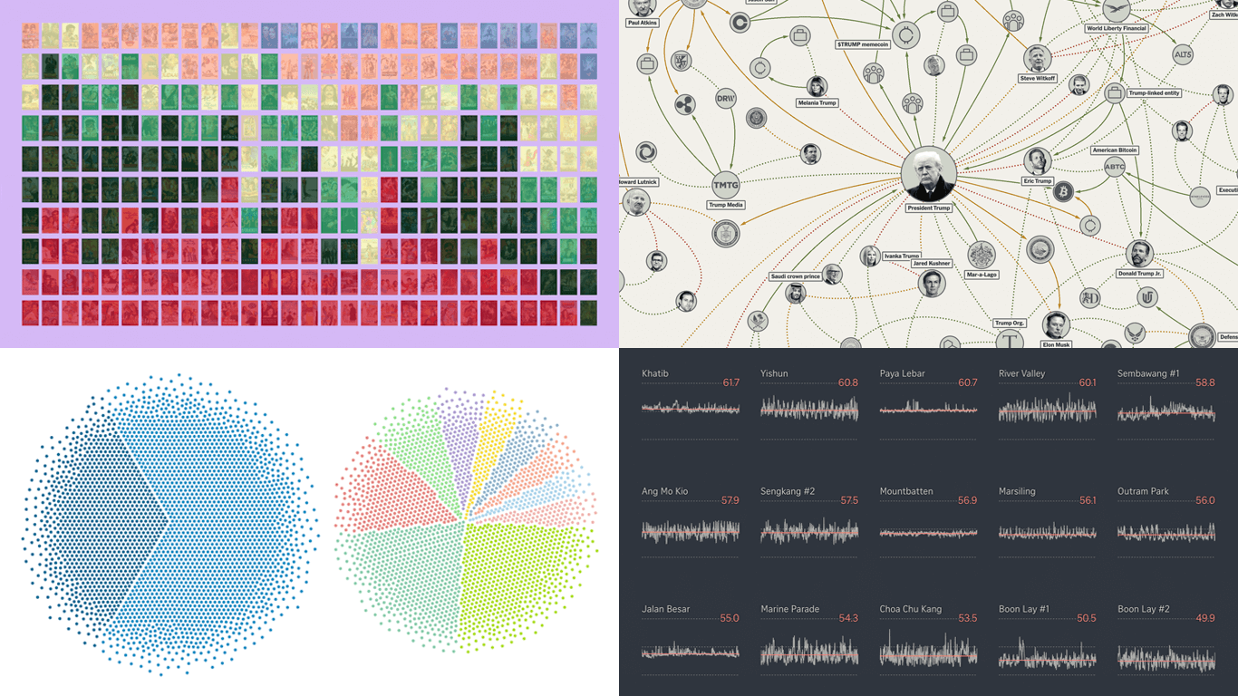
 DataViz Weekly is back on the AnyChart blog! It is our regular roundup where we share the most interesting data visualization work we have come across recently. In this edition:
- Bollywood’s shift away from romance — Kontinentalist
- Homeland Security footprint in Minnesota — The Minnesota Star Tribune
- Traffic noise inside Singapore homes — The Straits Times
- Trump deal connections — The New York Times

Data Visualization Weekly: January 16, 2026
Bollywood Shift Away From Romance
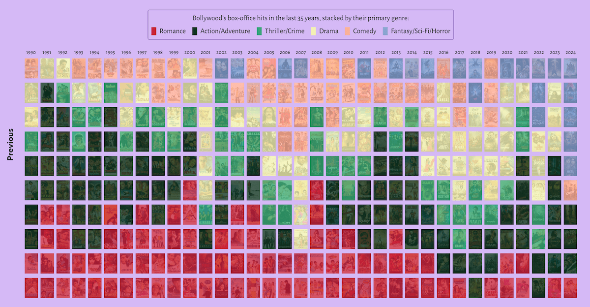
Bollywood romance used to be a hallmark of Hindi cinema, built around big feelings and song-and-dance set pieces. In recent years, many of the biggest releases have moved away from love stories.
Kontinentalist examines this shift in a visual essay based on an analysis of 350 top-grossing Hindi films from 1990 to 2024. It lays the films out year by year in a scrollable grid of posters, using color to mark each title’s primary genre. This format makes it easy to see romance show up less often among top earners over time, while other genres like action and fantasy appear more frequently.
Explore the feature on Kontinentalist, by Surbhi Bhatia.
Homeland Security Footprint in Minnesota
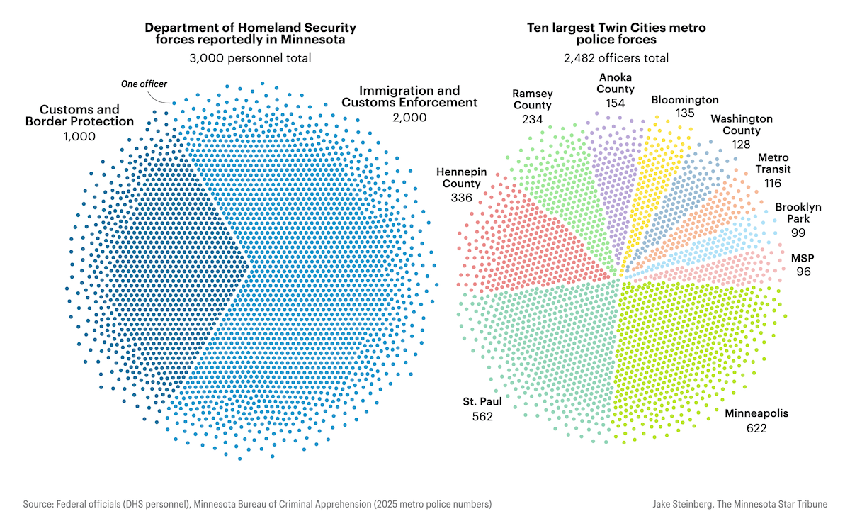
Federal immigration enforcement activity in Minnesota has increased, with publicly cited personnel figures reaching into the thousands. Much of the attention has focused on how those federal staffing numbers compare with local police forces.
The Minnesota Star Tribune published an article about the Department of Homeland Security’s presence in Minnesota, using unit-style charts to put the personnel numbers in context. In the screenshot above, pie charts are composed of individual dots, where each dot represents one agent or officer, so totals and breakdowns are visible at a glance. In this example, reported federal staffing, split between U.S. Customs and Border Protection and Immigration and Customs Enforcement, is shown alongside the headcounts of the ten largest metro police departments in the Twin Cities area.
Take a look at the piece on The Minnesota Star Tribune by Jeff Hargarten and Jake Steinberg.
Traffic Noise Inside Singapore Homes
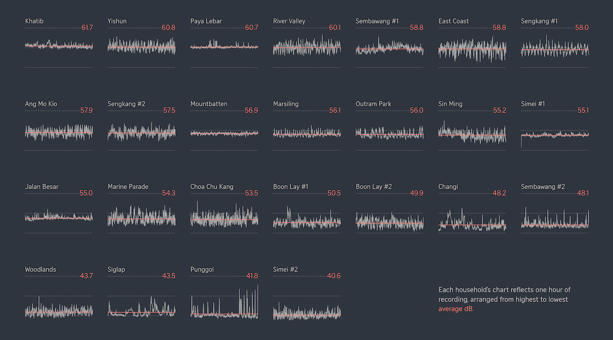
In dense cities, transport networks run close to where people live, work, and sleep. The result is that traffic noise often becomes a constant background that can spill indoors for long stretches of the day.
The Straits Times published an interactive story based on noise recordings made inside 25 homes across Singapore near busy roads, MRT lines, and aircraft routes. Line charts track the measured decibel levels over time across the sessions. The piece also includes audio clips and introduces “roughness” and “sharpness” as two ways to describe how different noises feel.
Check out the article on The Straits Times, by Amanda Shendruk, Azhari Mazlan, Roman Sverdan, Shannon Teoh, and Stephanie Adeline.
Trump Deal Connections
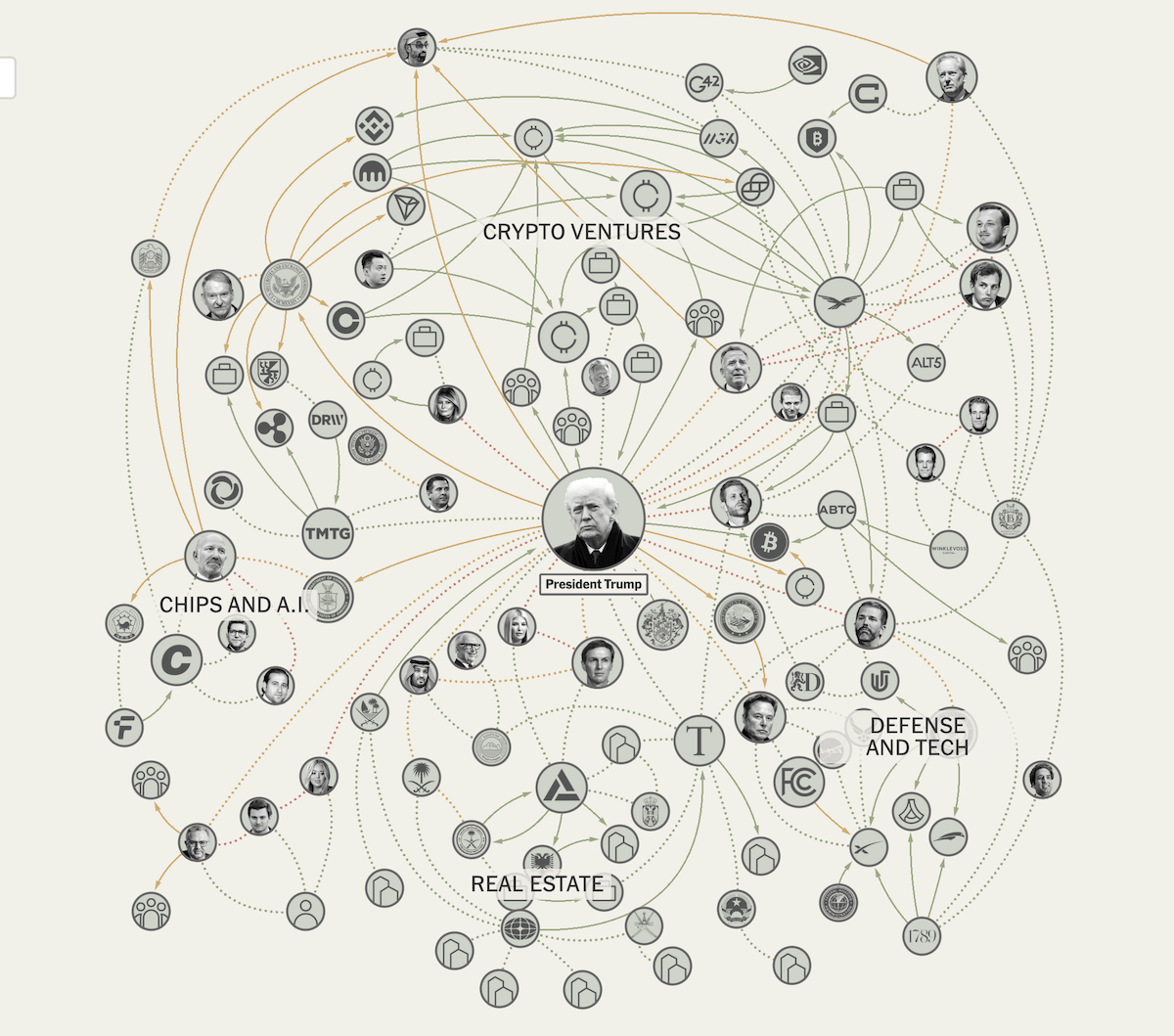
When political power and private business interests sit close together, people look more closely at connections. With President Trump back in office, business deals tied to his family and close associates have drawn renewed attention.
The New York Times builds the piece around a large network diagram with Donald Trump at the center, linking people, companies, government agencies, and foreign entities to business ties, projects, and policy actions covered in its reporting over the past year. As you scroll, the article zooms in on specific threads to show the connections in more detail. At the end, you can explore the diagram on your own.
See the story on The New York Times by Lazaro Gamio and Amy Schoenfeld Walker.
Wrapping Up
From federal staffing comparisons in Minnesota and traffic noise inside Singapore homes to shifting Bollywood genres and an interactive network of Trump-linked deals and actions, this edition shows how different formats can let data talk.
Stay tuned for more interesting examples of data visualization in action!
- Categories: Data Visualization Weekly
- No Comments »