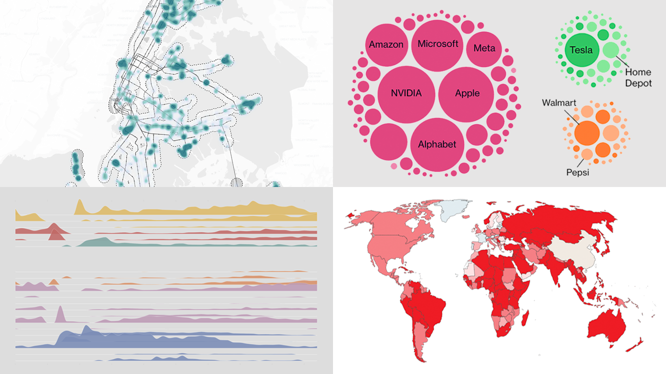
 If you love good charts and maps or want inspiration for your own work, you are in the right place. DataViz Weekly rounds up great new data visualization examples from around the web. In this edition:
- Time with others across the day — Nathan Yau
- Housing potential of NYC parking lots — Tom Weatherburn
- China’s rise in global trade — Our World in Data
- AI questions beyond tech earnings — Bloomberg

Data Visualization Weekly: December 12–19, 2025
Time with Others Across Day
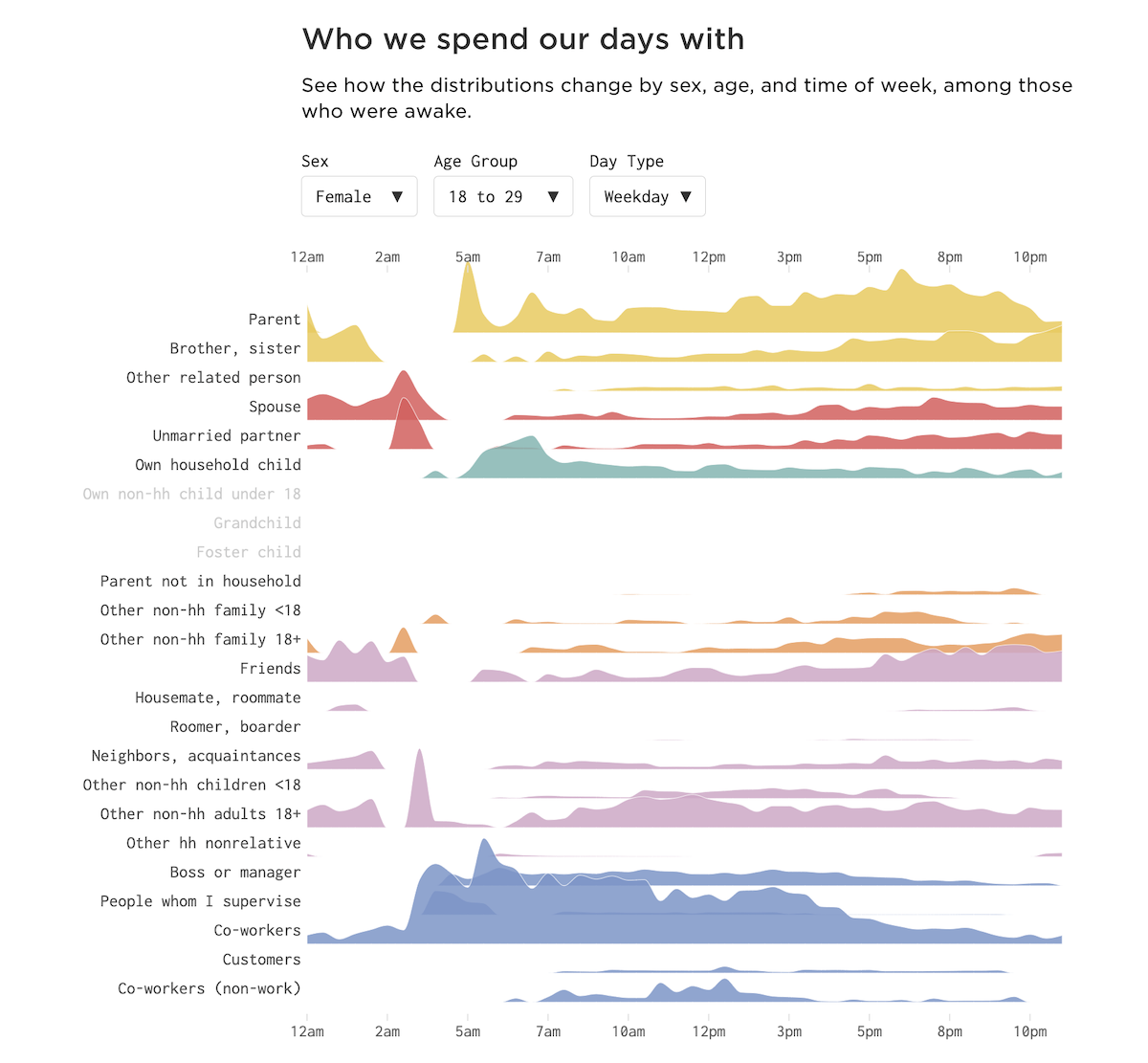
Daily life is usually a mix of time alone and time with other people. That balance shifts within a day and can change over the course of a life.
Nathan Yau uses American Time Use Survey data to examine when people in the United States spend time with others and who that company is. It opens with an area chart showing the share of people who are with someone during an average day, measured among those who were awake. The main view is an interactive set of frequency trails that lets you compare patterns by sex, age group, and time of week. It also includes a separate difference chart to compare how time with others changes across age groups for the selected time of week.
Look at the project on Nathan Yau’s FlowingData.
Housing Potential of NYC Parking Lots
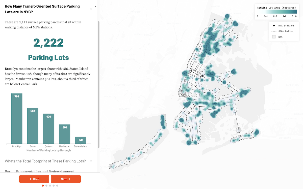
New York City has thousands of surface parking lots near transit, including 2,222 parcels within walking distance of MTA stations. If some of that land shifted from parking to housing, what kind of capacity might the footprint allow?
Tom Weatherburn answers that with an interactive story map that locates surface parking lots within 800 meters of MTA stations and walks through the analysis step by step. The map is the core visual, with sections that break sites down by borough, summarize total land area, and point out parcel fragmentation that can complicate redevelopment. Using ten years of PLUTO data, the project derives recent residential development density patterns by borough and applies them to the mapped parking lots to estimate how many housing units could physically fit under different density assumptions.
Along the way, it uses supporting charts, including column, bubble, and line charts, to provide context for the map views and calculations.
Explore the story here.
China’s Rise in Global Trade
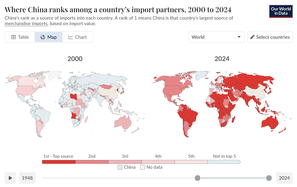
Import relationships shift as economies grow, supply chains change, and new manufacturing centers emerge. Over the past few decades, China has become a major part of how many countries source goods from abroad.
Our World in Data expands its Trade and Globalization topic page with a data-driven look at China’s role in global trade over time. A pair of side-by-side choropleth maps lets you compare two different years at once, showing how China ranks among each country’s import partners, with year selectors spanning from the mid-20th century through 2024. Another choropleth map shows the value of imports from China as a share of GDP in 2024, and it also supports switching years across the same long historical range. Percent stacked area charts add two country examples, Ethiopia and Colombia, tracking how the regional origins of their imports change over time as trade with China grows.
Check out the piece on Our World in Data, by Esteban Ortiz-Ospina, Bertha Rohenkohl, Veronika Samborska, and Simon Van Teutem.
AI Questions Beyond Tech Earnings

Artificial intelligence is reshaping how companies talk about products, spending, and productivity. But the amount of attention it gets from investors is not the same across the economy.
Bloomberg analyzes more than 7,000 S&P 500 earnings call transcripts from 2025 to track which companies were asked about generative AI, based on questions tied to human-like capabilities such as reasoning and decision making. A line chart shows the share of companies asked about AI on earnings calls by industry. A set of packed circles then breaks the S&P 500 into sectors, sizing points by market cap and marking which firms were asked about AI, with callouts for well-known companies and sector totals for quick comparison.
See the article on Bloomberg, by Carolyn Silverman, Jo Constantz, and Jennah Haque.
Wrapping Up
That is it for this set of great new data visualization examples. Check out the projects above for the full views and details. Stay tuned for more data visualization brilliance.
- Categories: Data Visualization Weekly
- No Comments »