 We continue our regular DataViz Weekly feature, where we curate the most interesting data visualization work we have come across over the past few days. Here is what made it into this edition:
- Michelin star restaurants in Spain — Colpisa
- Occupations with higher pay (than yours) — FlowingData
- Landfills across Europe — Investigate Europe & Watershed Investigations
- Catastrophic residential fire in Hong Kong — SCMP

Data Visualization Weekly: November 28, 2025 – December 5, 2025
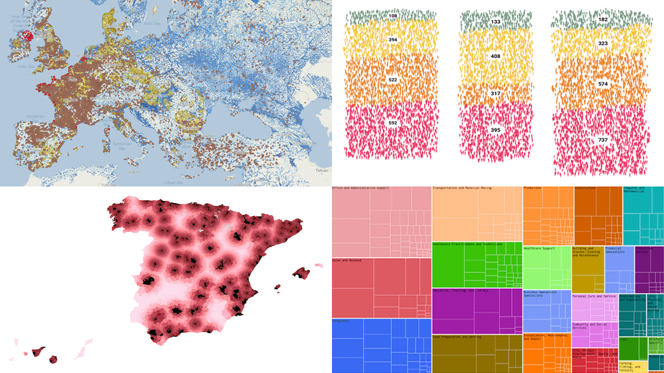
Michelin Star Restaurants in Spain
Fine dining is usually associated with big cities and dense urban areas. But in Spain, Michelin-starred restaurants appear across municipalities of very different sizes, from major urban centers to small towns and rural areas, sometimes serving more visitors than they have neighbors.
Colpisa journalists explore this distribution in a scrollytelling piece that blends narrative with data graphics. The map shown above, for example, colors every municipality by its distance to the nearest Michelin-starred restaurant, making it easy to see which areas sit close to at least one star and which are much farther away. Similar views focus specifically on access to two and three stars. Bubble plots then look at how these starred locations relate to the population size of municipalities.
See the story on Diario SUR by Guillermo Villar, Sara I. Belled, and Carlos Muñoz Díaz.
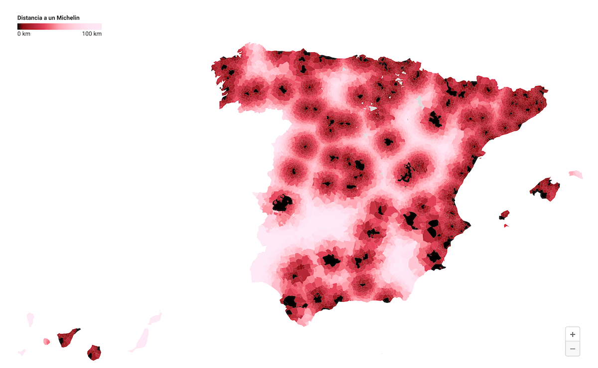
Occupations with Higher Pay (Than Yours)
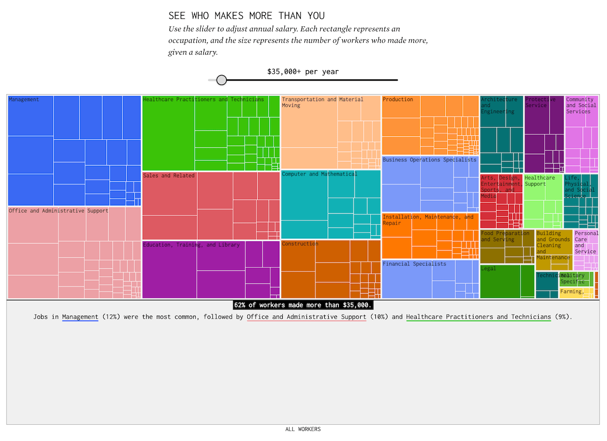
You know how much you earn, and you know there are people who earn more. What kind of jobs do those people have?
Nathan Yau built an interactive treemap where you move a slider to set an annual salary and then see which occupations have workers earning more than that amount in the United States. Each block in the chart represents a job group, and larger blocks mean more workers in that group are above the salary you selected. As you adjust the slider, the layout updates to show how the set of occupations above the threshold changes at different income levels.
Check out this work on FlowingData.
Landfills Across Europe
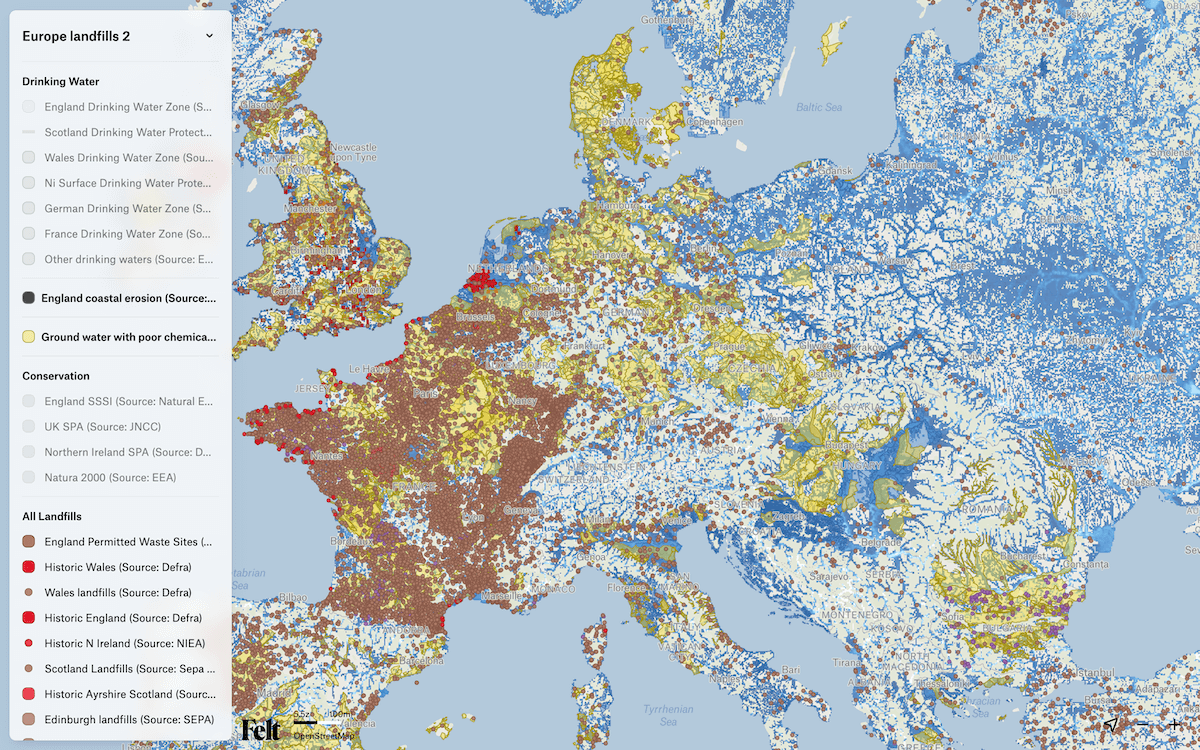
Landfills across Europe range from historic waste sites to locations still affecting nearby water, soil, and ecosystems. Many of them were established before modern environmental standards, and their exact distribution has long been difficult to understand because records are scattered across different countries and agencies.
Investigate Europe and Watershed Investigations present this landscape through the European Landfill Map, an interactive tool that locates more than 60,000 landfill sites and lets you switch on layers for flood risk, coastal erosion, drinking water zones, chemically failing groundwater, and protected areas. By zooming and toggling these layers, you can see where waste sites lie close to rivers, coasts, or conservation areas, and where they coincide with stressed groundwater. The map brings together information from multiple national and local sources into a single interface.
Explore the map here and learn more about the project on the Investigate Europe website.
Catastrophic Residential Fire in Hong Kong
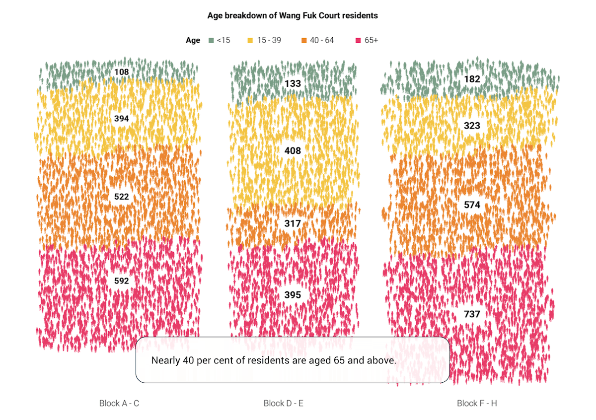
A catastrophic fire swept through the Wang Fuk Court housing complex in Hong Kong’s Tai Po district on November 26, 2025. Spreading across several 31-floor residential towers that were under renovation, it became the city’s deadliest blaze in more than seventy years.
South China Morning Post presents the event in a scrollytelling piece that combines video, illustrations, and data visuals. A step-by-step timeline shows how the fire and emergency response unfolded, sometimes down to the minute. And several charts summarize who lived in the towers, including the age breakdown shown in the graphic above. The story closes with an overview of the deadliest and most notable fires in Hong Kong’s recent history.
Look at the piece on South China Morning Post, by Rocio Marquez, Catherine Ma, Davies Christian, Carlos Araujo, Victor Sanjinez, Brian Wang, Kakuen Lau, Jeffie Lam, and Kaliz Lee.
Wrapping Up
These projects demonstrate the many ways visualization can help make sense of complex data. We hope you came away with something interesting. Stay connected for more great examples of data viz work featured in Data Visualization Weekly.
- Categories: Data Visualization Weekly
- No Comments »