 Some data visuals invite a closer look the moment they appear. We selected a set of fresh projects that have that effect and are happy to share them here in DataViz Weekly. Take a moment to explore the examples we picked for this edition:
- Trans media coverage patterns — Trans News Initiative
- Voters’ ideal political party positions — Strength In Numbers
- Epstein email network explorer — Max Andrews
- Fiscal inequality across the United States — Tax Base Fragmentation

Data Visualization Weekly: November 21–28, 2025
Trans Media Coverage Patterns
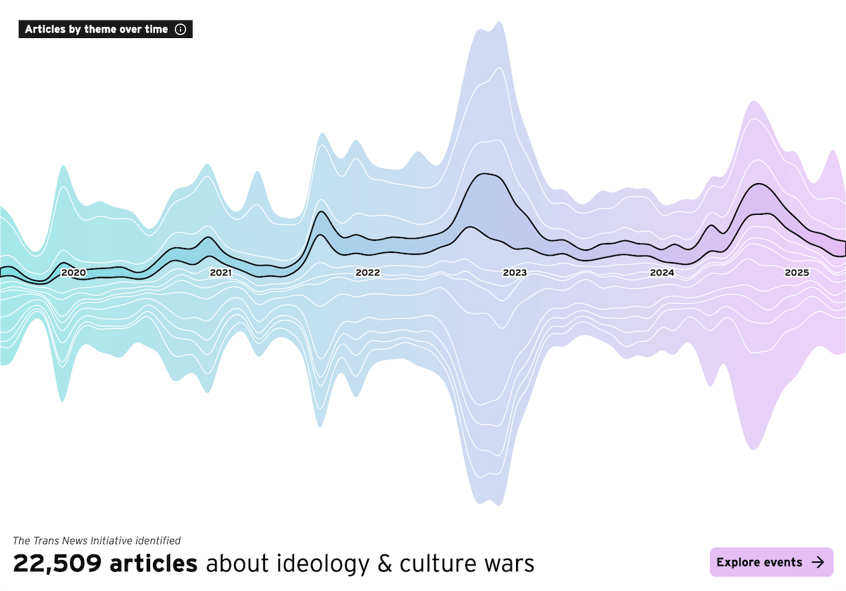
News about trans communities in the United States spans a wide range of topics, from public debates to policy shifts to cultural narratives. Looking at how that coverage has evolved over time helps clarify which themes gain attention and which receive comparatively little visibility.
The Trans News Initiative visualizes this using a set of interactive charts built from more than 190,000 national-news articles published since 2020. The main view is a streamgraph showing monthly article totals across thirteen themes, where taller streams indicate periods of heightened attention. Drilling into any theme reveals packed circles that group individual articles into coverage events, a beeswarm chart that plots every article by publication date, and a 100% stacked column chart showing publication-level political lean by year.
Together, these views lay out how different narratives about trans communities have been covered and how the balance among topics has shifted.
See the project at transnewsinitiative.org, developed in collaboration by the Trans Journalists Association, the University of Miami School of Communication, and Polygraph, with guidance from Alberto Cairo.
Voters’ Ideal Political Party Positions
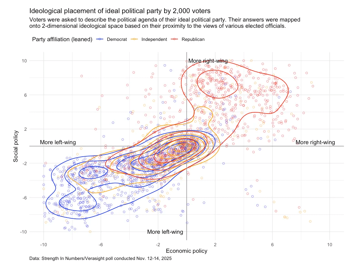
People often hold views that do not line up neatly with the platforms of the major political parties. Understanding how people imagine their “ideal” party helps show where public preferences cluster and where they diverge from current political alignments.
G. Elliott Morris examines these patterns using multiple visualizations based on a recent poll of 2,000 voters. The chart above maps respondents into a two-dimensional ideological space using their answers on the political agenda. Each dot represents one voter, color-coded by leaned party affiliation, and the contour lines show where these respondents concentrate within the space.
The article also includes additional scatter plots (including quadrant charts), as well as word clouds and other data graphics that illustrate how different groups describe the agenda they want from an ideal party.
See the project on Strength In Numbers.
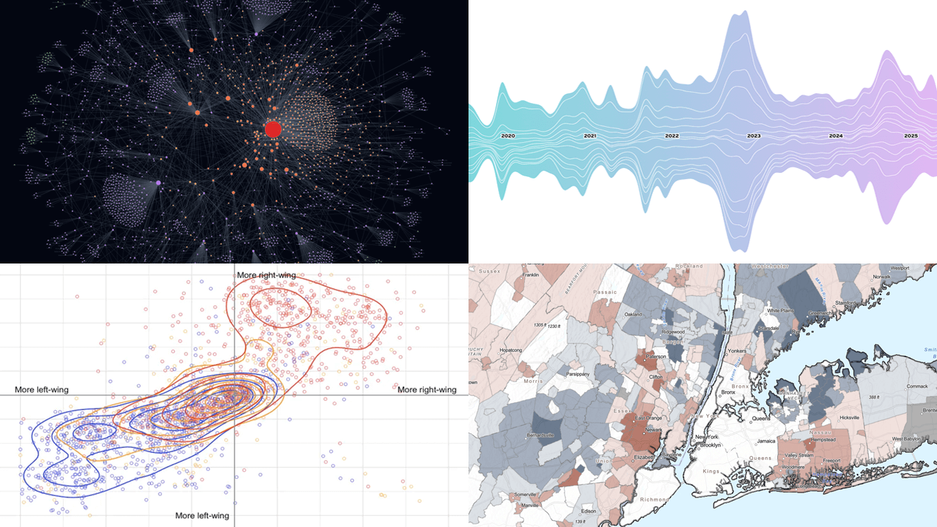
Epstein Email Network Explorer
The recent release of Epstein-related emails by the House Oversight Committee has drawn attention to the large number of people, places, and events referenced in the documents. With so many records involved, it is not easy to see how everything connects at a glance.
Max Andrews presents an interactive network graph that maps the relationships extracted from the released email corpus. Claude AI is used to identify entities and documented links, which appear as nodes and connections you can click, zoom, and pan across. Filters let you refine the view by time, person, keyword, or tag, and selecting a relationship in the timeline opens the original source document for verification and context.
The result is a document-analysis tool that turns a large, unstructured archive into a navigable set of connections.
See the project at epsteinvisualizer.com.
Fiscal Inequality Across the U.S.
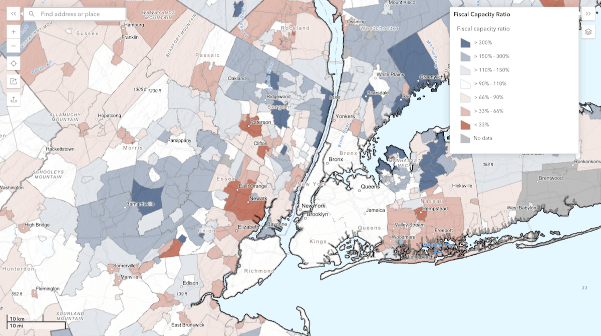
Property wealth varies sharply across neighboring jurisdictions in the United States, shaping how local governments fund services ranging from schools to public safety. Because the U.S. lacks an equalization system used in many other countries, differences in taxable property value can translate directly into unequal fiscal capacity from one municipality to the next.
A new project called Tax Base Fragmentation represents this landscape using an interactive choropleth map built from more than 138 million property tax assessment records from 2019. In the default view, municipalities are shaded by their fiscal capacity ratio, which compares each locality’s per capita tax base with the average for its metropolitan area. Blue areas indicate places with more taxable wealth than their metro peers, while red areas indicate places with less. Clicking on any jurisdiction opens a panel with its population, tax base per capita, and fiscal capacity ratio, and a secondary layer lets you switch to raw taxable value per capita when comparing across regions.
The map offers a detailed look at how fiscal inequality is distributed within metro areas and how large the gaps can be between neighboring local governments.
See the project at taxbasefragmentation.net, by Robert Manduca, Brian Highsmith, and Jacob Waggoner.
Wrapping Up
These visualizations draw you in from the start and make it easy to explore the patterns and details behind the data. We hope you like this selection and that these charts and maps sparked a few useful ideas for your own work. Stay tuned to Data Visualization Weekly for more great examples.
- Categories: Data Visualization Weekly
- No Comments »