 Raw data can be difficult to read and interpret at a glance. Charts and maps make it easier to see what it has to say. We continue to curate great new visuals in our regular series DataViz Weekly, and here’s our latest selection:
- Causes of death in reality and in media — Our World in Data
- EU healthcare priorities — European Data Portal
- U.S. school system redistricting — New America
- Religious mixing in Australian marriages — ABC News
Data Visualization Weekly: October 3–10, 2025
Causes of Death in Reality and in Media
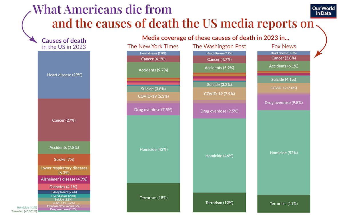
People often assume that news coverage reflects real-world risks, yet the picture it paints can be far from accurate. In the United States, heart disease and cancer are responsible for most deaths, while much rarer causes like homicide and terrorism receive disproportionate attention.
Our World in Data compared these two realities using 2023 mortality data from the CDC and article mentions from The New York Times, The Washington Post, and Fox News, collected via Media Cloud. The chart above consists of four 100% stacked columns: the first represents the actual distribution of causes of death, while the other three show how much coverage each received across the three outlets. Chronic diseases dominate the mortality column but shrink to thin bands in the media columns, whereas rare violent events expand dramatically. A companion column chart quantifies this imbalance by showing the ratio between deaths and mentions, moving from barely covered causes such as heart disease and stroke on the left to heavily overrepresented ones like homicide and terrorism on the right.
Take a closer look at the project on Our World in Data, by Hannah Ritchie, Tuna Acisu, and Edouard Mathieu.
EU Healthcare Priorities
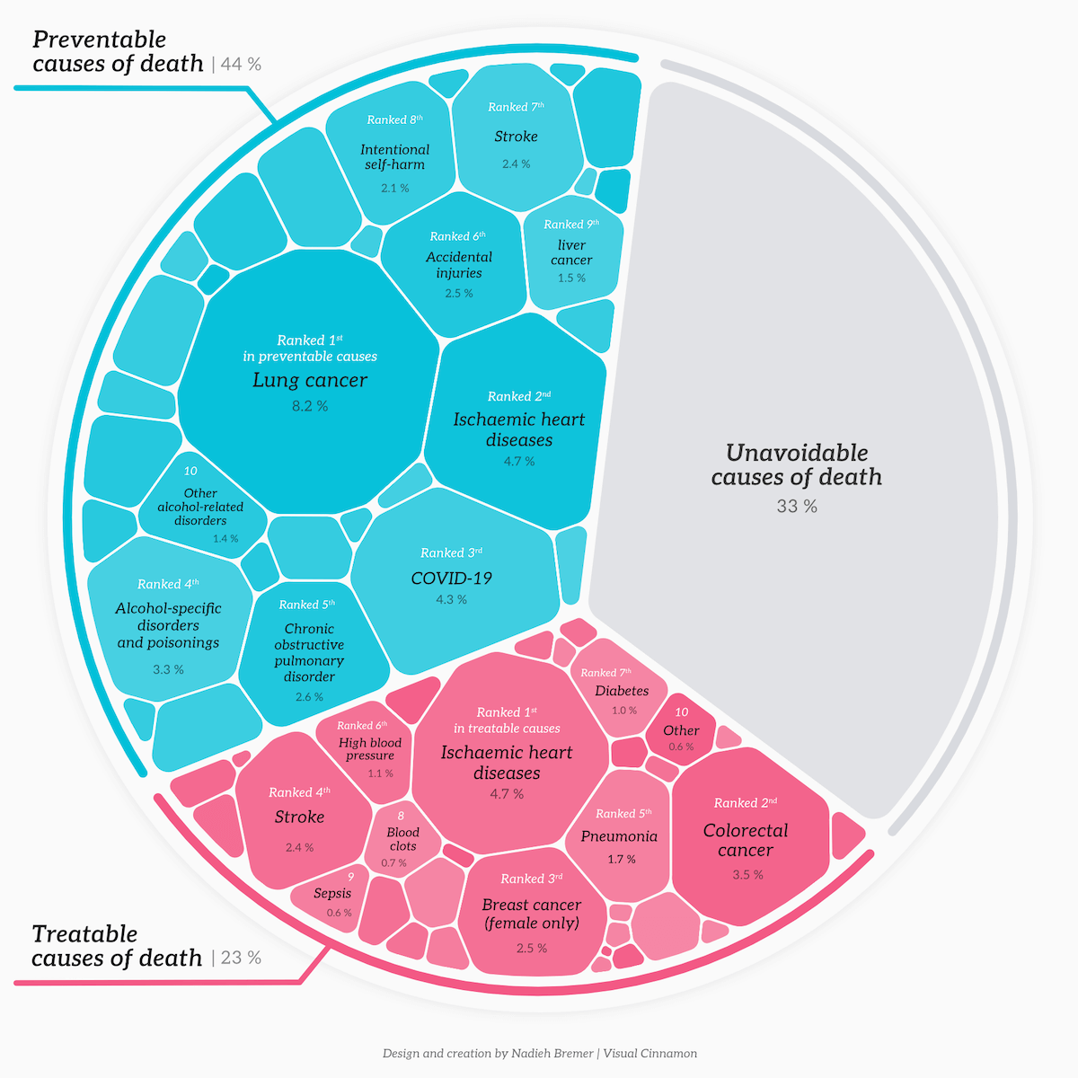
Good health supports both individual well-being and social resilience. Across Europe, healthcare systems strive to balance prevention, treatment, and access — yet the question remains whether resources truly align with people’s needs.
A recent data story on the European Data Portal brings these connections into focus with a set of Voronoi treemaps designed by Nadieh Bremer. Drawing on Eurostat data, the first visualization shows how national healthcare budgets are split across subcategories, highlighting the shares of curative and rehabilitative care, preventive care, and others. The next graphic, pictured above, categorizes premature deaths before age 75 into preventable, treatable, and unavoidable causes, showing that two-thirds fall into the first two groups — notably ischemic heart disease, lung and colorectal cancers, and COVID-19. The final chart highlights why some Europeans still miss needed care, visualizing reasons such as long waiting times, high costs, or hoping symptoms would fade on their own.
See the article on data.europe.eu, and check out two other data stories Nadieh Bremer made for them lately.
U.S. School System Redistricting
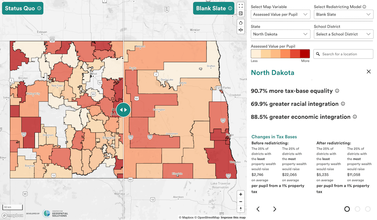
School district lines in the United States often mirror long-standing racial and economic divides, influencing both the makeup of classrooms and the flow of local education funding. Because those boundaries determine how local property taxes get into education budgets, even small shifts can have major effects on funding equity and diversity.
New America’s Education Funding Equity Initiative examined how rethinking these lines could create school systems that are both more equitable and more integrated. Using data from the U.S. Census Bureau and the Lincoln Institute of Land Policy, the team applied machine-learning methods to simulate three alternative redistricting models: complete redraws, county-wide systems, and strategic mergers of existing districts. Their findings suggest that redrawing boundaries could sharply reduce both economic and racial segregation while improving per-pupil tax-base equality. An accompanying interactive choropleth map lets users explore every state, comparing current district layouts with each proposed model through a sliding interface that reveals how such changes might reshape access to educational opportunity.
Explore the tool and check out the report by Zahava Stadler and Jordan Abbott.
Religious Mixing in Australian Marriages
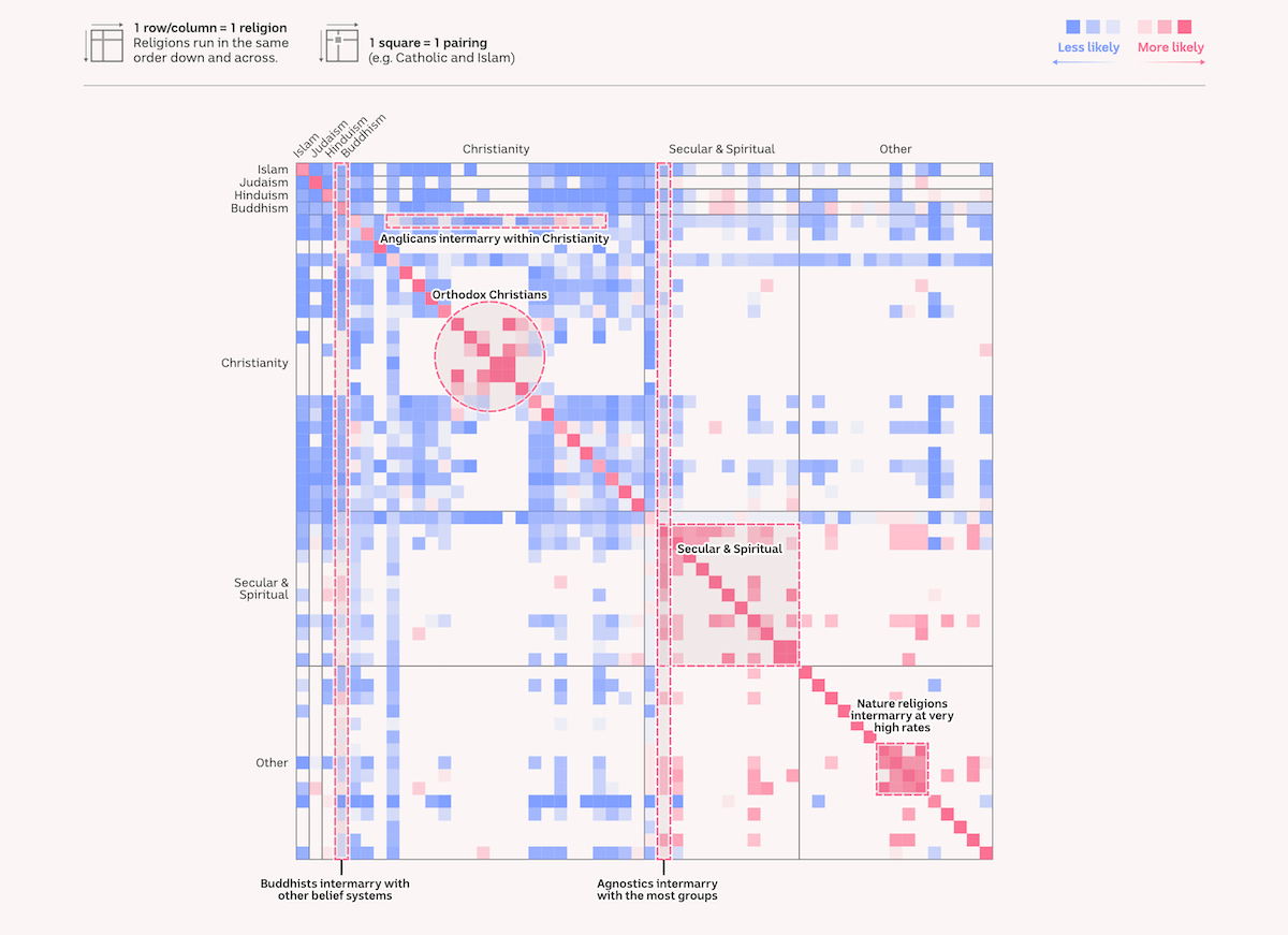
Religious identity long influenced whom Australians married, but that pattern is changing. Census data show that nearly one in five marriages now bridge different faiths — about twice the share recorded in 1986 — reflecting a steady rise in relationships that cross religious lines.
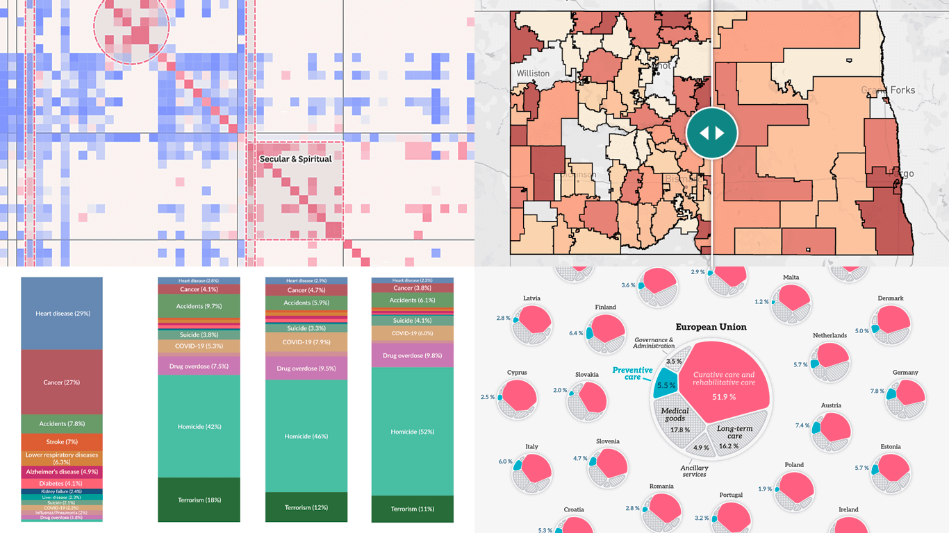
ABC News analyzed data for 5.2 million couples from the 2021 Census, covering more than 50 faith groups, to find out how religion shapes modern partnerships. The chart above, for example, plots 1,275 pairings between religions in a color grid, with pink indicating matches within the same faith and blue showing where interfaith unions are rare. Other visualizations reveal the most frequent matches for each religion, compare pairing probabilities, and let users see how typical their own relationship type is. Together, the graphics illustrate both the persistence of “birds of a feather” marriage patterns and the growing openness of Australians to interfaith unions.
Check out the story on ABC News, by Inga Ting, Katia Shatoba, Brody Smith, Alex Palmer, and Thomas Brettell.
Wrapping Up
Isn’t it striking how clearly data can speak when shown the right way? That idea drives Data Visualization Weekly — a space to share visual work that turns data into something we can see and understand. Stay with us for more in the next edition.
- Categories: Data Visualization Weekly
- No Comments »