 Numbers often stay abstract until they are put into form. Visuals can help reveal what is hidden in plain figures, generating insight and bringing meaning to the surface. In this edition of DataViz Weekly, we offer a quick look at four recent projects that turn data into something we, humans, can truly see and grasp more clearly.
- Pay across occupations — FlowingData
- Billionaires in America — WSJ
- Africa’s real size — Reuters
- Zodiac signs out of sync — The Upshot
Data Visualization Weekly: September 5—12, 2025
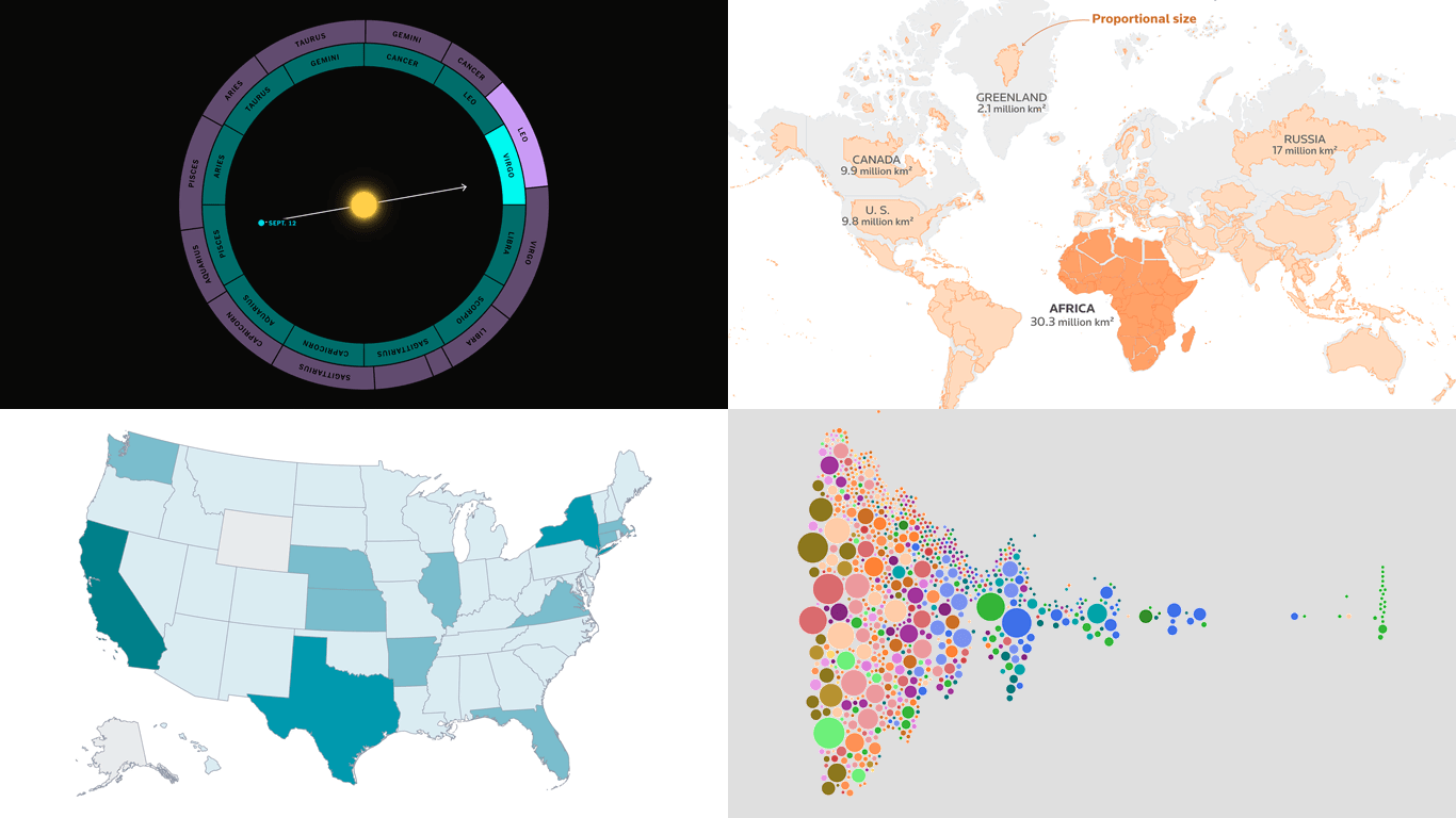
Pay Across Occupations
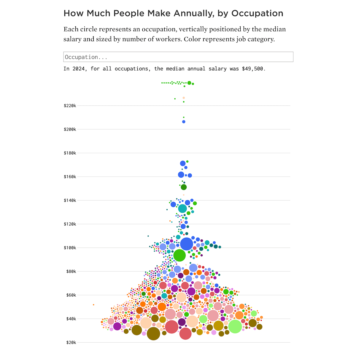
Good things deserve a second run. And who does not enjoy a well-made beeswarm?
Back in November 2019, we featured Nathan Yau’s beeswarms on salaries by occupation in the United States. Several days ago, he returned to the subject with an update using 2024 estimates from the Bureau of Labor Statistics.
The main bee swarm chart positions each occupation by median pay, with circle size showing the number of workers and color marking the job category. Small multiples then show salaries within categories, highlighting clusters in healthcare, management, computer, construction, and beyond. Hovering over bubbles reveals the 25th and 75th percentile values, making clear that even within a single role, earnings can vary widely.
Check out the project on FlowingData, by Nathan Yau.
Billionaires in America
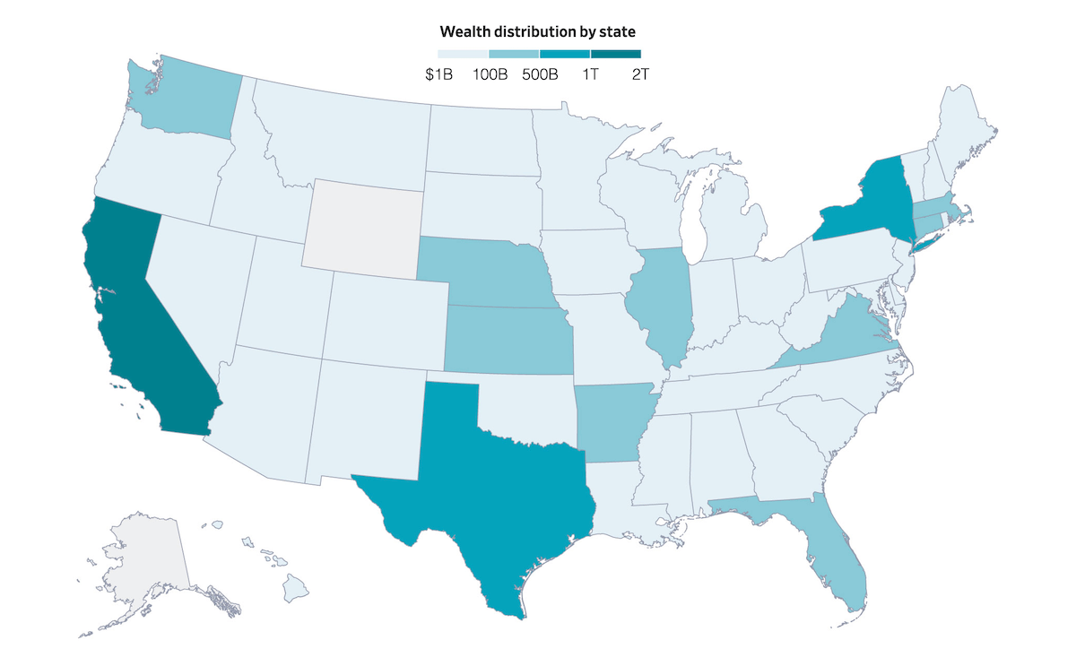
The number of people in the United States with fortunes of at least $1 billion has climbed in recent years, reaching more than a thousand. While names like Elon Musk or Taylor Swift may dominate headlines, many others are behind businesses in less visible places, from Wisconsin roofing suppliers to firms based in small Southern towns.
The Wall Street Journal visualized this expanding group with scrollytelling maps built from Altrata wealth data. A bubble map shows billionaire-owned properties by ZIP code, followed by another bubble map grouping their primary businesses by city. A choropleth map then illustrates how billionaire wealth is distributed across states, totaling over 5 trillion U.S. dollars in 2024. California alone accounts for 255 individuals.
Look at the piece at WSJ.com, by Inti Pacheco and Theo Francis, with graphics by Drew An-Pham and Peter Santilli. The full version is for subscribers, but these maps are available to view publicly.
Africa’s Real Size
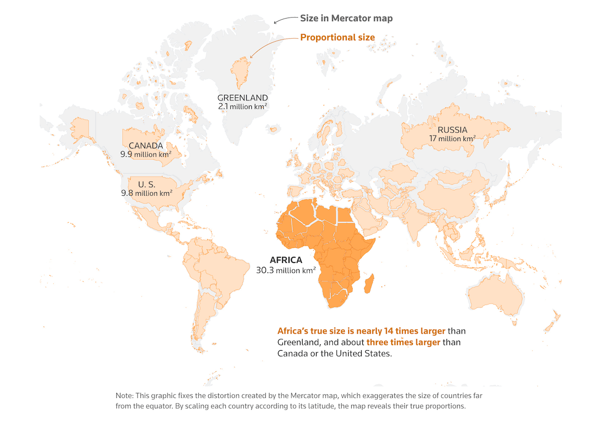
The debate around map projections has reignited with the “Correct The Map” campaign, now endorsed by the African Union. At the center is the Mercator projection, introduced in the 1500s for navigation. It enlarges northern countries like Greenland and Canada while shrinking landmasses near the equator, and for centuries, it dominated school maps, giving the wrong sense of Africa’s scale.
Reuters lays out the distortions in a scrolling visual story. A set of maps and animations contrasts the Mercator projection with the Equal Earth version at a glance. For instance, the visual pictured above clearly shows Africa to be 14 times larger than Greenland, 3 times Canada, and over 1.5 Russia. Another striking illustration fits the United States, China, India, and much of Europe inside Africa’s outline, revealing its immense size. The piece closes with 18 world map projections side by side, offering a quick comparison of how each reshapes the globe.
See the story on Reuters, by Mariano Zafra and Sudev Kiyada.
Zodiac Signs Out of Sync
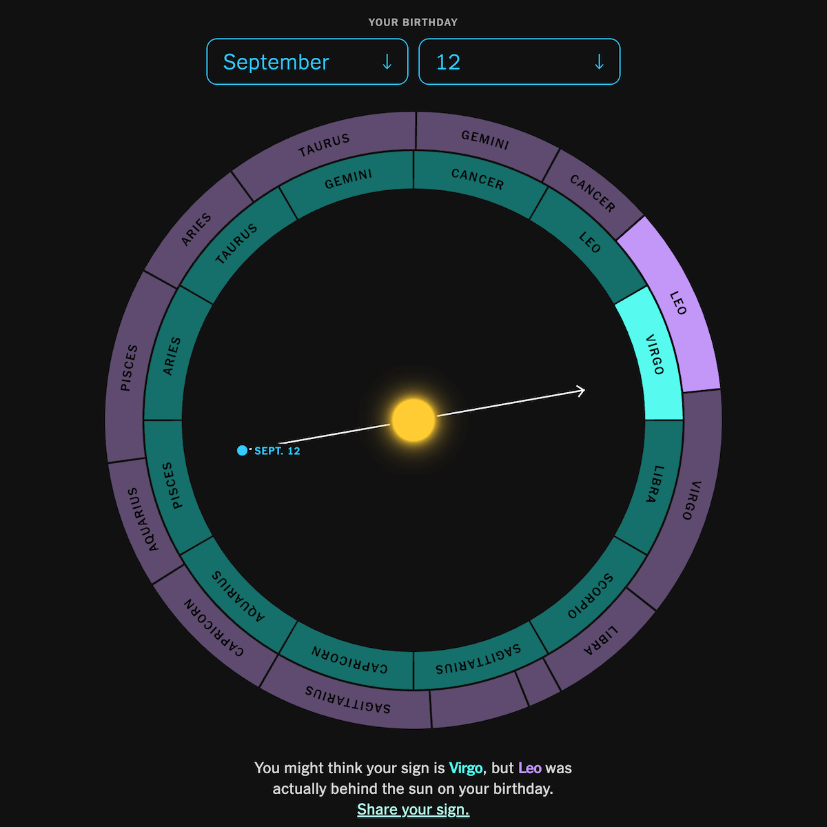
The zodiac calendar most people know is about 2,000 years out of step with the stars. Earth’s slow wobble has shifted the constellations behind the sun, so the sign on your birthday today is often not the one you have always believed.
The New York Times’ The Upshot illustrates this drift with rich visuals. Animations show how the sky shifted from ancient times to the present, and you can even enter your birthday to see which constellation was really behind the sun. The scrolling graphics explain how precession works, why the zodiac signs and seasons diverged, and how our perspective of the night sky keeps changing.
Explore the interactive on The Upshot, by Aatish Bhatia, Francesca Paris, and Rumsey Taylor.
Wrapping Up
These projects span work, wealth, geography, and the sky above — four different domains where visualization turns abstract data into clear insight. Each demonstrates how seeing numbers in visual form can make patterns easier to understand.
Stay with Data Visualization Weekly for more examples of how charts and maps work in practice.
- Categories: Data Visualization Weekly
- No Comments »