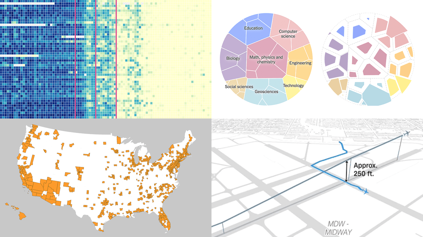
 Seeing data is not the same as understanding it — that is where visualization makes the difference. This edition of DataViz Weekly features fresh examples showing how insight emerges when numbers are presented thoughtfully. Whether you work with data or just follow it, here’re four new projects we thought you wouldn’t want to miss:
- Aviation incidents in America — CNN
- County population across the United States — Kyle Walker
- Cuts in U.S. science funding — The Upshot
- Measles vaccination impact — Our World in Data
Data Visualization Weekly: May 16–23, 2025
Aviation Incidents in America
Several high-profile aviation incidents occurred recently, including the January midair collision over the Potomac River between a Black Hawk helicopter and American Airlines Flight 5342. That raised a natural question: has flying become less safe than it used to be?
CNN explored that question with data. In a visual article by Amy O’Kruk, Alex Matthews, and Curt Merrill, flight safety records are illustrated through dots, bubbles, and lines. The most compelling element is a series of animated maps that reconstruct recent near misses, based on Flightradar24 and NTSB data. These show not only horizontal aircraft movement but also changes in altitude, offering a spatial view of how close planes came during incidents in Chicago, Phoenix, Los Angeles, and Boston.
Check out the story on CNN.
County Population Across United States
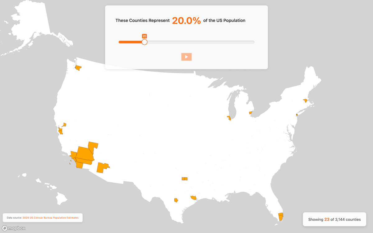
The United States has over 3,000 counties, but population distribution across them is highly uneven. For instance, the 23 most populated counties together account for 20% of the total U.S. population, while it takes over 2,500 of the least populated ones to reach the same share.
Kyle Walker represented this disparity in an interactive map built with statistics from the U.S. Census Bureau. As you move the slider, the map highlights counties one by one in descending order of population, displaying the cumulative share of the U.S. population they represent. You can also hit play to let the animation run automatically. It all starts with Los Angeles County (CA), then Cook (IL), Harris (TX), and so on.
See the interactive here.
Cuts in U.S. Science Funding
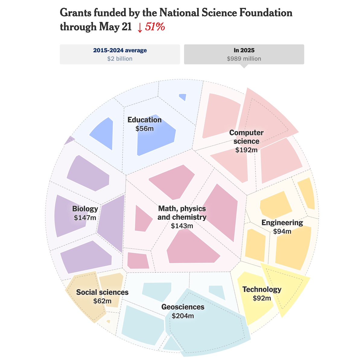
Grant-awarding by the National Science Foundation (NSF), which supports a fifth of all federally funded basic research at U.S. universities and colleges, has slowed to its lowest pace in over three decades. Most scientific fields have seen funding levels drop well below recent norms, with only a handful of exceptions.
The New York Times’ The Upshot visualized the shift using the circular Voronoi diagram technique. Cells represent research areas, comparing current NSF grant totals for 2025 (through May 21) with the ten-year average for the same period. Only four fields, including cyberinfrastructure, innovation and technology ecosystems, ocean sciences, and behavioral and cognitive sciences, stand out with higher funding levels.
Following the big-picture view, the article briefly shifts to show field-level aggregates with bar charts and cumulatives by year since 1990 with stepped lines, then zooms into individual research areas for more detail.
Look at the piece on The Upshot — by Aatish Bhatia, Irineo Cabreros, Asmaa Elkeurti, and Ethan Singer.
Measles Vaccination Impact
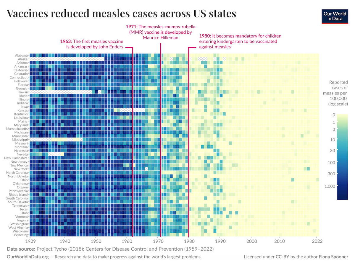
Measles once infected nearly all children and caused millions of cases each year. That began to change in the 1960s, when vaccination efforts were introduced and steadily expanded. Since then, global immunization programs are estimated to have saved more than 90 million lives.
Our World in Data, in a visual essay by Saloni Dattani and Fiona Spooner, explores the development and impact of measles vaccines. The article features several charts — including the heatmap shown above, which illustrates the decline in reported cases across U.S. states over time, with darker shades marking years of higher incidence. Additional visuals, such as area, line, and bar charts, provide broader context on global progress.
Explore the article on Our World in Data.
Wrapping Up
From flight risks and population patterns to research funding and vaccine outcomes, these projects demonstrate how visualization brings clarity to raw numbers.
We hope you found this edition of Data Visualization Weekly meaningful. Stay tuned for more examples of how data becomes visual insights.
- Categories: Data Visualization Weekly
- No Comments »