 Qlik Connect was a blast — catch some highlights on our LinkedIn if you’re interested. With all that whirlwind now behind, we’re completely back in the flow of our Friday tradition with a new edition of DataViz Weekly. As always, it is all about sharing great projects that show how visualization lets data talk and sparks insight. Today, we bring you four new visual data stories to check out:
- Visual guide to papal election — Atlo
- Chance of death on birthday — The Pudding
- Sinking ground in U.S. cities — The Washington Post
- Chinese products in American homes — The New York Times
Data Visualization Weekly: May 9–16, 2025
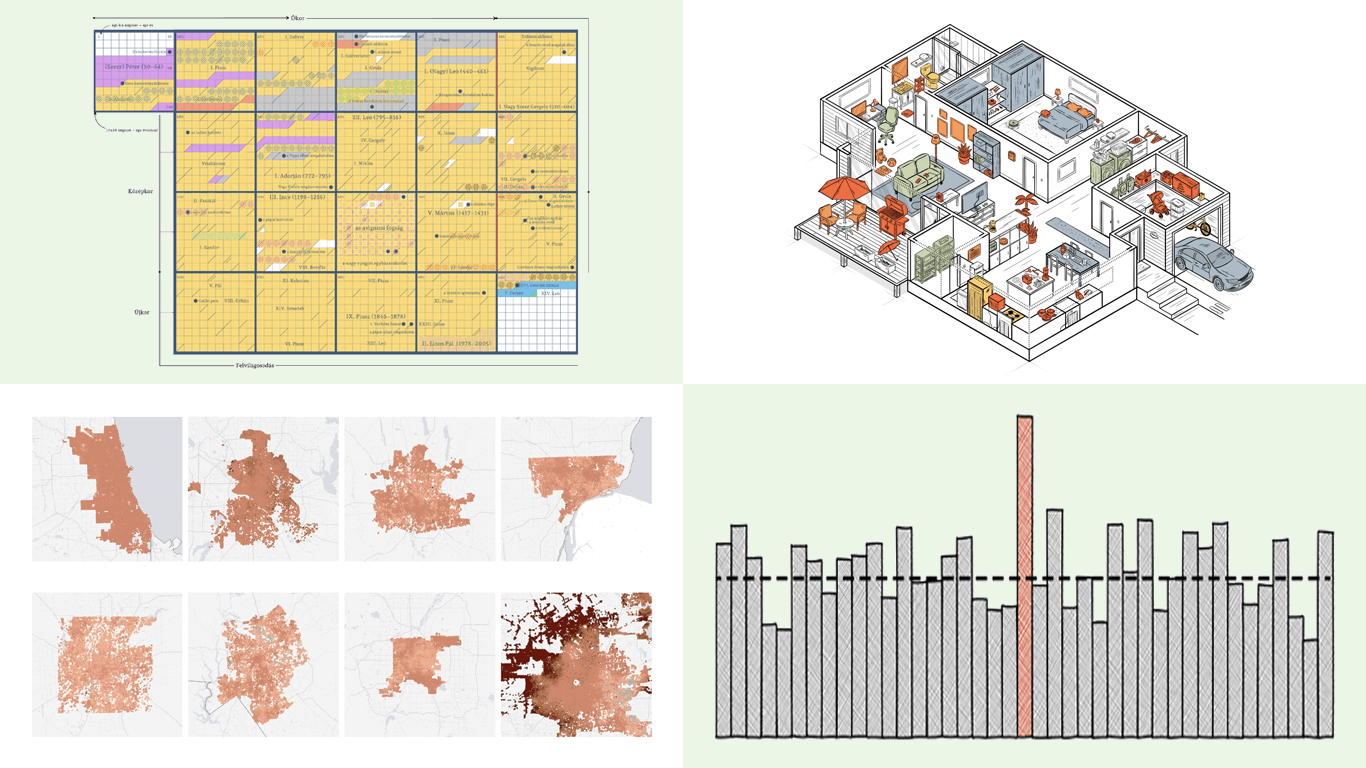
Visual Guide to Papal Election
The papal throne stood vacant after the death of Pope Francis, and ahead of the 2025 conclave, global attention focused not only on who would be chosen but also on how the Church selects its next leader. On May 8, U.S.-born Cardinal Robert Francis Prevost was elected as the 267th pontiff, taking the name Leo XIV.
Átló, namely Krisztián Szabó and Attila Bátorfy, created a richly illustrated project that explores the Catholic Church’s papal selection process and its broader historical context. The visualizations include a timeline of all popes since Saint Peter, color-coded by region; maps of existing papal tombs; breakdowns of the cardinal-electors’ geographic origins; and diagrams explaining conclave rituals and voting procedures. The story also highlights where leading contenders in this conclave were understood to stand on key issues, such as blessings for same-sex couples and communion for the divorced.
Explore the project on the Átló website — on how the Church’s leadership is chosen and how the 2025 conclave fits into centuries of papal tradition.
Chance of Death on Birthday
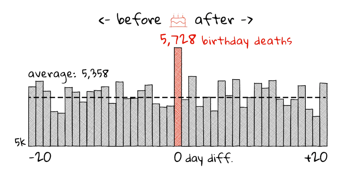
Are people more likely to die on their birthdays? Actually, it seems so, and this phenomenon, known as the birthday effect, has been observed in several studies and now tested again using local data.
The Pudding published a visual essay by Russell Samora that investigates this question using death records from Massachusetts. The analysis walks through key steps of the statistical approach: calculating day differences between birth and death, testing for significance, and controlling for seasonal mortality patterns. Illustrated throughout with a series of handmade-style column charts, the story reveals a measurable spike in deaths on birthdays, even after adjusting for broader trends, with the effect particularly visible among older individuals and in accidental causes.
Check out the piece on The Pudding — on what Massachusetts data shows about the birthday effect.
Sinking Ground in U.S. Cities
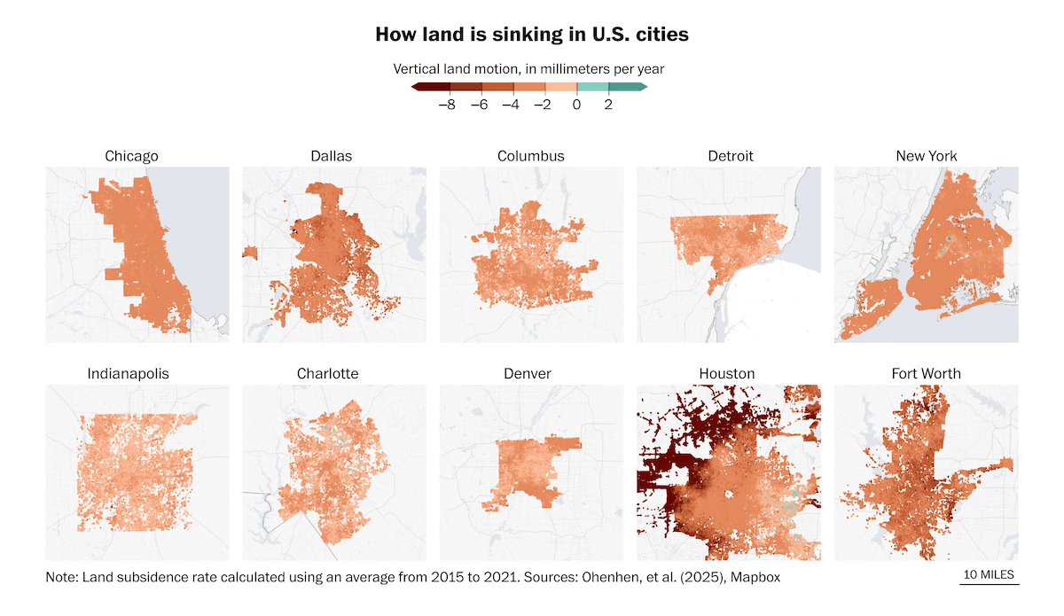
Across the United States, land beneath major cities is sinking — often imperceptibly, but with effects that build up over time. The causes vary, from groundwater extraction and glacial rebound to heat absorption and tectonic pressure, but the risks are shared: damaged buildings, strained infrastructure, and increased flood vulnerability.
The Washington Post, in a story by Kasha Patel and Naema Ahmed, presents findings from a study by Leonard Ohenhen, Guangquan Zhai, Jessica Lucy, and others, recently published in Nature Cities. The project includes a series of maps showing vertical land motion in ten of the most affected cities — Chicago, Dallas, Columbus, Detroit, New York, Indianapolis, Charlotte, Denver, Houston, and Fort Worth — where up to 98% of land area is subsiding. Additional graphics depict vertical land motion in Washington, D.C., and two focused maps for San Antonio, Texas: one highlighting sinking rates, the other indicating infrastructure risk zones.
See the article on The Washington Post — on where land is sinking under U.S. cities and what that means for the future.
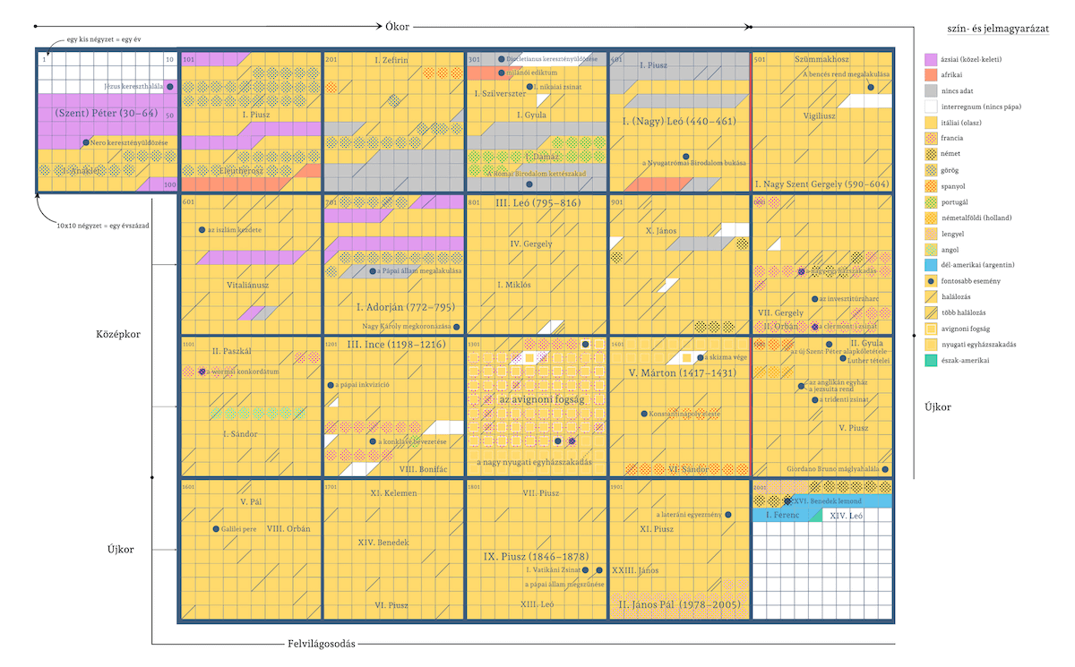
Chinese Products in American Homes
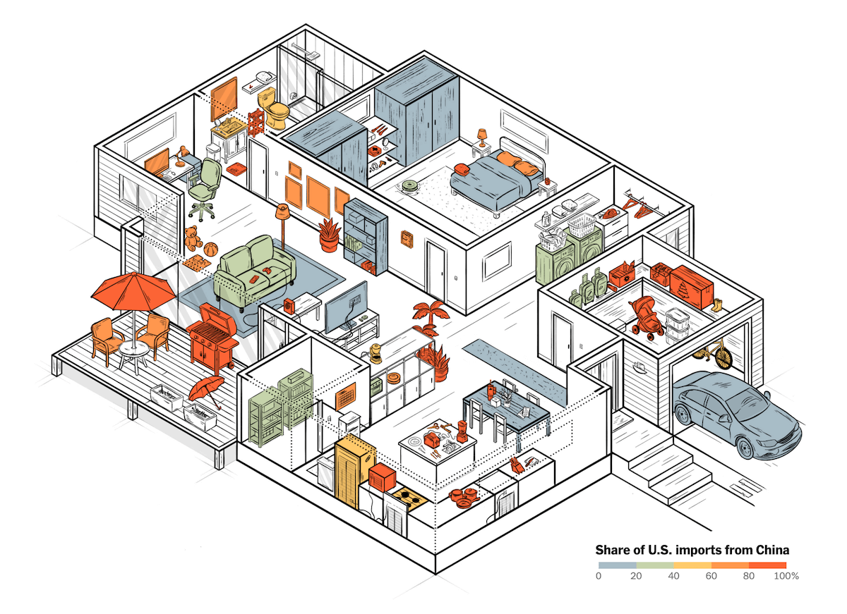
It is difficult to imagine an American household without products made in China. From toasters and combs to artificial plants and baby strollers, many everyday items are imported overwhelmingly — and sometimes almost exclusively — from Chinese factories.
The New York Times offers an engaging piece of storytelling by Pablo Robles, Agnes Chang, and Lazaro Gamio that visualizes this dependence using a floor plan of a typical home. Color coding shows how much each item relies on Chinese manufacturing, based on the share of U.S. imports from China. Labels provide exact figures: over 99% for toasters, 97% for strollers, 96% for thermoses, and so on. The visualization makes clear how deeply American households depend on Chinese-made goods — a reality that helps explain how shifts in tariffs could affect household budhets.
Look at the story on The New York Times — on how deeply Chinese manufacturing is embedded in American homes.
Wrapping Up
That wraps up this edition of Data Visualization Weekly. From religion and mortality to geography and trade, these four projects highlight how visualization can make complex topics easier to explore and understand.
Stay tuned for more, and until then, may your charts stay clear and your insights sharp.
- Categories: Data Visualization Weekly
- No Comments »