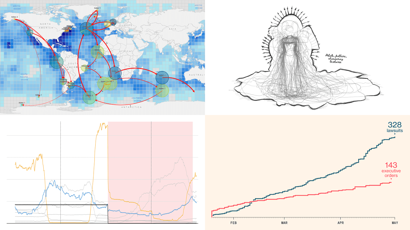
 We skipped a few Fridays — but for good reason. With Qlik Connect just around the corner, we have been deep in prep mode: finalizing assets, polishing demos, and getting our brand-new Spreadsheets extension for Qlik Sense completely ready to launch. Still, we could not hold off any longer, so we carved out a quick break to bring you a new edition of DataViz Weekly! Here are the most compelling visualizations we have come across lately — take a look:
- Marine migration pathways — MiCO
- Spain’s energy system under strain — Colpisa
- Lawsuits against Trump’s executive orders — Bloomberg
- Met Gala outfit silhouettes over time — Reuters
Data Visualization Weekly: May 2, 2025 — May 9, 2025
Marine Migration Pathways

The ocean might seem vast and open, but for many species, survival depends on very specific migration routes and habitats. Understanding these connections is key to protecting wildlife that travels across national borders and international waters.
As part of the initiative called Migratory Connectivity in the Ocean (MiCO), an international team of scientists from the United States and Australia created an interactive map that sheds light on how more than a hundred migratory species — including birds, mammals, turtles, and fish — travel across and depend on the high seas. Based on data from over 1,300 studies, the tool centers around flows and bubbles, and tiles. The example pictured above, for instance, shows migration data for the Arctic tern. For those looking to dive deeper, the tool also offers a range of charts — bar, donut, and more.
Explore the project on MiCO’s website, built on models developed by scientists from the University of Queensland and Duke University. For more scientific context, see the Nature Communications article by Lily K. Bentley, Dina Nisthar, Ei Fujioka, Autumn-Lynn Harrison, and others.
Spain’s Energy System Under Strain
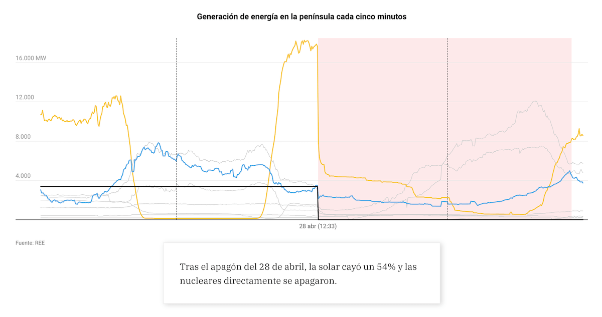
On April 28, 2025, a major blackout swept across the Iberian Peninsula. Everything shut down in seconds, and the incident sparked fresh scrutiny of energy infrastructure and regulations in the region.
Agencia Colpisa created an interactive visual explanation for Vocento’s regional newspapers that offers a comprehensive look at how Spain’s electrical system functions — and how it failed. The story begins with a visual analogy, likening the grid to a system of interconnected pipes. Then it unfolds through a rich sequence of annotated data graphics, such as line and area charts, as well as geographic maps. Taken together, the visuals help clarify the factors that contributed to the collapse and highlight the broader challenges in adapting the grid to the pace of the energy transition.
Check out Colpisa’s explainer as published on Diario SUR, by José A. González, Sara I. Belled, and Cristina Cándido.
Lawsuits Against Trump’s Executive Orders
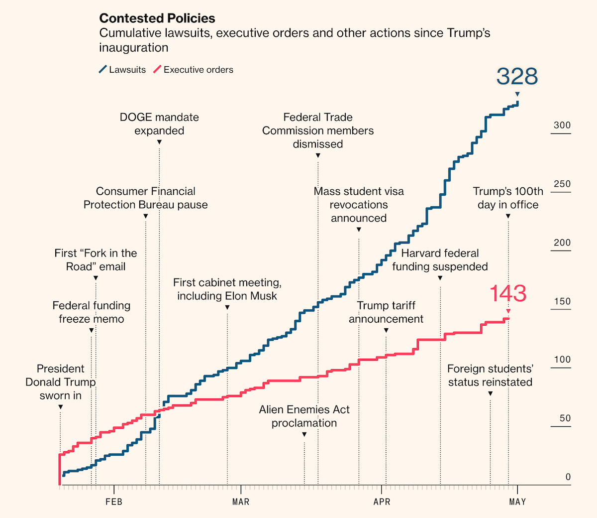
President Donald Trump’s second term has triggered a flood of legal opposition. Since his inauguration in January 2025, over 300 lawsuits have challenged executive actions — from immigration measures and DEI rollbacks to decisions tied to Elon Musk’s Department of Government Efficiency.
Bloomberg visualized the scale and outcomes of this litigation in a detailed data-driven story. The piece features a step-line chart, a waffle chart (a square pie), a Sankey diagram, and more — categorizing cases by policy area, tracing their legal trajectories, and highlighting key examples. Together, the visuals offer a clear view of how various initiatives have been contested in court and what those fights have meant in practice.
See the article on Bloomberg Politics, by Zoe Tillman and Christopher Cannon.
Met Gala Outfit Silhouettes Over Time Over Time
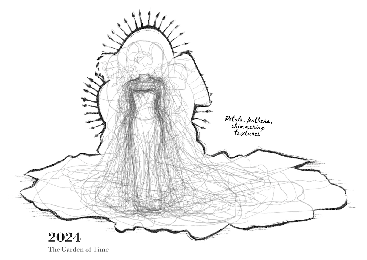
The Met Gala is all about fashion at its most extravagant. And we could not skip a project that captures its visual drama so elegantly. When data meets couture, even red carpet coverage becomes a compelling case of visualization in action.
Ahead of the 2025 event, which took place on May 5, Reuters traced how the scale of Met Gala outfits has shifted over time. They turned to their own photo archive and outlined the silhouettes of hundreds of dresses worn in 2004, 2009, 2014, 2019, and 2024. For each of these years, the traced contours — each shown as a gray line — were layered into a composite visual, illustrating how the shapes and reach of outfits varied across attendees. Viewed side by side, these images let you compare silhouettes across time and observe changes in the overall scale of high-fashion spectacle.
See the project on Reuters, by Ben Kellerman, Ally J Levine, Tiana McGee, and Travis Hartman.
Wrapping Up
That wraps up our latest data viz roundup. From marine migration and energy systems to political disputes and fashion silhouettes, these examples show how graphics can make complex topics tangible. We will be back with more right after Qlik Connect, taking place next week, May 13–15, in Orlando. Stay tuned for the next edition of Data Visualization Weekly!
- Categories: Data Visualization Weekly
- No Comments »