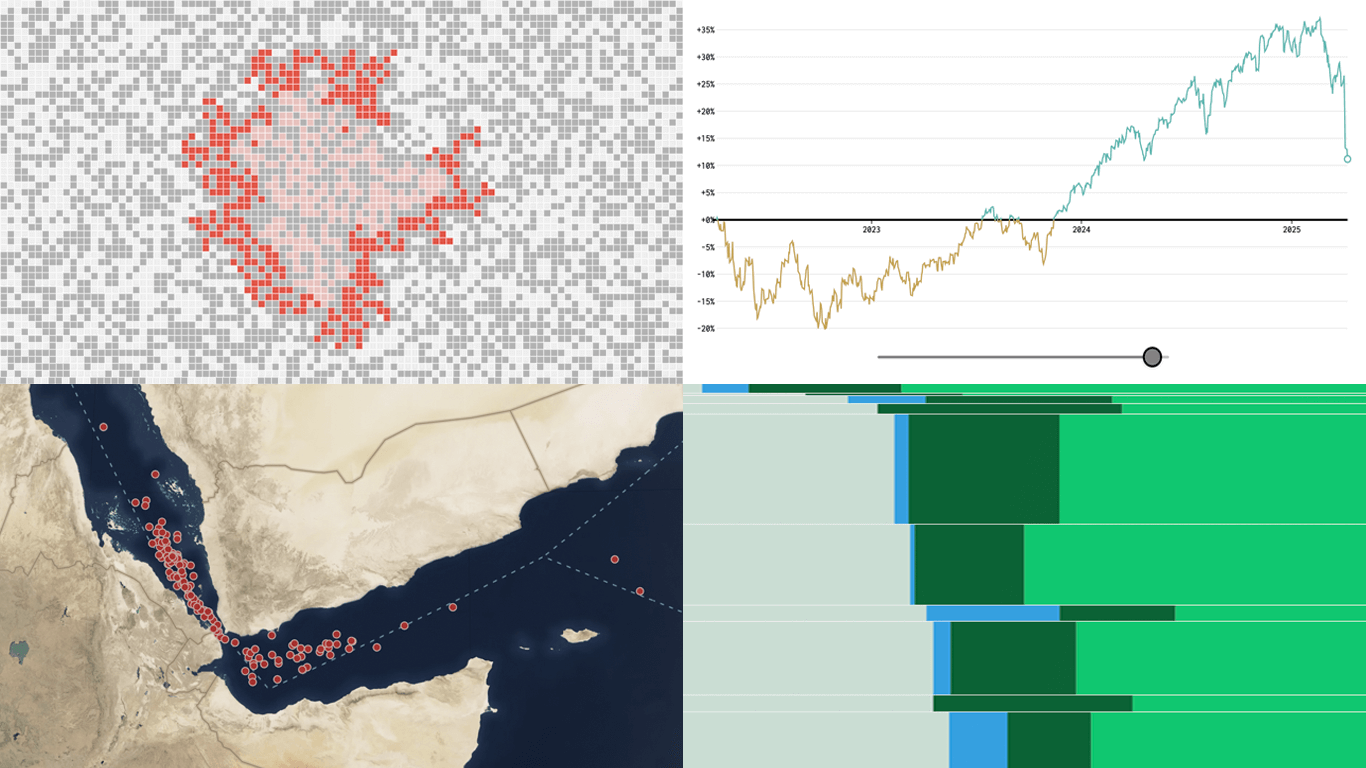
 New week, new visualizations that deserve your look! DataViz Weekly brings together several strong new examples demonstrating how data visualization works in practice — making patterns visible, comparisons clearer, and context easier to understand.
- S&P 500 drops and recoveries over time — FlowingData
- Herd immunity thresholds in disease outbreaks — The Upshot
- Renewable energy targets in the Mediterranean — Ember
- Red Sea under Houthi attacks — International Crisis Group
Data Visualization Weekly: April 4–11, 2025
S&P 500 Drops and Recoveries Over Time
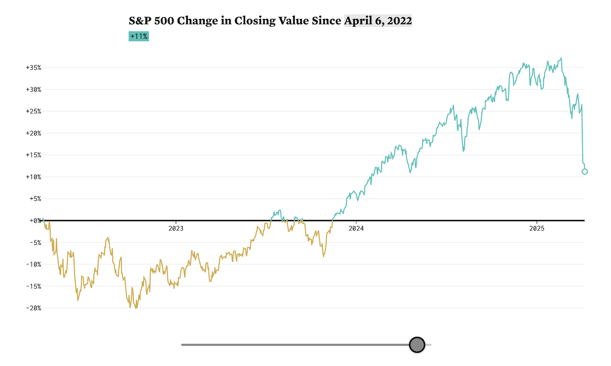
Stock markets are down noticeably this year, and for over half of U.S. households with market exposure, the drop feels personal. But how alarming is it, really?
Nathan Yau created an interactive line chart that invites a step back for context. By default, it highlights the sharp decline since January 21, 2025 — a view that can feel dramatic. But dragging the slider gradually pushes the starting point back, all the way to January 5, 1970, revealing a long-term upward trend and showing that the S&P 500 has always bounced back from every downturn — eventually. Supporting tables list the steepest 5-, 10-, and 20-day drops in the index since 1957 and how long recovery took in each case — providing deeper historical grounding.
Check out the project by Nathan Yau on his blog FlowingData.
Herd Immunity Thresholds in Disease Outbreaks
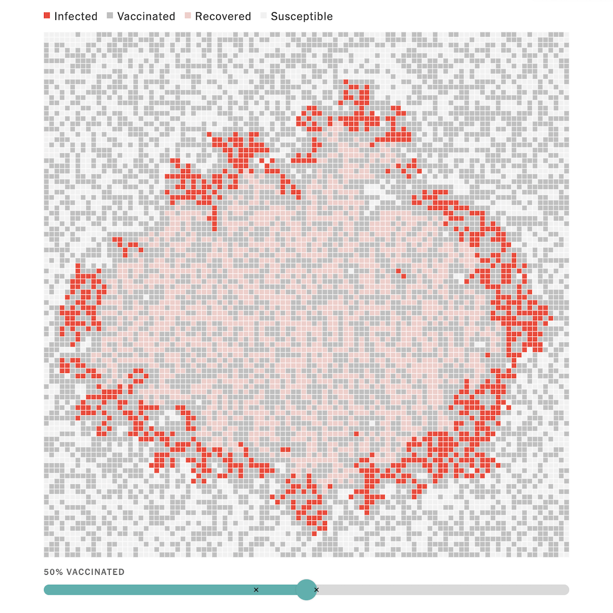
As measles cases rise both globally and in the United States, attention has returned to the importance of vaccination. To stop the spread of a disease like this, not everyone needs to be vaccinated — but a large majority of the population does.
The Upshot by The New York Times published an interactive feature that makes this dynamic easy to grasp. Aatish Bhatia and Francesca Paris created pixel-based simulations demonstrating how an infectious disease moves through a population under different vaccination rates. A slider lets you adjust the level of immunization and watch the outcomes unfold. The project then explores how contagious measles is, using bar and line charts, and concludes with a striking simulation revealing how the virus can still sweep through the U.S. under current vaccination levels.
See the visual explainer on The Upshot, by Aatish Bhatia and Francesca Paris.
Renewable Energy Targets in Mediterranean
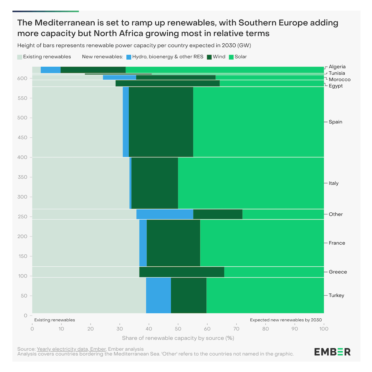
Clean energy expansion is picking up momentum across the Mediterranean, with the region expected to nearly double its total installed renewables by 2030. Still, that trajectory would miss the 1 TW target set by the TeraMed Initiative — underscoring the urgency of stepping up collaboration and investment to reach shared energy goals.
Ember’s new report provides a compelling visual overview of these dynamics. Using column and bar charts alongside a vertical Mekko chart, the piece compares current trends, planned capacity, and what would be needed to hit the TeraMed benchmark. The visuals also break down how capacity is distributed between countries, spotlighting key contributors and areas where much more growth is required.
Explore the report on Ember’s website, by Elisabeth Cremona and Sarah Brown.
Red Sea Under Houthi Attacks
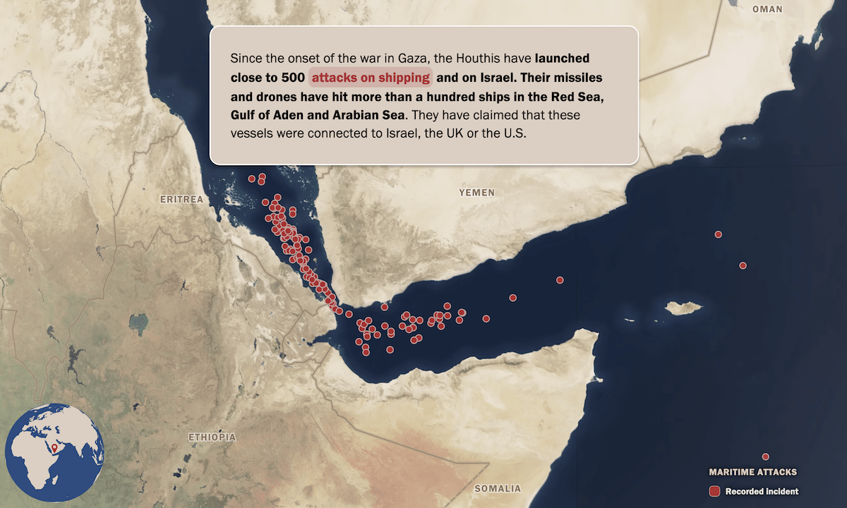
Since the onset of the war in Gaza, the Houthis have launched hundreds of attacks on commercial vessels in the Red Sea, Gulf of Aden, and Arabian Sea — targeting ships they claim are linked to Israel. This maritime offensive has contributed to a sharp drop in Suez Canal traffic, forcing global rerouting and increasing costs.
The International Crisis Group published a scroll-driven visual explainer tracing how the Houthis’ campaign evolved from missile strikes on Israel to sustained disruptions of global shipping. It maps the group’s control along Yemen’s western coast and key islands, showing how that geography enables interference near the Bab al-Mandab Strait. Broader consequences for trade and shipping patterns are also displayed.
Look at the story on the International Crisis Group’s website, with lead contributions from Ahmed Nagi and visual work by Claire Boccon-Gibod and Paul Franz.
Wrapping Up
That’s our latest set of standout data viz projects — each one a great example of how well-crafted charts and maps can shape understanding. Keep following Data Visualization Weekly for more handpicked, awesome data graphics.
- Categories: Data Visualization Weekly
- No Comments »