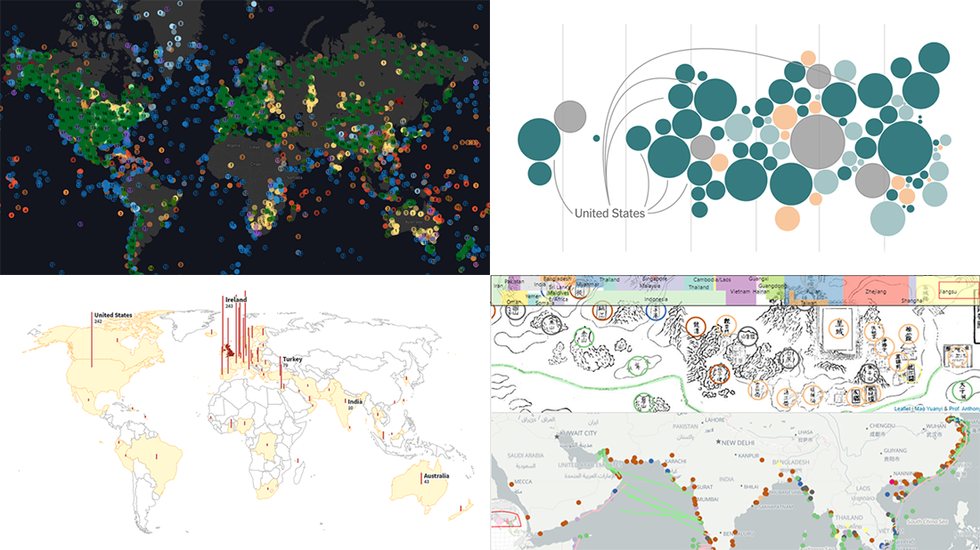
 As we continue to bring you regular roundups of the best visualizations we have stumbled upon out there, it’s Friday and DataViz Weekly here! Read next and you’ll meet the following new stunning projects:
- Country wealth and vaccination roll-out — The New York Times
- Spread of the Kent variant across Britain and worldwide — Reuters
- Earth’s сlimate history in proxy data — Carbon Brief
- Interactive Mao Kun map explorer — Ryan Carpenter
Data Visualization Weekly: March 26, 2021 — April 2, 2021
Country Wealth and Vaccination Roll-Out
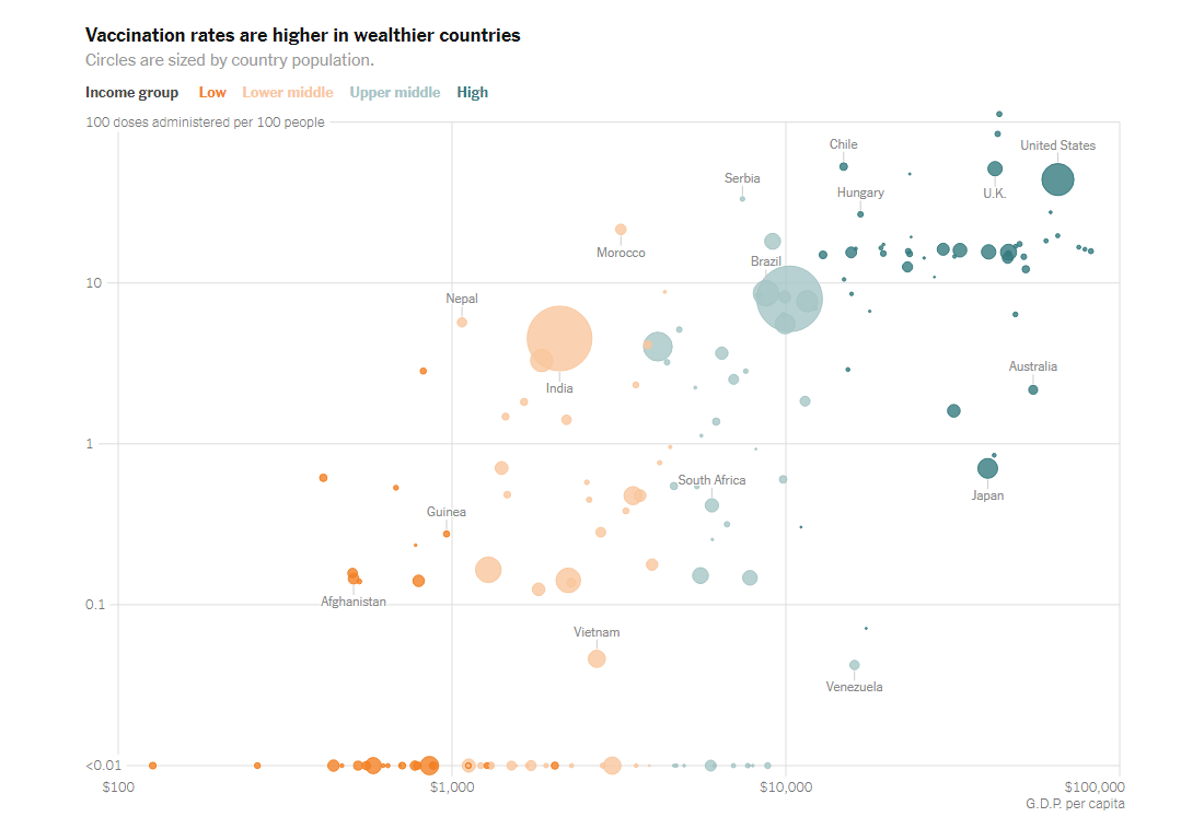
The latest data shows that countries considered low-income have received only 0.1% of all the 564 million coronavirus vaccine shots administered globally. At the same time, 86% of all doses went to high-income and upper-middle-income countries. According to experts, the main cause of this huge disproportion is that wealthier countries could afford preordering shots early enough and managed to cover their populations multiple times over, making it too hard for others to win contracts.
The New York Times provides a look at how rich countries got to the very front of the line. Keith Collins and Josh Holder visualized country income along with vaccine data. The first chart in the article displays vaccine deals over time. The second one (see above) plots vaccination rates against GDP per capita. The third visualization shows what countries have relied on what vaccines. In all these three graphics, countries are displayed as bubbles colored according to their income groups.
Look at these telling charts to take note of how the GDP figures determine how vaccination rolls out around the world.
Spread of Kent Variant Across Britain and Worldwide
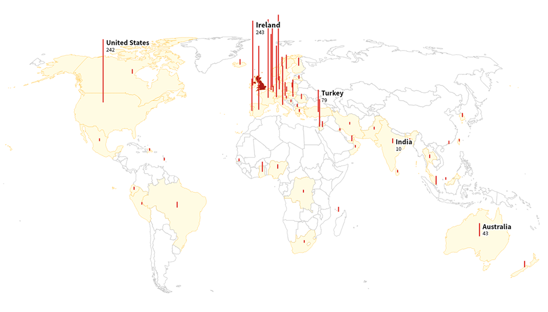
Most mutations the SARS-CoV-2 coronavirus has gone through over the course of the pandemic do not change its impact on our health significantly. But the B.1.1.7 variant first noticed in September 2020 in Kent, a county in South East England, was found to be much deadlier. Known as the British variant (also as the U.K. variant or Kent variant), it already dominates in Britain and has gone international, expected by experts to become the prevailing strain in the United States about now.
Reuters — namely Jitesh Chowdhury, Simon Scarr, Andrew MacAskill, and Andrew R.C. Marshall — tells the story of B.1.1.7 with the help of graphics. The article begins with a visualization of the weekly breakdown of 230,000 coronavirus samples, which shows how the Kent variant overtook GV, previously the most widespread strain. Then, you can find out where the Isle of Sheppey is located, the area in which it all began, and how B.1.1.7 hit the nearby Medway Maritime hospital which soon became the busiest COVID-19 hospital in Britain.
The centerpiece of the story is two scroll-driven map-based timelines where you can watch how it spread away from Kent, first across the United Kingdom and then worldwide.
Earth’s Climate History in Proxy Data
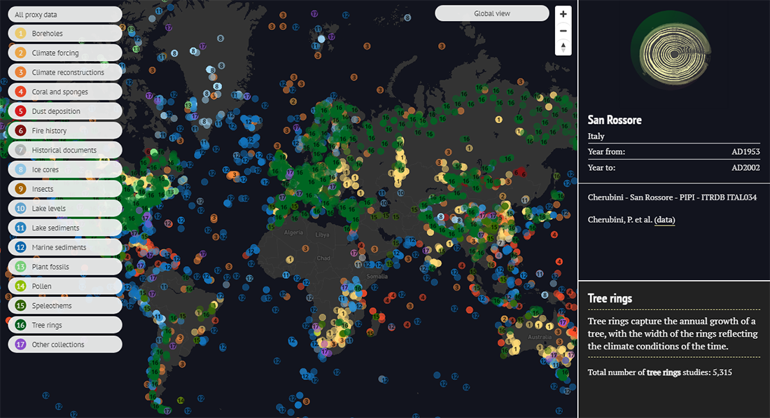
The longest archive of the global temperature goes back to 1850. But our planet is much older, you know. Luckily, it has its own climate records imprinted all over the biosphere. Tree rings, ice layers, lake and marine sediments, speleothems such as stalagmites and stalactites in caves, and many other things can serve as sources of so-called “proxy data” allowing scientists to study long-term trends in climate change.
To provide a convenient way to explore past climates, Carbon Brief made an impressive interactive map visualizing the archive of over ten thousands of such proxy (paleoclimatology) datasets collated by the U.S. National Oceanic and Atmospheric Administration (NOAA).
When viewing the map, you can click on a point to learn more about that particular dataset, including the period it covers, the name of the site, and a link to the study on the NOAA website. It is also possible to filter the view by proxy type — just pick the category you want to look at, in the legend.
Interactive Mao Kun Map Explorer
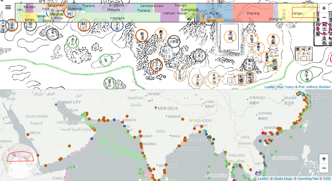
Here’s one more truly marvelous visualization project. Ryan Carpenter, a software engineer, created an interactive version of Zheng He’s Navigation Map (鄭和航海圖). Referred to in English as the Mao Kun map, it is based on notes from the 15th-century travels of Zheng He, a Chinese mariner and diplomat, and is the earliest known Chinese map providing an appropriate representation of Southern Asia, Persia, Arabia, and East Africa.
The project consists of two maps. The top one is the old map itself, charting the route from the imperial palace of the Ming dynasty in Nanjing, through Yangtze River, around the Malay Peninsula, past India, to East Africa and the island of Hormuz. There are plenty of place labels on the original map, and all of them are made interactive here. Click any and you’ll see its location on a contemporary map (it’s the bottom half of the screen in this Ryan Carpenter’s web project) and the English translation.
The maps are synchronized, which makes it easy to explore the amazing Mao Kun map.
***
Thanks for your attention. The Data Visualization Weekly roundup is out every Friday on our blog. Stay tuned not to miss a thing!
- Categories: Data Visualization Weekly
- No Comments »