 Good charts let data speak, providing insight, revealing patterns and trends, and telling stories. Look at new projects featuring graphics like that, from data visualization professionals!
- Physical traits defining men and women in literature — The Pudding
- Remote work dividing America — Reuters
- Racial disparities in unemployment in America — ProPublica
- Ageing indicators across the United Kingdom — ONS
New Good Charts in Data Visualization Weekly: July 17, 2020 — July 24, 2020
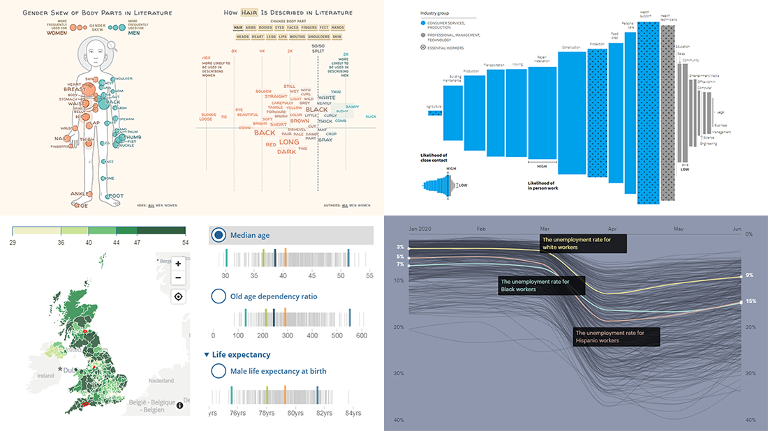
Physical Traits Defining Women and Men in Books
Data visualization pro Erin Davis noticed that book authors tend to describe human bodies in quite a similar, stereotyped way. “Women are all soft thighs and red lips. Men, strong muscles and rough hands.” Wondering how widespread such patterns are, Erin decided to conduct a more substantial analysis. She picked two thousand books, from mass market bestsellers to Pulitzer Prize classics, published between 1008 and 2020. Then she ran them all through a dedicated parser. The findings were then represented in a beautiful graphical piece on The Pudding with the help of illustrator Liana Sposto.
In the story, you are invited to take a quick quiz to start with, guessing whether a description is about a woman or a man. Actually, it’s all effortless and intuitive, so most of your answers will be correct. That’s because men and women are written about in really different and indeed easily recognizable ways.
Keep scrolling down the piece for an in-depth exploration of the trends and you’ll discover a clear gender skew. Look what body parts are more often mentioned and adjectives used when describing women and men in literature. Very interesting.
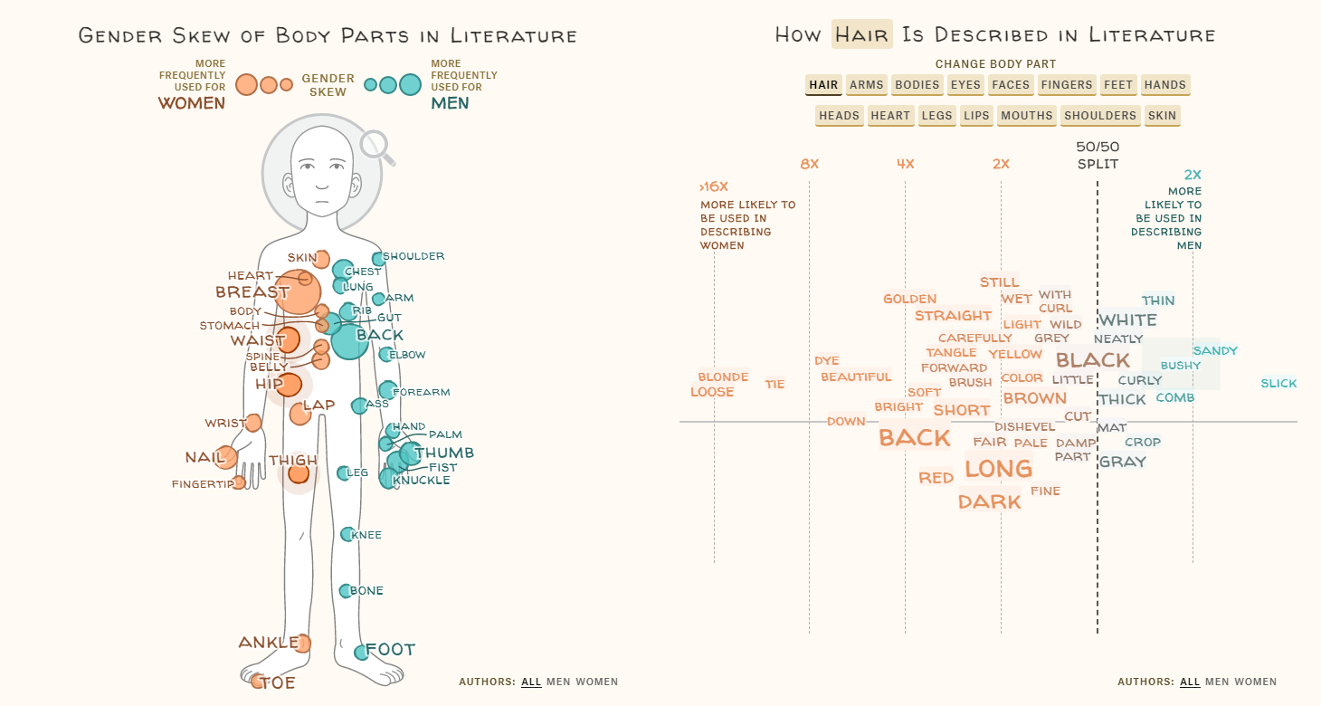
Remote Work Dividing America
As the United States went into the coronavirus lockdown, millions of Americans switched to working from home. So generally, people like office workers, web developers, accountants, and others who can telecommute managed to keep the same or at least about the same level of income. However, there are other millions of Americans who lost the jobs as they have to be personally present on site to do what they are supposed to do for work. These latter people — for example, blue-collar workers — will be able to return to work after the respective restrictions get lifted and unemployment benefits end. But they will be especially vulnerable to the virus due to close personal contact with other people. This is how remote work has become an important factor splitting the country.
To look into this problem and find out more, journalist Sarah Slobin analyzed the recent findings of the University of Chicago’s economists and visualized data from their research. Published on The Pudding, the graphics allow us to see the scale of the differences at a glance. Explore the likelihood of close contact versus the likelihood of in-person work across industries. Then see several more charts. Collectively, the graphics reveal the configuration of two different Americas, now in terms of the ability to work remotely from home as a novel determinant of wellbeing.
Racial Inequality in Employment in America
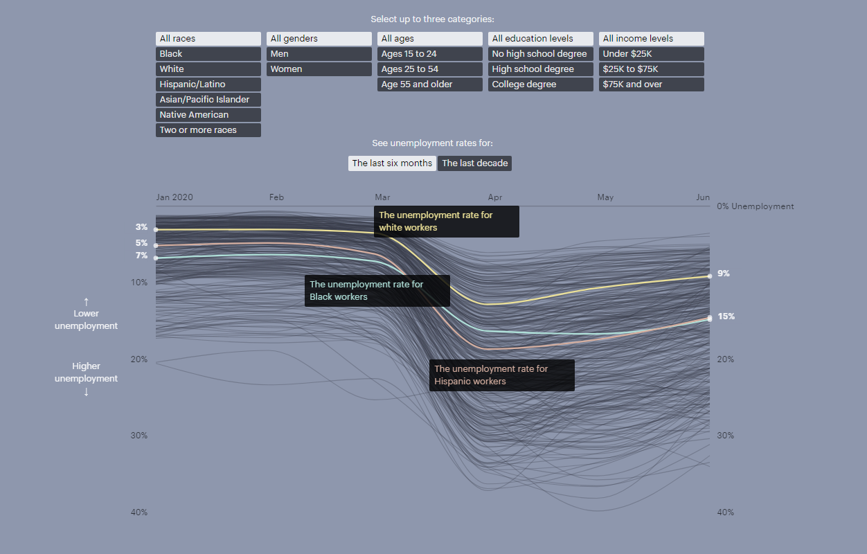
While the COVID-19 pandemic has had an overwhelming impact on employment across all groups of the American population, workers of color are reported to have been hit notably harder than their white counterparts. Data shows, however, that racial disparities in unemployment have been a reality for decades.
ProPublica’s journalist Lena V. Groeger visualized unemployment data from the Current Population Survey, depicting the rates for different groups of Americans with individual lines. The chart can be set to show unemployment over the last six months or over the last decade, allowing you to choose up to three categories at a time to see the respective trajectory highlighted — by race, gender, age, education, and income.
The visualization reveals some persistent disparities. Play with the parameters and watch how different groups have been experiencing unemployment in the United States, since 2010 and over the present year. You’ll see, for example, that the employment gap between Black and White Americans is almost always there and hardly depends on the level of education as much as someone could expect.
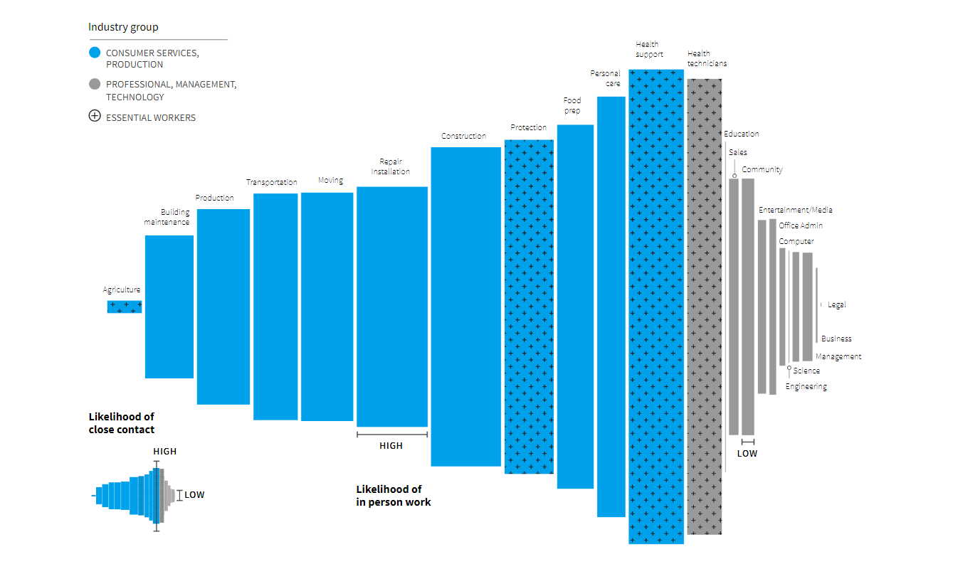
Ageing Indicators Across United Kingdom
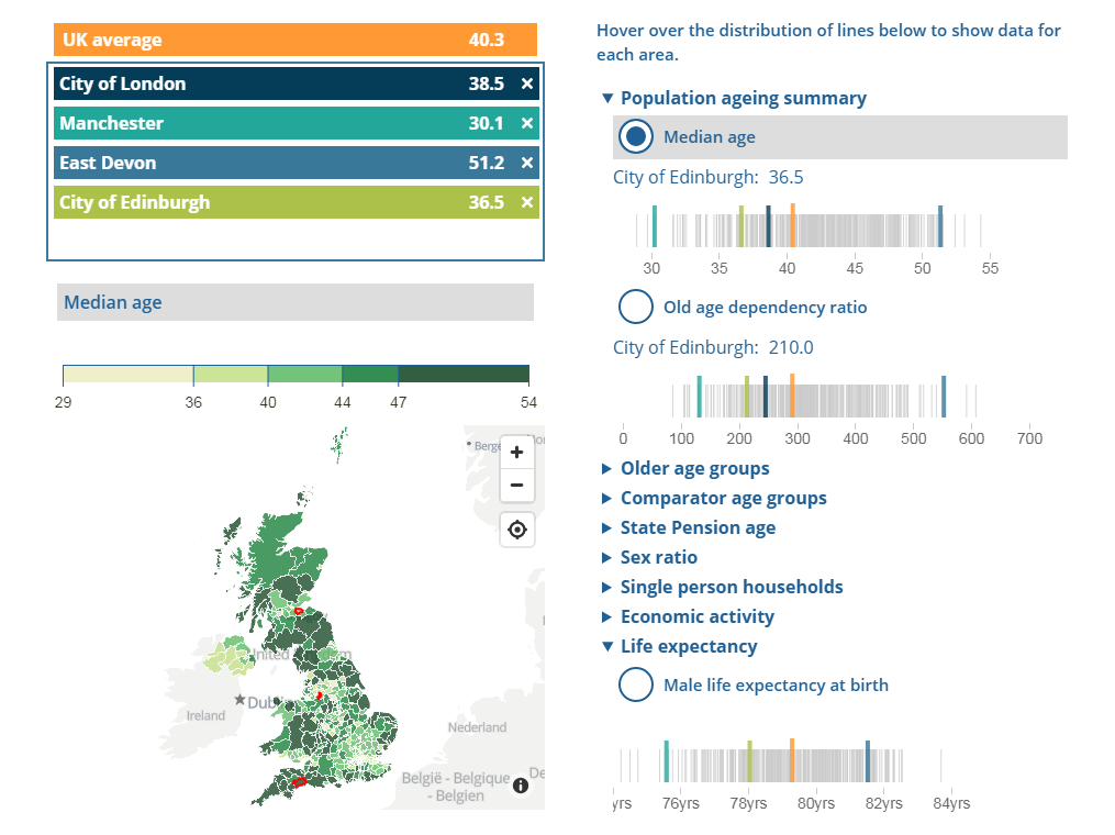
Population ageing is an important trend that needs to be taken into account when making decisions in government. The Office for National Statistics (ONS) of the United Kingdom launched a new interactive dashboard that lets everyone easily track ageing indicators and compare them at the subnational level, across local areas and regions. It consists of a choropleth map, barcode charts, and line charts. All the underlying data is made ready for download for possible additional visualizations and third-party analysis.
The tool provides a look at a wide range of demographic data, including median age, 65+ groups, state pension age, single person households, life expectancy, and much more for each area. It is possible to choose up to four areas for closer comparisons. In addition to current data, you can explore projections for the ageing indicators through 2043.
***
We share new selections of good charts every Friday in Data Visualization Weekly. Stay tuned!
- Categories: Data Visualization Weekly
- No Comments »