 Good data graphics keep turning up online, and we never stop looking. DataViz Weekly is our regular roundup of the latest examples we think are worth your attention. Take a look at our new picks:
- Early leaves and blooms across the United States — The Washington Post
- D.C. cherry blossom shifts — Sara Staedicke
- Satellites crowding Earth’s orbit — The Guardian
- Every building in the Netherlands by year built — Bert Spaan

Data Visualization Weekly: April 3–10, 2026
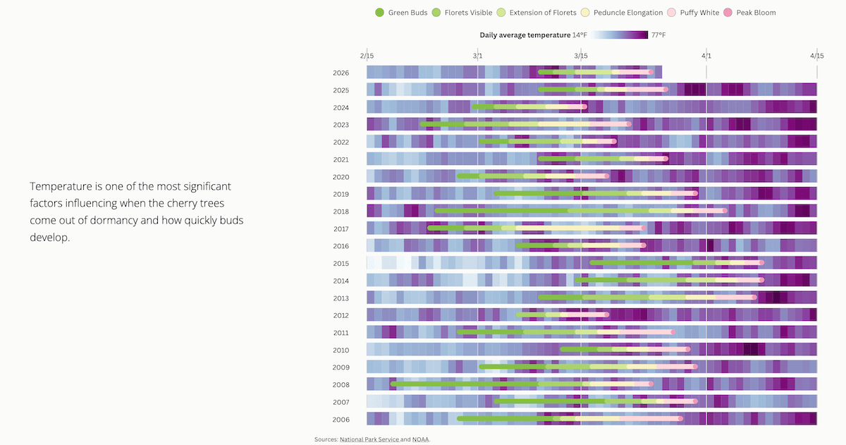
Early Leaves and Blooms Across U.S.
Plants leaf out and flower in response to accumulated warmth, not the calendar. In 2026, an exceptionally warm March pushed that timing well ahead of schedule across much of the United States.
The Washington Post tracked where spring arrived early and where it ran behind, using data from the USA National Phenology Network. A city-level chart opens the piece: select a location to find out when leaves appeared and flowers bloomed this year against the historical average and range. Maps of the contiguous United States follow to put the geographical pattern in full view. First for leaves, then for blooms, pink marks areas ahead of schedule, green marks areas behind, with some cities annotated and new records flagged. A third map shows where March temperatures themselves broke records.
See the piece on The Washington Post, by Ben Noll, John Muyskens, and Naema Ahmed.
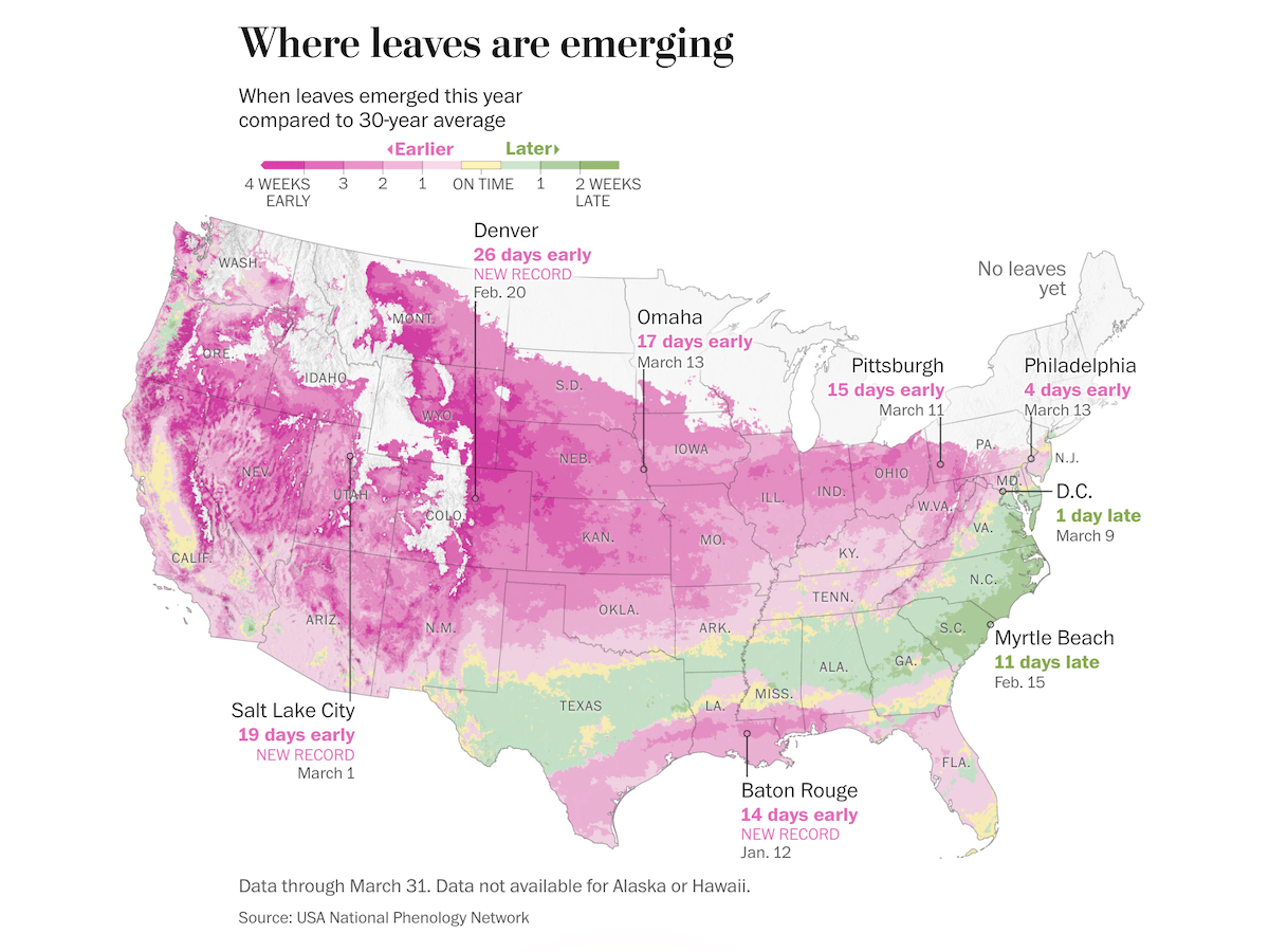
D.C. Cherry Blossom Shifts
Washington, D.C.’s cherry blossoms draw over a million visitors each spring. This year, peak bloom arrived on March 26, which is three days ahead of the National Park Service forecast and even earlier than every other major prediction.
Sara Staedicke examines the biology of the 2026 season and the long-term shift in bloom timing for the U.S. capital. As you scroll, a timeline of cherry tree development appears year by year since 2007, tracking progression through six bloom stages from green buds to peak bloom. Daily temperature data then fills in behind the bars, making the link between warm or cold spells and the pace of development visible directly.
Line and dot charts then zoom in on 2026 — first how temperatures compared to the 30-year average, then how the actual peak bloom date stacked up against forecasts from five organizations. A scatter plot takes the long view, plotting every NPS-recorded peak bloom date since 1921 with a 10-year moving average showing the steady drift toward earlier flowering. The final visual maps cherry tree locations around the Tidal Basin and across the city.
Look at the story on DC in Bloom.
Satellites Crowding Earth’s Orbit
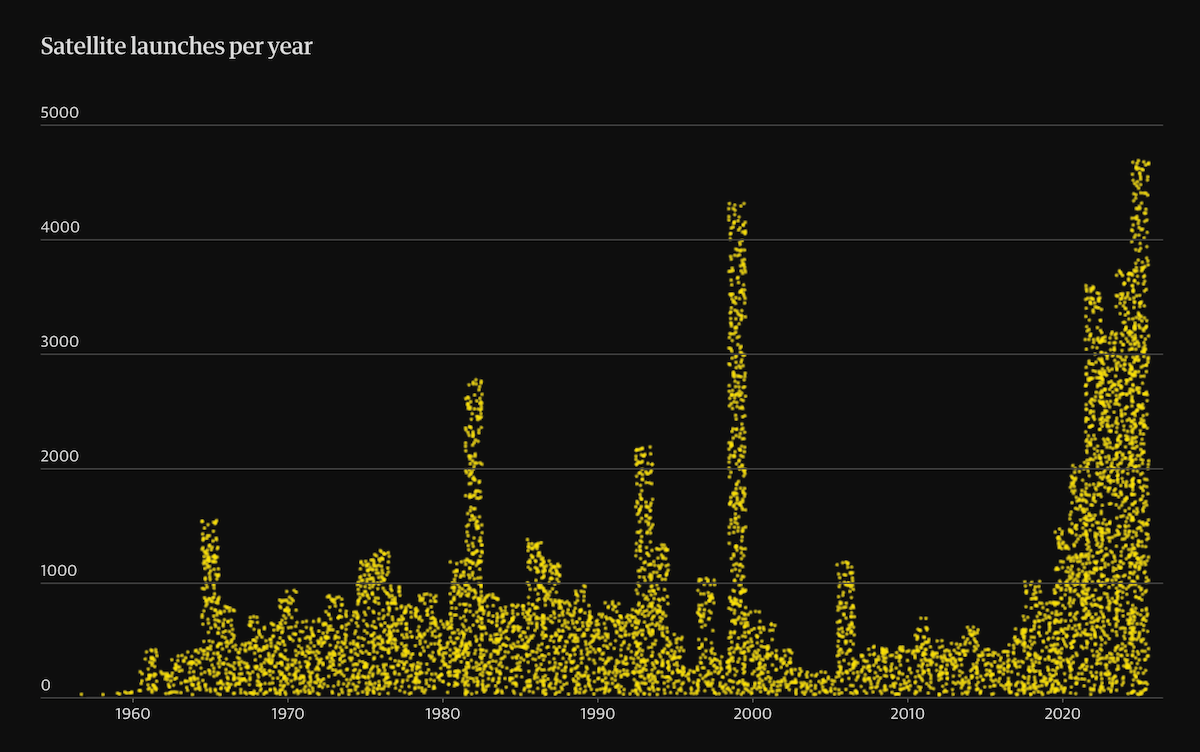
Since 1957, the number of objects in Earth’s orbit has grown from one to more than 30,000. The rise has accelerated sharply with commercial mega-constellations adding thousands of satellites in recent years.
The Guardian looks at how Earth’s orbit became this crowded and what a collision chain reaction could mean for the future of space. First, dots flying around an animated globe show how satellite counts have accumulated over time. A unit chart then plots satellite launches per year from 1957 to the present, with each dot representing about ten satellites. The same dots are then reorganized into a series of proportional circle comparisons, breaking down what is up there: decayed versus still in orbit, government versus private launches, Starlink versus everything else, active satellites versus space junk, and objects by country.
Check out the article on The Guardian, by Frederick O’Brien, Ashley Kirk, and Oliver Holmes.
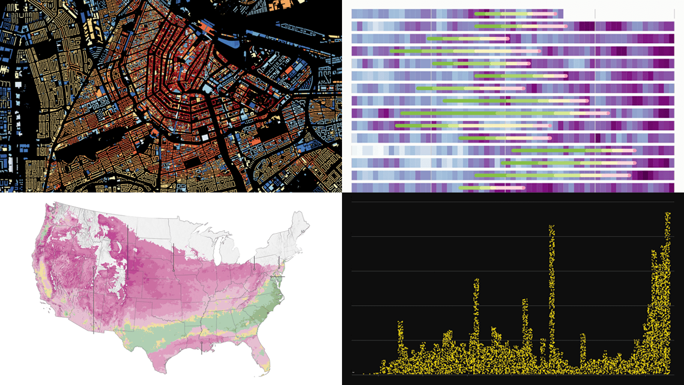
Every Building in the Netherlands by Year Built
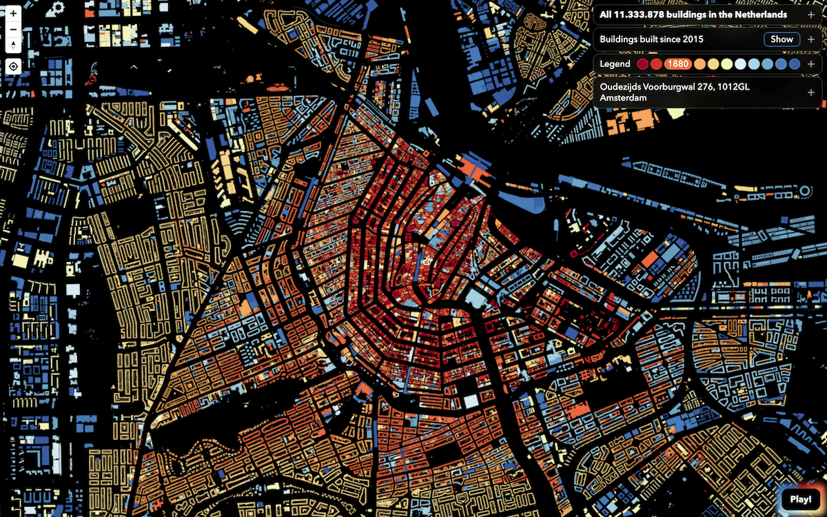
The Netherlands maintains a national registry of every address and building in the country, including when each was constructed. The dataset currently covers more than 11 million structures.
Bert Spaan mapped it all. Each building is colored by year of construction, with hues of red, yellow, and blue shifting across the centuries of the built environment. Clicking any building brings up its registry ID, construction year, and links to OpenStreetMap, Google Street View, and Allmaps.
It’s a new version of his own map created in 2013 and last updated in 2015, at that time covering under 10 million buildings. This latest version has a toggle layer highlighting the roughly 1.5 million buildings added since. There is also a city-guessing game based on building patterns.
Explore the map on Bert Spaan’s website.
Wrapping Up
Good visualization makes data easier to understand. This week’s four projects do that across very different ground. We will be back with more examples of data graphics worth exploring in Data Visualization Weekly — stay tuned.
Bonus: Yesterday we published a step-by-step tutorial on how to create a JavaScript vertical area chart. It uses 80+ years of U.S. presidential job approval/disapproval ratings (Gallup) as a practical example, visualized as two mirrored area series running top to bottom. Check it out.
- Categories: Data Visualization Weekly
- No Comments »