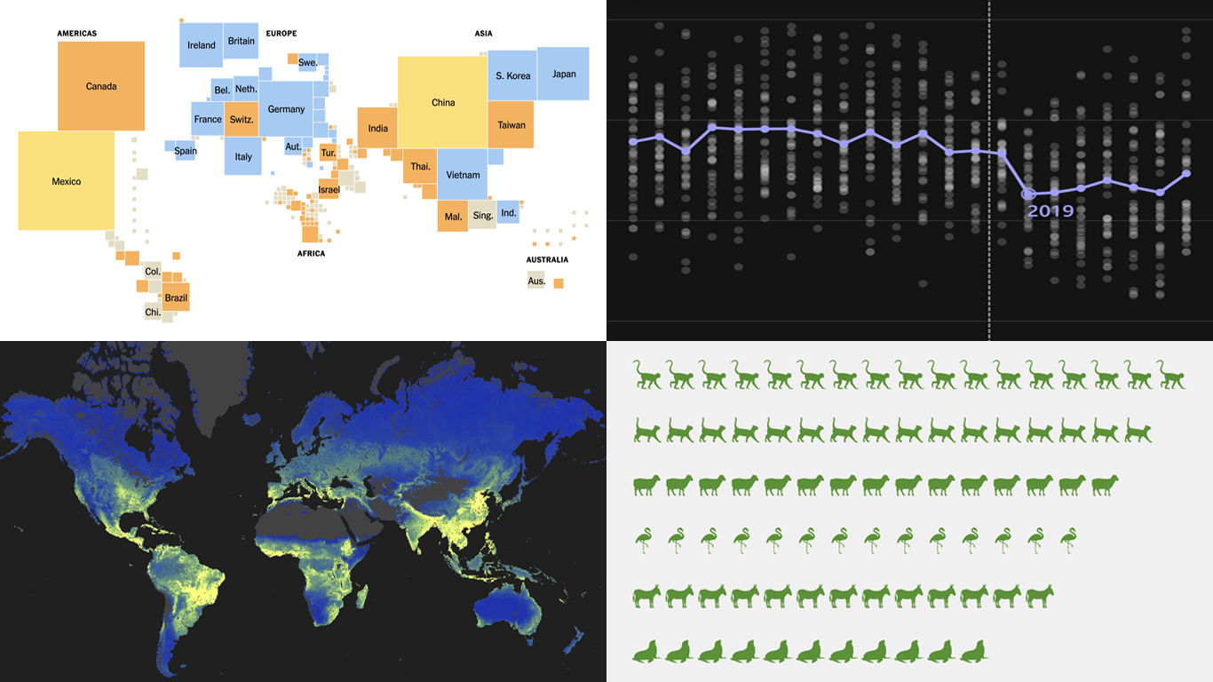
 Figures alone can inform, but visuals make their meaning clear. Well-crafted charts and maps reveal trends, comparisons, and scale in ways text cannot match. That is the idea behind DataViz Weekly — a place to spotlight new projects that make data easier to grasp and interpret. This time, we invite you to check out:
- U.S. tariffs by country — The New York Times
- TikTok’s effect on pop song lengths — BBC
- Global underground fungal biodiversity — SPUN
- Zoo escapes — The Washington Post
Data Visualization Weekly: August 1–8, 2025
U.S. Tariffs by Country
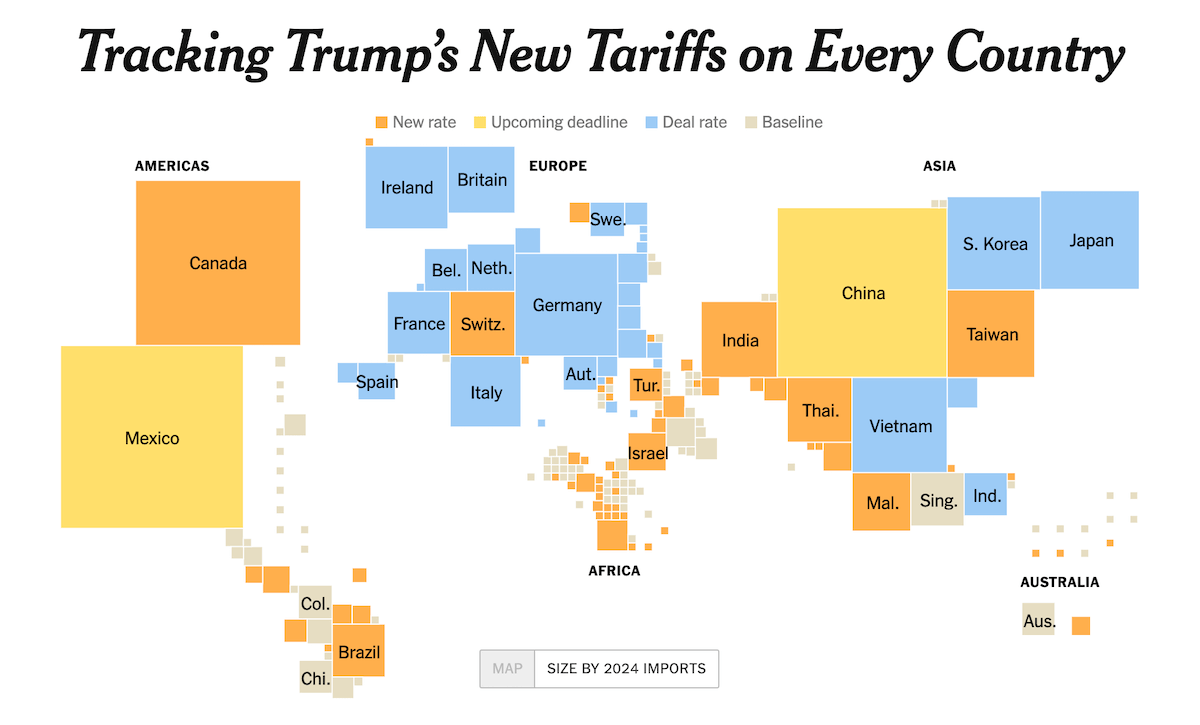
In late July, the United States implemented new import tariffs affecting about 90 countries. Some of the rates are steep, reaching 50 percent.
The New York Times shows a choropleth map classifying each country’s tariff status — new rate, upcoming deadline, deal rate, or baseline — plus a cartogram resizing countries by 2024 import values. The piece details recent changes and existing arrangements, zooms in on China as well as Canada and Mexico with step-line charts, and outlines measures aimed at specific industries.
Check out the article on The New York Times by Lazaro Gamio, Tony Romm, and Agnes Chang.
TikTok’s Effect on Pop Song Lengths
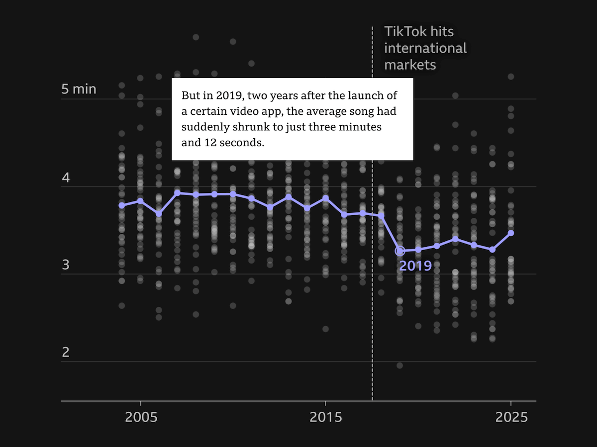
Since the rise of streaming, hit songs have steadily lost seconds to suit on-demand listening. TikTok accelerated the shift, bringing the average UK Top 40 track to just over three minutes.
BBC illustrates the change with scrollytelling graphics: a strip plot of Top 40 tracks from 2004–2025 with a clear dip and a 3:12 low point, followed by what could be seen as a creep back upward. Later graphics compare standard pop structures with shortened viral hits like Boy’s a Liar Pt. 2 and finish by charting “happiness” scores, highlighting years such as 2009 and 2024.
See the story on the BBC website by Mark Savage and Jess Carr.
Global Underground Fungal Biodiversity
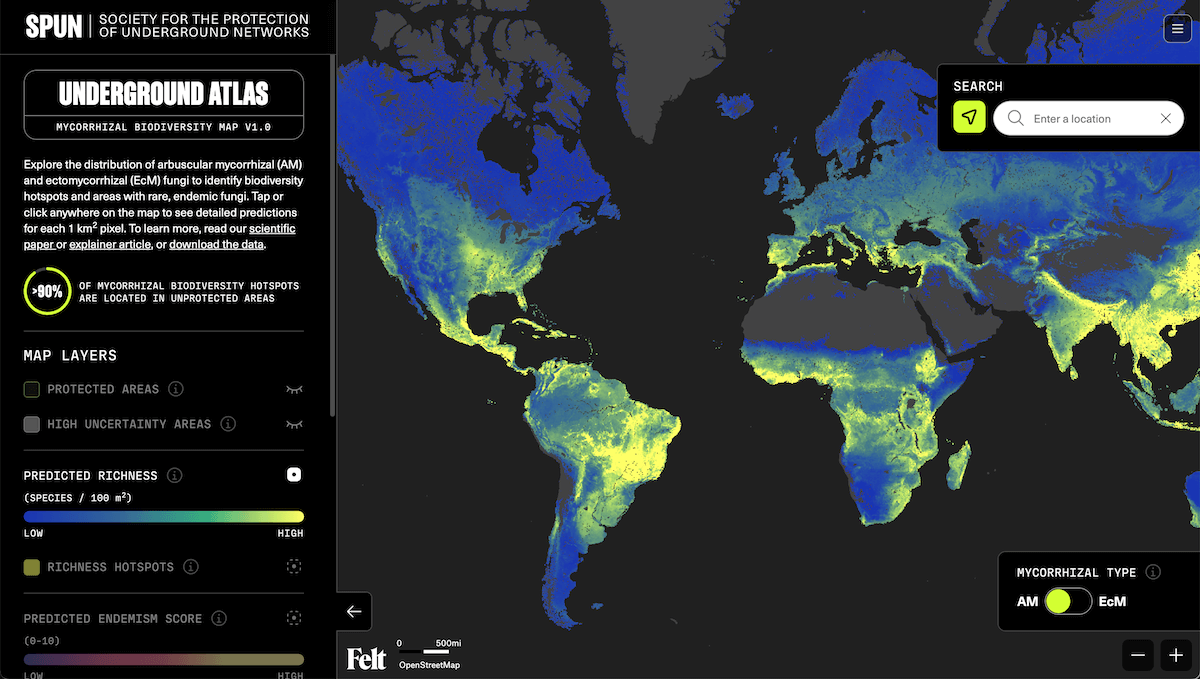
Beneath forests, grasslands, and farmland lies a hidden web of mycorrhizal fungi that links plants, moves water and nutrients through soil, and locks carbon underground. These networks are vital globally, yet their diversity and distribution have been largely unseen.
The Society for the Protection of Underground Networks (SPUN) presents the Underground Atlas, a high-resolution world map predicting species richness for ectomycorrhizal (EcM) and arbuscular mycorrhizal (AM) fungi. Built from fungal DNA from soil samples gathered in 130 countries, it lets you view predictions for any location and identify biodiversity hotspots.
Explore the project on SPUN’s website and the explainer by Jason Cremerius and Michael Van Nuland.
Zoo Escapes
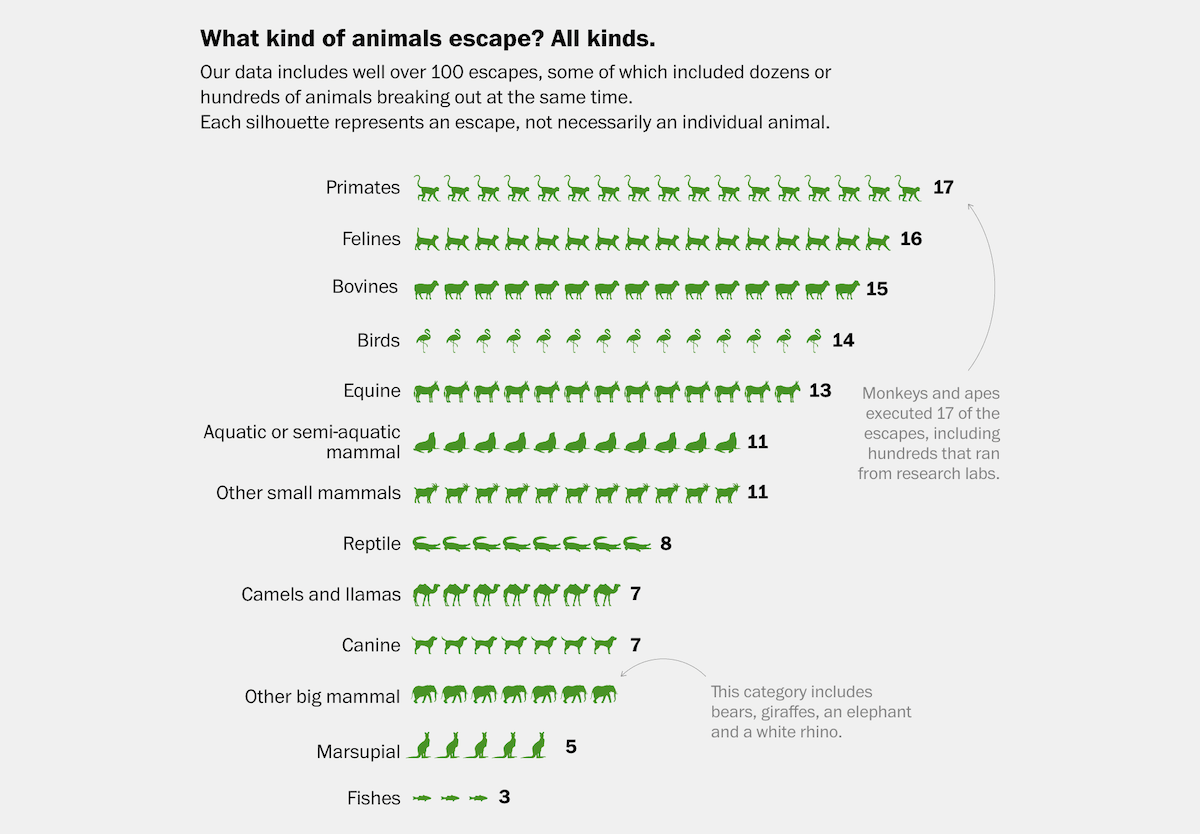
From zebras to octopuses, animals have been escaping from zoos, aquariums, and farms for as long as they’ve been confined. Some make only brief forays before being caught, while others vanish into the wild for good.
The Washington Post reviewed online news reports from around the world to document escapes spanning more than 130 years and over 90 species. One chart shows which kinds of animals most often get out, and another represents how far escapees travel, from a few miles to hundreds. The article also recounts notable cases behind those numbers.
Take a look at the piece on The Washington Post by Bonnie Berkowitz, Artur Galocha, and Andrew Van Dam.
Wrapping Up
From tariffs and music trends to underground fungi and animal escapes, this edition brings together a diverse set of recent visual projects. Each shows in its own way how charts and maps can turn data into something clear and engaging.
Stay tuned for more in the next Data Visualization Weekly.
- Categories: Data Visualization Weekly
- No Comments »