 Get ready for another dose of amazing charts and maps! DataViz Weekly‘s here to show you a set of new projects featuring graphics that make data talk — excellent examples of data visualization in action!
Here are this week’s picks:
- Over 200 years of migrations in the American South — Edward Ayers, Nathaniel Ayers & Justin Madron
- NBA fouls and violations, by referee — Owen Phillips
- U.S. unemployment change, by occupation — Nathan Yau
- U.S. hospital COVID-19 bed occupancy — Carlson School of Management at UMN
Data Visualization Weekly: December 11, 2020 — December 18, 2020
200+ Years of Migrations in American South
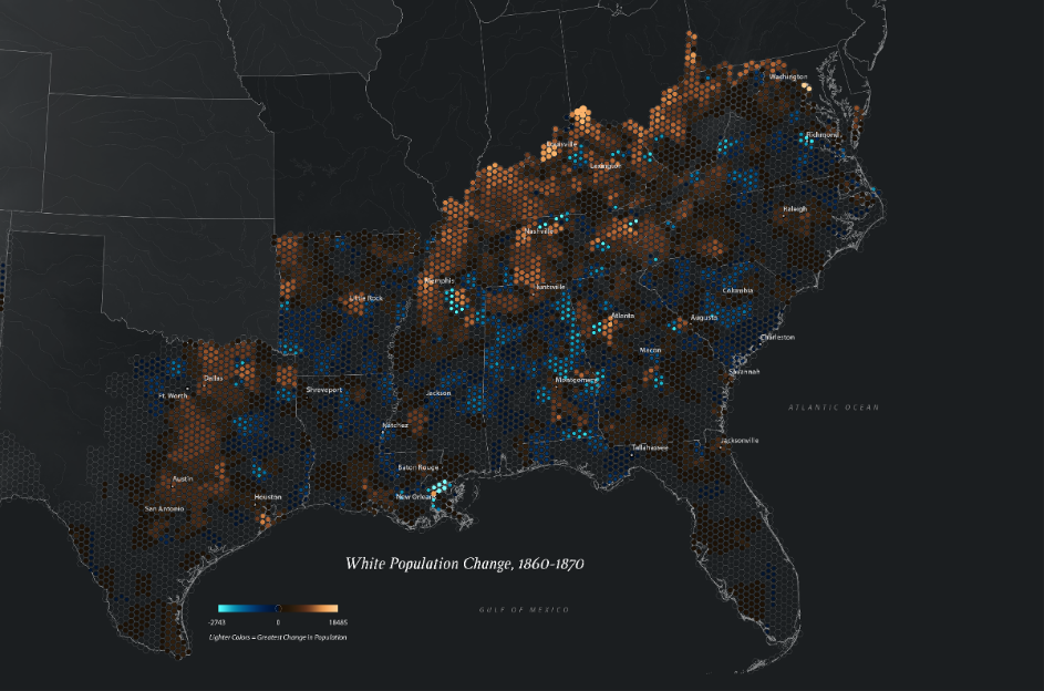
For inspiring maps, and especially if you like all things history, don’t miss a new book by Edward L. Ayers, Southern Journey. Published with Louisiana State University Press, it offers a look at the history of the American South from 1790 to the present day through the lens of migration.
To explain movement and settling patterns within the American South in the most insightful way, Ayers makes use of numerous color map visualizations created by Justin Madron and Nathaniel Ayers. Good news: You can view and explore them online, in a special storytelling project on the website of the Digital Scholarship Web at the University of Richmond.
Check out the migrations of the American South mapped, across over 200 years.
NBA Foul Calls By Referee
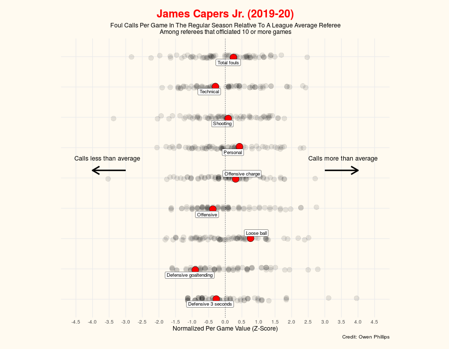
Owen Phillips, a data analyst known in particular for editorial contributions to FiveThirtyEight, compiled a database of all foul calls for each NBA referee since 2016 based on the NBA play-by-play datasets. Named “The Unofficial NBA Ref Ball Database,” it covers regular season and playoff games over four seasons, from 2016-2017 to 2019-2020, and is available in online data tables and in a CSV file.
Right there, on the project’s website, you can not only dive into raw data but also explore part of it in a lovely data visualization tool. Pick an NBA referee and a season from the corresponding dropdown lists. You will see a cool chart providing insights into how that person compares to the other referees — and to a league average — in terms of the number of foul and violation calls per game. (Note that the charts show data only for regular season games and playoffs are not taken into account.)
Take a look and see what data can reveal about the referees’ performance.
U.S. Unemployment Change By Occupation
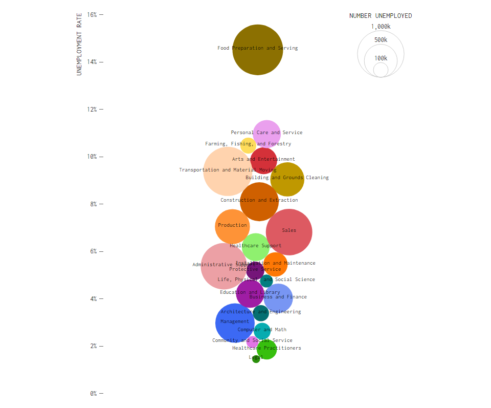
The pandemic along with measures to combat it led to a surge in unemployment rates this year in the United States. However, the scale of job loss is not the same across all industries. Nathan Yau, a data scientist, decided to zoom on the impact with the help of data from the U.S. Bureau of Labor Statistics (BLS).
So, he plotted the unemployment rates for November 2020 and November 2019 in a beeswarm chart, displaying the share of people without a job, by occupation: food preparation and serving, healthcare, production, sales, legal, personal care and service, transportation and material moving, arts and entertainment, building and grounds cleaning, and more.
You can see the switch between the two years is nicely animated, making it easy to follow the changes by occupation and quickly notice the most striking differences. Feel free to compare.
U.S. Hospital COVID-19 Bed Occupancy
![]()
The U.S. Department of Health and Human Services started publishing detailed data on hospital COVID-19 capacity, displaying how full every facility is in terms of the number of beds for patients with the coronavirus. Previously, only aggregated data was available, by state.
The new, per-hospital data, promised to be updated by the HHS on a weekly basis, allowed the Carlson School of Management at the University of Minnesota to launch a new interactive map that they called “the first-ever visualization tool showing sub-state COVID-19 hospitalizations across the country.” The map makes it easy to explore the share of occupied regular and I.C.U. COVID-19 beds at the county level.
The new data visualization is now part of the UMN Hospitalization Tracking Project launched on March 26th. There is also a dashboard representing COVID-19 hospitalizations by state according to data from state websites.
In case you are also interested to view the HHS data on a per-facility basis, The New York Times made a map that can tell you about the I.C.U. occupancy in hospitals near you.
***
Thank you for your attention. Stay tuned for great visualizations.
- Categories: Data Visualization Weekly
- No Comments »