 Hardly a day goes by without new visualizations appearing around the internet, providing insight into data about various things, big and small. Every week, we curate some of the most interesting ones to meet you with them within the framework of our regular DataViz Weekly feature. Enjoy and get inspired by information graphics examples on the following subjects in our new selection of cool visual data projects:
- Preferential polling for the Democratic presidential primaries — Swayable
- Rent prices in Germany — Zeit Online
- Flu season in the United States — athenaInsight
- Thanksgiving harvest origins — Esri’s StoryMaps team
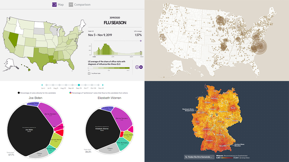
New Great Information Graphics Examples in Data Visualization Weekly: November 22, 2019 — November 29, 2019
Preferential Polling for Democratic Primaries
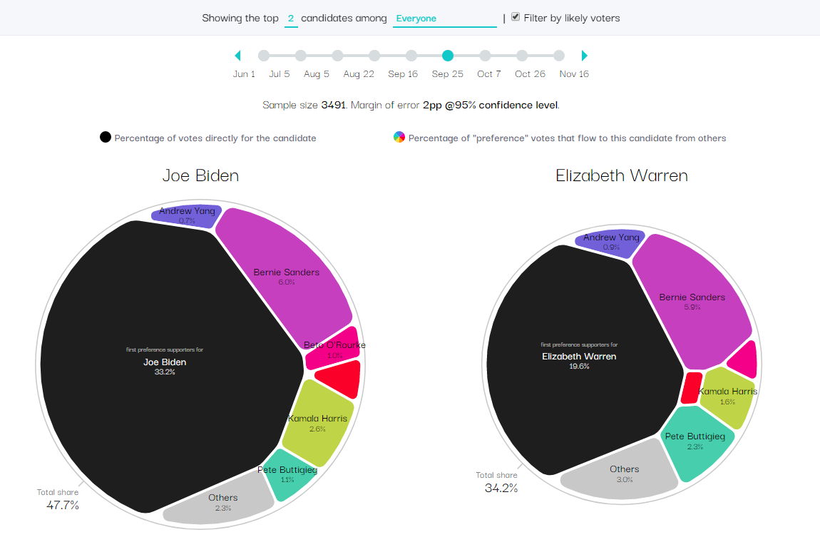
Swayable, a data science platform measuring how media content campaigns impact public opinion, decided to use their tools to go deeper with pre-election polls than the standard horse-race model would usually offer when it comes to (crowded) primaries. So they organized mass digital ranked-choice polling on thousands of respondents every few weeks between the beginning of June 2019 through the middle of November 2019. Then they analyzed the collected data and presented some of the results in fascinating charts with the help of a prototype created for Swayable by Nadieh Bremer, a well-known data visualization designer.
Look at the interactive Voronoi diagrams and streamgraphs in the project. They visualize preferential polling results for the Democratic primary candidates for the U.S. 2020 presidential elections in a really beautiful and informative way, providing quick answers to a lot of questions.
Rent Prices in Germany
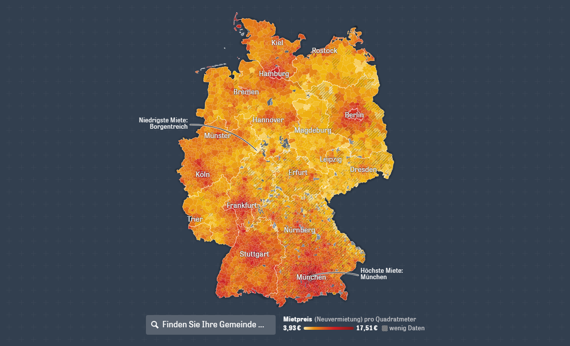
The continuing rise of the cost of rent in Germany has turned into a topical political issue. To show the current situation across the country and how the prices have changed since 2012, Zeit Online created a special interactive map based on real estate market data from empirica-systeme GmbH.
Explore the map to find out where home accommodation rental is most and least expensive. Hover over an area to see a tooltip with a chart displaying the change up to the current level over the past eight years and how it compares to the average trendline for entire Germany. Scroll down the article for a deeper analytical look into the situation in several particular regions.
Flu Season in America
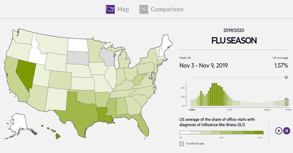
The 2019/2020 flu season in the United States has already started. To make a tool that would allow analysts to track the spread of the flu across the country, athenaInsight used athenahealth’s healthcare network. Based on collected diagnosis codes from insurance claims data across one million weekly patient visits to over 25,000 medical care providers all over America, the company made an interactive dashboard which gets updates every week.
Check out the athenaInsight Flu Dashboard. It consists of two main data presentations. The first one is a choropleth map showing the distribution of flu state by state as of any week starting from November 25, 2018. The second tab provides a chart-based view of the aggregated data.
Thanksgiving Harvest Origins
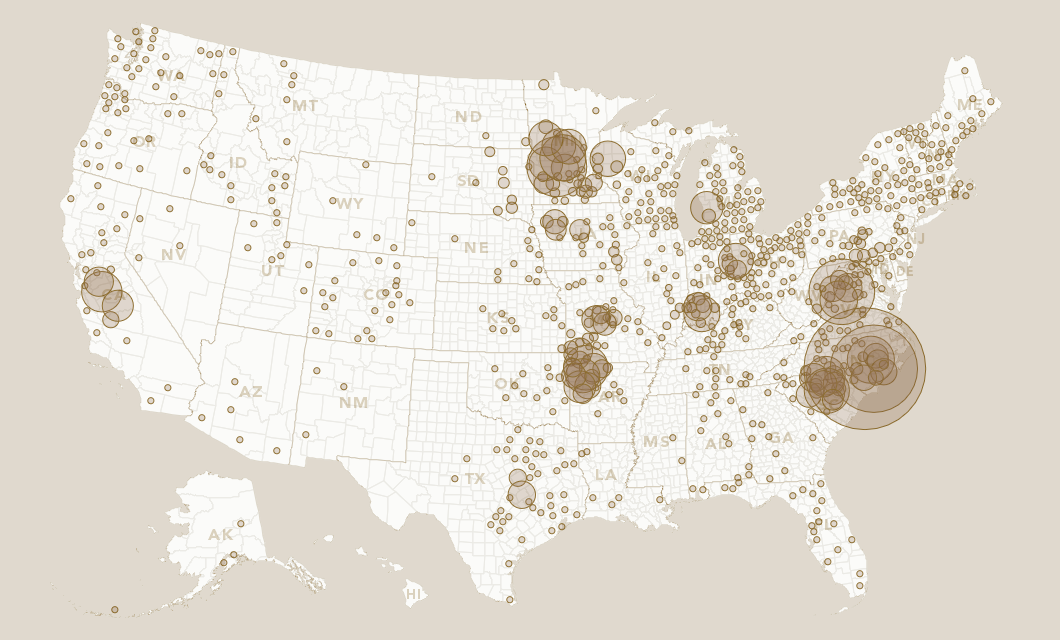
Yesterday the United States celebrated Thanksgiving Day. As is the case here on the fourth Thursday of November each and every year, it brought millions of Americans together with their relatives to enjoy family solidarity and a traditional special feast historically dedicated to the end of the harvest season. Wondering where the staples like turkey and vegetables passed around the Thanksgiving dinner table come from, Esri’s StoryMaps team delved into data from the USDA Census of Agriculture.
Look at a cool interactive bubble map they made. On the visualization, you’ll be able to explore the origins of turkeys, cranberries, potatoes (and sweet potatoes), green beans, Brussels sprouts, pumpkins, and pecans. See what areas produce the most of each product in the U.S. nowadays.
***
Check out these cool information graphics examples and stay tuned for Data Visualization Weekly (it’s been published weekly for years, indeed).
- Categories: Data Visualization Weekly
- No Comments »