The very first version of AnyChart hit the shelves more than 10 years ago, check out what our products went through and see what's new in the most recent update.
Version 8.x History
AnyChart version 8.14.1
Released Jan 19, 2026Bug fixes:
- License key application to gauge charts.
- Applying credits settings via JSON.
AnyChart version 8.14.0
Released Nov 19, 2025Improvements:
Licensing update
We updated the licensing system. If you have any questions about your license, please reach out to our team.
AnyChart version 8.13.1
Released Jun 17, 2025DVF-4707 — Legend position on-demand
A new feature has been introduced to get or set the current position of a chart legend. This includes support for drag transformations, enhancing flexibility in layout customization and interactivity.
- Take a look at the legend's position() in the API.
Improvements:
DVF-4703 — Added an option to show two markers simultaneously for both ends of data ranges in range charts, using the new 'rangeMode' setting in the marker's position().
AnyChart version 8.13.0
Released Sep 24, 2024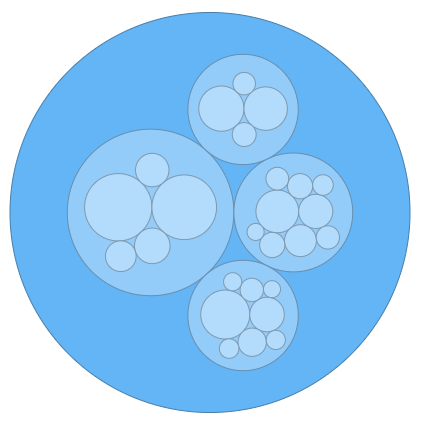
DVF-4682 — Circle packing now offers new labels mode
Circle Packing Chart (also known as Circular Treemap) is a variation of a Treemap that uses circles instead of rectangles. While Circle Packing may not be as space-efficient as a traditional Treemap, it better reveals hierarchical structures. The AnyChart Circle Packing Chart is interactive, robust, and provides all the features you enjoy in other AnyChart products.
- Take a look at Circle Packing Chart Samples in the Gallery.
- Take a look at labelsMode in the API.
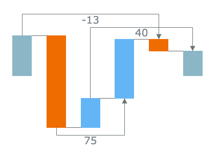
DVF-4691 — Waterfall Arrows Improvement and more
The Arrows feature in Waterfall Charts allows you to add Arrow-shaped connectors between different parts, along with labels to show changes. The arrow placement algorithm has been improved.
- Take a look at Waterfall Arrows in the API.
- Take a look at Waterfall Arrows in the Gallery.
Bug fixes:
- DVF-4690 — Timeline chart now correctly displays labels for years between 0 AD and 100 AD
- DVF-4696 — Text-related memory leak issue fixed
AnyChart version 8.12.1
Released Apr 11, 2024Bug fixes:
- DVF-4680 — Legend memory leak issue fixed
- DVF-4681 — Connect missing points issue fixed
- DVF-4684 — Timeline chart useHtml axis labels issue fixed
- DVF-4685 — Timeline chart zoom issue fixed
AnyChart version 8.12.0
Released Dec 4, 2023Interactivity Events in Calendar and Circle Packing Charts
We've upgraded Calendar and Circle Packing charts by integrating a comprehensive suite of interactivity events. Now, you can attach event listeners to any chart element, triggering actions such as adding or changing information and reshaping chart behavior in response to user interactions like mouse movements, hovers, clicks, and more.
This enhancement ensures seamless and engaging interactivity in both Circle Packing and Calendar charts, giving you the flexibility to create even more dynamic, informative, and personalized data visualizations of those types with the AnyChart JavaScript charting library.
Bug fixes:
- DVF-4668 — Default export to CSV fixed for pie charts
- DVF-4675 — Label annotation issue fixed
AnyChart version 8.11.1
Released May 10, 2023Bug fixes:
- DVF-4636 — Surface chart markers zIndex issue fixed
- DVF-4641 — Network Graph arrows issue fixed
- DVF-4664 — Surface droplines serialization issue fixed
- DVF-4665 — Surface csv export issue fixed
- DVF-4666 — Label annotation issue fixed
AnyChart version 8.11.0
Released Dec 7, 2021
DVF-4552 — Cross-axis settings
AnyChart Charts now allow you to put Y and X Axes anywhere on the chart - not only fixed Top/Left/Bottom/Right positions. Move your charts to the next level or readability right now!
- Take a look at axes.Linear.value() in the API.
- Take a look at Updated Column Chart with Negative Values sample in the Gallery.

DVF-4545 — Waterfall outside labels
Waterfall charts now have outside labels that allow you to mark small elements in an efficient way.
- Take a look at axes.Linear.value() in the API.
- Take a look at Income Statement by Region(with auto positioned labels) sample in the Gallery.
Improvements:
- DVF-4540 — Waterfall total point as independent element option added, you can configure it efficiently now.
- DVF-4610 — Waterfall Split total feature added - you can show total point as several elements now.
- DVF-4541 — Waterfall stack labels for single-series is now available.
Bug fixes:
- DVF-4617 — Firefox context menu accessibility issue fixed
- DVF-4569 — Pie chart radius issue fixed
- DVF-4568 — Waterfall chart arrows issues fixed
- DVF-4590 — Surface axes labels overlap issue fixed
AnyChart version 8.10.0
Released May 20, 2021
DVF-4550 — Waterfall Arrows
Waterfall charts Arrows feature allows to add Arrow shaped connectors between different parts along with labels to show changes.
- Take a look at Waterfall Arrows in the API.
- Take a look at Waterfall Arrows in the Gallery.
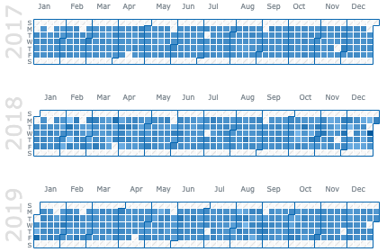
DVF-4554 — Calendar Chart
A calendar chart is a visualization used to show activity over the course of a long span of time, such as months or years. Use a calendar chart when you want to show how quantifiable values vary depending on the day of the week, season, or how it trends over time.
- Take a look at Calendar Chart Samples in the Gallery.

DVF-4555 — Circle Packing Chart
Circle Packing Chart (Circular Treemap) is a variation of a Treemap that uses circles instead of rectangles. Circle Packing may be not as space-efficient as a Treemap, but it reveals hierarchical structure much better than a Treemap. AnyChart Circle Packing Chart is interactive, robust, and provides all the features you enjoy in other AnyChart products.
- Take a look at Circle Packing Chart Samples in the Gallery.
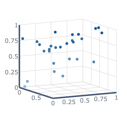
DVF-4442 — Surface Chart: Marker series
We have improved our Surface chart with Marker series which allows showing a set of dots in 3d space.
- Take a look at "GDP Per Capita" Sample in the Gallery.
Improvements:
- DVF-4527 — Context values {%stack} {%total} for stack labels added
- DVF-4530 — Tag Cloud stroke settings
- DVF-4499 — Network Chart arrows for edges
Bug fixes:
- DVF-4512 — Export as xlsx issue fixed
- DVF-4517 — Polar Chart value spreading issues fixed
- DVF-4549 — Value scale application issue fixed
- DVF-4511 — Waterfall stack labels incorrect position issue fixed
- DVF-4510 — Waterfall isVertical application issue fixed
- DVF-4566 — Waterfall scales issue fixed
- DVF-4509 — Continuous series select api issue fixed
- DVF-4562 — Waterfall incorrect axis behaviour in isVertical mode issue fixed
AnyChart version 8.9.0
Released Sep 29, 2020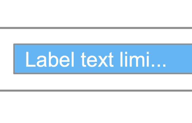
DVF-4373 — Labels text length
Added an option to limit the number of characters in labels for easier control over the chart display.- Take a look at maxLength() in the API.
DVF-4383 — Client-side CSV/XLSX export
CSV/XLSX can now be exported on client-side, without the help of an export server.
DVF-4415 — First and Last labels placement improvement
First and last labels of regular chart now always find their place on the chart making the chart display more consistent and appealing.
DVF-4465 — Polar points automatic placement feature
Polar charts now can spread the point along the category allowing to create so-called Bullseye chart.- Take a look at Marker Polar Chart with Spreading Points in the Gallery.
- Take a look at spreadValues() in the API.

DVF-4479 — Waterfall stack labels (multi-series)
Multi-series Waterfall got an extra label to show the sum of the stack- Take a look at Waterfall stack labels (multi-series) in the Gallery.
- Take a look at stackLabels() in the API.
Improvements:
- DVF-4482 — Network Graph selection API improved
- DVF-4455 — CSV/XLSX export headers can now be formatted
Bug fixes:
- DVF-4429, DVF-4430 — Client side export issues fixed
- DVF-4382 — Axis markers issue fixed
- DVF-4385 — Zero-value stacked bar issue fixed
- DVF-4436 — Legend in Firefox fixed
- DVF-4440 — Markers issue fixed
- DVF-4448 — Network tooltip issue fixed
- DVF-4463 — Polar chart grid palette fill fixed
- DVF-4466 — Waterfall connector stroke issue fixed
- DVF-4472 — Ordinal scale issue fixed
API changes:
| Method | Use instead |
|---|---|
| pie.getCenterPoint() | pie.center().getPoint() |
| pie.explodeSlice() | pie.select() |
| pie.explodeSlices() | pie.select() |
| piePoint.exploded() | piePoint.selected() |
AnyChart version 8.8.0
Released May 22, 2020
DVF-4386 — Text shadow effect
Most of the text elements got an option to tune text shadow with the textShadow() method.Shadow effect can help with text display on certain background colors or give your visualizations more wow-effect.
- Take a look at Top 1000 Companies in the Gallery.
Improvements:
- DVF-4371 — Background corners settings can now be set in percents as well as in pixels
- DVF-4409 — Sunburst labels performance significantly improved, can now render more than 20.000 points.
Bug fixes:
- DVF-4372, DVF-4377 — Timeline chart minor issues fixed
- DVF-4407 — Sunburst single leaf label issue fixed
AnyChart version 8.7.1
Released Dec 17, 2019Bug fixes:
- DVF-4315, DVF-4325 — Client-side export issue
- DVF-4319 — Hover cursor on legend
- DVF-4341 — Selection Marquee issue
- DVF-4239 — Log scale ticks issue
- DVF-4255 — Sunburst label issue
- DVF-4327 — Mobile tappable area for gauge's needle
- DVF-4322 — Mobile issue (Network chart)
- DVF-4289, DVF-4290, DVF-4291, DVF-4292 — Gauge ticks issues
Improvements:
- DVF-4320 — Disable credits over theme
- DVF-4340 — Legend items alignment settings
AnyChart version 8.7.0
Released Aug 7, 2019
DVF-4247 — Client-Side Export
We've added the client-side export feature to all our JavaScript charting libraries - AnyChart, AnyStock, AnyGantt, and AnyMap. This will allow you to have your data visualizations saved as images (SVG, PNG, and JPG) and PDF documents without a roundtrip to the server, by leveraging the built-in browser features for a seamless JS chart export, fast and secure.Improvements:
- DVF-4277 — Legend. Add some icons support
Bug fixes:
- DVF-4201 — Legend issues
AnyChart version 8.6.0
Released May 15, 2019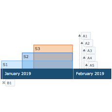
DVF-4186 — Timeline Chart
A timeline is a display of a list of events in chronological order. It is typically a graphic design showing a long bar labeled with dates paralleling it, and usually contemporaneous events.- Take a look at Timeline Chart in the Gallery.
- Learn more about Timeline Chart in the Chartopedia.
- Check out Timeline Chart in the Documentation.
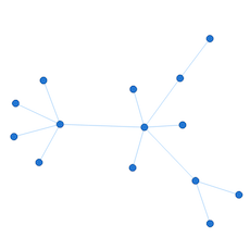
DVF-2987 — Network Graph
Network graph is a mathematical structure (graph) to show relations between points. The graph visualizes how entities are interconnected with each other. Entities are displayed as nodes (points) and the relationship between them (edges) are displayed with lines.- Take a look at Network Graph in the Gallery.
- Learn more about Network Graph in the Chartopedia.
- Check out Network Graph in the Documentation.
Improvements:
- DVF-3596 — AnyChart Locales Improved
- DVF-3597 — Custom Messages in locales
- DVF-4051 — Color Scale reworked - default range and "equal" flag are added.
- DVF-4073 — Auto localized context menu from the included locale
Bug fixes:
- DVF-3897 — Ticks, grids, crosshair appearance issue fixes.
- DVF-4210 — Polar chart resize issues fixed.
- DVF-4095 — Issues with xMode "scatter" fixed.
- DVF-3944 — Resize event issues fixes.
- DVF-4187 — Charts disposing improved.
AnyChart version 8.5.1
Released Feb 4, 2019Bug fixes:
- DVF-4041 — fixed 3d grids redrawing problem
- DVF-4095 — fixed issues with xMode scatter, when scale values are redefined
- DVF-4107 — fixed issues with sunburst drilldown in FF
- DVF-4109 — fixed legend redraw bug when position mode is inside
- DVF-4112 — fixed pie appearance bug with outside labels
- DVF-4142 — fixed tag cloud appearance bug
- DVF-4147 — fixed issues with pie labels clipping
- DVF-4154 — fixed issue in wordtree chart
- DVF-4156 — fixed issue with pie outside labels
- DVF-4174 — fixed issue with pie point hover, after clicking on missing point in legend
AnyChart version 8.5.0
Released Dec 24, 2018
DVF-3894 — Word Tree
A Word Tree chart is a visualization of a set of words in a hierarchical way. It can be used to show which words most often follow or precede a target word or to show a hierarchy of terms. The font size of words represents their weight - the frequency/number of children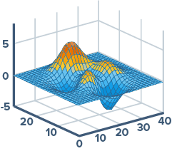
DVF-3061 — Surface Chart
Surface chart (3D Surface plot) displays a set of three-dimensional data as a mesh surface and is used when you need to find the optimum combinations between two sets of data. The colors and patterns in this chart indicate the areas that are in the same range of values.- Take a look at Surface Chart in the Gallery.
- Learn more about Surface Chart in the Chartopedia.
- Check out Surface Chart in the Documentation.

DVF-3378 — Multi Series Charts Grouped by Series
Sometimes it is useful to visualize comparison in a different way - group columns by series. Now you can enable this mode for all basic cartesian charts.- Take a look at Multi Series Charts Grouped by Series in the Gallery.
- Check out Multi Series Charts Grouped by Series in the Documentation.

DVF-3858 — Y Scroller
Now you can add both X and Y Scrollers to your charts.- Take a look at Y Scroller in the Gallery.
- Check out Y Scroller in the Documentation.
Improvements:
- DVF-3085 — New chart constructors added to make API more uniform.
- DVF-3639 — Ordinal Scale Modes are introduced to cover certain Area and Line Series Display Requirements (API)
- DVF-3893 — Cartesian Series Multiple X Mode: Now you can display cartesian charts with several points with the same argument.
Bug fixes:
- DVF-3804 — Heatmap tooltip format issue fixed.
- DVF-3975 — Linear scale small values calculation improved.
- DVF-3995 — Paginator background bug fixed.
- DVF-3999 — Tag Cloud tooltip position mode bug fixed.
- DVF-4045 — Firefox labels issue fixed.
- DVF-4078 — Empty Data Treemap serialization issue fixed.
- DVF-4118 — Resource chart JSON/XML deserialization issue fixed.
AnyChart version 8.4.2
Released Nov 23, 2018Bug fixes:
- DVF-4045 — FFox labels fix
- DVF-4063 — Chart background zIndex issue
- DVF-3995 — paginator fix
- DVF-3999 — tagCloud tooltip fix
AnyChart version 8.4.1
Released Oct 30, 2018Bug fixes:
- DVF-3941 — Performance improvements.
AnyChart version 8.4.0
Released Oct 5, 2018
DVF-3857 — Performance issues
We have significantly improved the performance.
DVF-3171 — Sankey Diagram
A Sankey diagram is a flow diagram that shows nodes linked by flows, the quantity of each flow being represented as its width. This chart type emphasizes the major transfers or flows within a system and helps to locate dominant contributions to an overall flow.- Take a look at Sankey Diagram in the Gallery.
- Learn more about Sankey Diagram in the Chartopedia.
- Check out Sankey Diagram in the Documentation.
Improvements:
- DVF-3873 — Improved rendering of legend.
- DVF-3861 — Line markers of the axes now can dispatch mouse events.
- DVF-3826 — Now the fill of the 3D Pie chart can be transparent.
- DVF-3733 — Added the contextMenu() method to the anychart.ui.table class.
- DVF-1768 — Now a gradient fill can be set as a string.
Bug fixes:
- DVF-3850 — Improved positioning of the data area.
- DVF-3835 — Fixed the issue with tree search.
- DVF-3823 — Fixed the issue with Treemap labels.
- DVF-2015 — Improved drawing of 3D Area series.
- DVF-1748 — Improved positioning of labels.
- DVF-1514 — Improved calculation of the Circular Gauge's range.
AnyChart version 8.3.0
Released Jul 10, 2018
HTML Tooltips Support
Tooltip customization is way easier now. Full support of HTML is available. You can write your own HTML code and customize tooltip visualization using CSS classes.- Take a look at HTML Tooltip in the Gallery.
- Check out HTML Tooltip in the Documentation.

Background Settings for Chart Data Bounds
The background can be changed for the data area if needed.- Take a look at Background Settings for Chart Data Bounds in the Gallery.
- Check out Background Settings for Chart Data Bounds in the Documentation.

Coloring Rules and Thresholds
New ways to customize the coloring of series are added. Negative/positive colors, rising/falling colors, and the ability to specify the Color Scale with thresholds for series.- Take a look at Coloring Rules and Thresholds in the Gallery.
- Check out Coloring Rules and Thresholds in the Documentation.

Axis Labels Positioning
The positioning of axis labels inside data plots is made easier.- Take a look at Axis Labels Positioning in the Gallery.
- Check out Axis Labels Positioning in the Documentation.
Improvements:
- Color palettes improvements
- Labels background settings improvements
- Axis markers improvements (new methods: background, padding, scaleRangeMode)
- Markers/Labels clipping improvements
- anychart.ui.Table: new export methods ( saveAsXlsx, saveAsCsv)
- 3D Charts issues
- Venn Chart: new token %selectedPointsSum
- Pie Chart labels overlap improvements
Bug fixes:
- Tooltip issues in financial charts
- Color functions anychart.color.darken and anychart.color.lighten issues
- XML serialize scale ticks issue
- Escape/Unescape symbols in XML serialization
- Linear Gauge issues
- Pointer's z-Index in Circular Gauges issue
- Heat map scroll inversion bug
- Gauges scale calculations problems
- Charts xScroller issues
AnyChart version 8.2.1
Released Apr 16, 2018Improvements::
- DVF-3634 — 3D pie minor improvements.
- DVF-3552 — Scatter ticks improvements. The allowFractional() method added.
- DVF-3475 — The toCsv() method improved.
Bug fixes::
- DVF-3678 — Ticks calculations after draw fixed.
- DVF-3048 — Fixed issues with stacked points with zero value.
- DVF-2916 — Grid layout issues fixes.
- DVF-1350 — The bug in the search() method fixed.
AnyChart version 8.2.0
Released Mar 26, 2018
Sunburst Chart
In addition to a lot of chart types already available in the AnyChart JavaScript charting library out of the box, we've added the Sunburst Chart (also called Radial Treemap). It presents an excellent way of visualizing hierarchical data by means of concentric circles.- Take a look at Sunburst Charts in the Gallery.
- Learn more about Sunburst Chart in the Chartopedia.
- Check out Sunburst Chart in the Documentation.

Min/Max Labels
Min/Max labels give you a unique opportunity to show the minimum and maximum values on the chart. This feature allows users to see at a glance what is happening with the data.- Take a look at Min and Max Labels on Range Column Chart in the Gallery.
- Check out Min and Max Labels in the Documentation.

Crosshair Multiple Labels
Now you can display several crosshair labels on additional axes of the chart. Hence, it is possible to add an extra axis (e.g. one with percentage values), enable this feature and get more insights at a time while exploring such an interactive data visualization.- Take a look at Crosshair Multiple Labels in the API.

Negative Logarithmic Scale
In release 8.2.0, we've introduced the support of negative values on the logarithmic scale. This can be helpful in creating a clearer and more comprehensive visualization when working with large data sets.Improvements:
- DateTime Scale improvements
- Update localizations files. Current version is 1.2.0 (see at cdn).
Bug fixes:
- Legend issues
AnyChart version 8.1.0
Released Dec 20, 2017
Pie Chart — Outline
Although the outline itself does not carry any particular information on a chart, it can be utilized to make a Pie Chart stand out visually in comparison with the other charts and to stress the importance of the data displayed. By default, the Pie Chart Outline features the width of 10 pixels and the lighter fill color.- Take a look at Pie Chart with Outline in the Gallery.
- Learn more about Pie Chart in the Chartopedia.
- Check out Pie Chart Outline in the Documentation.

Donut Chart — Center Content
How to efficiently use the space on a web page will always remain a topical question for the web design. To contribute to this field, we've introduced the .center() method making the process of adding the content to the center of a Pie Chart as easy and convenient as possible. You can use .center() to add text or other charts.- Take a look at Donut Chart with Text as Center Content in the Gallery.
- Take a look at Donut Chart with Geo Map as Center Content in the Gallery.
- Learn more about Pie Chart in the Chartopedia.
- Check out Pie Chart Center Content in the Documentation.

Pie Chart — Interactivity
New methods now available in Pie Chart: normal(), hovered() and selected(). They allow to configure any settings for the corresponding states, including fill(), stroke(), outline() and explode().- Take a look at Donut Chart with Complex Interactivity Settings in the Gallery.
- Learn more about Pie Chart in the Chartopedia.
- Check out Pie Chart Interactivity in the Documentation.

Pie Chart — Label Placement Algorithm
The newly added Pie Chart Outside Labels distribution algorithm makes sure that labels are well-positioned and provided with enough space to be displayed in a clear, neat manner. The outsideLabelsSpace() method is now deprecated as far as its value is calculated automatically. See the Pie Chart with Dynamic Start Angle example to see how it works.- Take a look at Pie Chart with Dynamic Start Angle in the Gallery.
- Learn more about Pie Chart in the Chartopedia.
- Check out Pie Chart Outside Labels in the Documentation.

Label Annotation
Label Annotation is an excellent way to highlight particular data or events on a chart, add trendline captions and leave notes for data analysts.- Take a look at Labels Annotations in the Gallery.
- Check out Labels Annotations in the Documentation.
Improvements:
- Improved memory allocation when running AnyChart in Node.js environment.
- String Tokens now auto-detect the type of formatting (string, number or DateTime) by token arguments. In addition, types of formatting can now be defined directly using the type argument.
Bug fixes:
- Fixed issues with using String Tokens in Legend itemsFormat() method.
- Fixed issues with extra small and extra large values formatting.
- Fixed issues with unicode symbols in String Tokens (desk case #3833, TS-415).
- Fixed animation issues that accure during update of Pareto Chart settings (desk case #3062, TS-229).
- Fixed bug with labels settings from data (DVF-3403).
- Fixed bug with cycling angles values in Tag Cloud.
- Fixed issues with inappropriate chart rendering into containers with flex layout in Firefox.
AnyChart version 8.0.0
Released Oct 2, 2017
Modular System
Modular System is the core of AnyChart 8. It allows you to significantly reduce the size of the JavaScript running on your web page by connecting only those chart types and features that you actually use. The modular based AnyChart is perfectly compatible with popular bundling tools such as Webpack, Browserify, and so on. Use our JS Builder to easily generate a custom build.- Check out Modular System in the Documentation.

Custom JavaScript Builds
Custom JavaScript Builder is designed for assembling a JavaScript file that contains only the features and chart types you are really going to use. The AnyChart version 8.0.0 contains 30 modules and 16 themes. You can also build a file that contains your license key.- Try Custom JavaScript Builder right now
- Check out Modular System in the Documentation.

Node.js Server-side Rendering
Node.js server is a lightweight web server that provides API for generating vector graphics (PDF, SVG, or PS), bitmap images (PNG, JPG, or TIFF), PDF reports, and data in CSV and XLSX (Excel). It uses the JavaScript code as well as JSON and XML configurations as input data. The server is very easy to install and customize, you can run it on any major platform: Linux, Windows, and macOS. It is ideal for creating report systems that send charts via email or social network sharing tools.- Check out Node.js Server API in the Documentation.

No Data Label Feature
No Data Label Feature is an API designed to notify the chart viewer that data is not available. Data can be missing due to its absence by default or if it has been removed by means of the Data Updating API, Exclude Data Point feature, or through the interactivity.- Take a look at No Data Label in the Gallery.
- Check out No Data Label in the Documentation.

CSV/Excel Export Reworked
By popular demand, we've remastered the algorithm for preparing CSV/Excel data for charts. Now it takes into account the chart type specific features and allows you to use multiple data sets for different series.- Check out Data Export in the Documentation.

Chart Export Settings
Now you can customize the export settings for each chart: links and descriptions for sharing on Facebook, image export options, and so on.- Take a look at Chart Export Settings in the API.
- Check out Chart Export Settings in the Documentation.
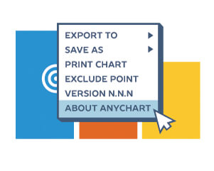
Context Menu Customization API
We've significantly simplified the process of the context menu customization. Now each item of the context menu is assigned with an ID that can be called to access the corresponding fields and settings as well as to add custom ones. We've also added the option to localize the context menu.- Check out Context Menu in the Documentation.
General API Improvements
We've substantially improved the AnyChart JS Charts API specifically for the 8th generation of our JavaScript charting libraries. Appearance settings, Grids settings, Data Mapping settings can now be made much easier. To facilitate and streamline the transition from AnyChart 7 to AnyChart 8, we've created the Migration Tool that will allow the majority of users to switch over to the new version in semi-automatic mode.- Check out Migration Process in the Documentation.

Data Points Size Settings
The size of Data Points is now under your full control as we've added the following methods:- chart.pointWidth() — sets fixed size Data Points when series are added dynamically;
- chart.maxPointWidth() — sets the width of points when data is updated;
- chart.minPointLength() — to make sure relatively small and near-zero values are displayed.
- Take a look at Data Points Size Settings in the Gallery.
- Check out Data Points Size Settings in the Documentation.

3D Line Chart
AnyChart already supports multiple dozens of chart types out of the box. Release 8.0.0 brings the next new one: We've added the 3D Line Chart type.- Take a look at 3D Line Chart in the Gallery.
- Check out 3D Line Chart in the Documentation.

Series Stacking Order feature
Now you can set the order of series in Stacked Charts by using the stackDirection() method. This feature will be helpful when you work with data from third-party sources and have no control over the input data format.- Check out Series Stacking Order feature in the Documentation.
Improvements:
- Improved API of mapAs() method, now it accepts only one parameter instead of four (old version).
- Bar and Column Charts now apply softMinimum() settings with value 0 by default
- Improved Grids API, grid()/minorGrid() methods are replaced with xGrid()/yGrid(), xMinorGrid()/yMinorGrid() methods. Coloring oddFill()/evenFill() methods are replaced with fill() and palette() methods. See Axes basics article to learn more.
Bug fixes:
- Fixed issues with Drawing Annotations Labels formatting (Case 3293, TS-195)
- Fixed issues with changing series data after draw in financial charts (TS-150)
- Fixed error with displaying tooltips in IE 6-8 (Case 3173, TS-296)