Discover Some of Most Interesting Recent Data Visualization Projects — DataViz Weekly
July 23rd, 2021 by AnyChart Team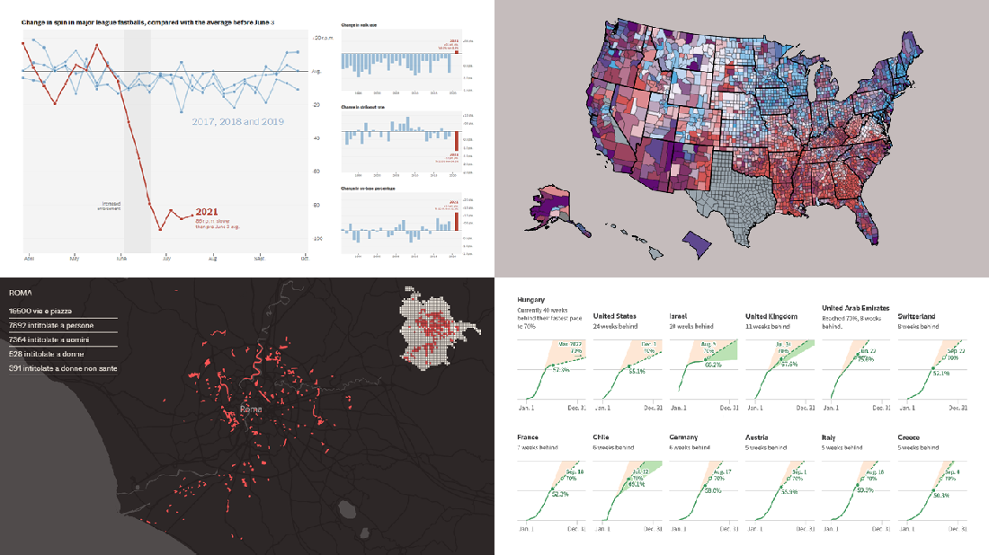 Look at some of the most interesting data visualizations we have come across out there over the last few days! The following projects are deservedly featured in DataViz Weekly this time:
- Falling spin rates in American baseball after a crackdown on sticky substances — The Upshot
- Gender diversity in Italian street names — EDJNet
- Shifts in the COVID-19 vaccination pace worldwide since January 2021 — Reuters
- Vaccination equity in America — CDC
- Categories: Data Visualization Weekly
- No Comments »
Great New Examples of Charts and Maps Worth Seeing — DataViz Weekly
June 18th, 2021 by AnyChart Team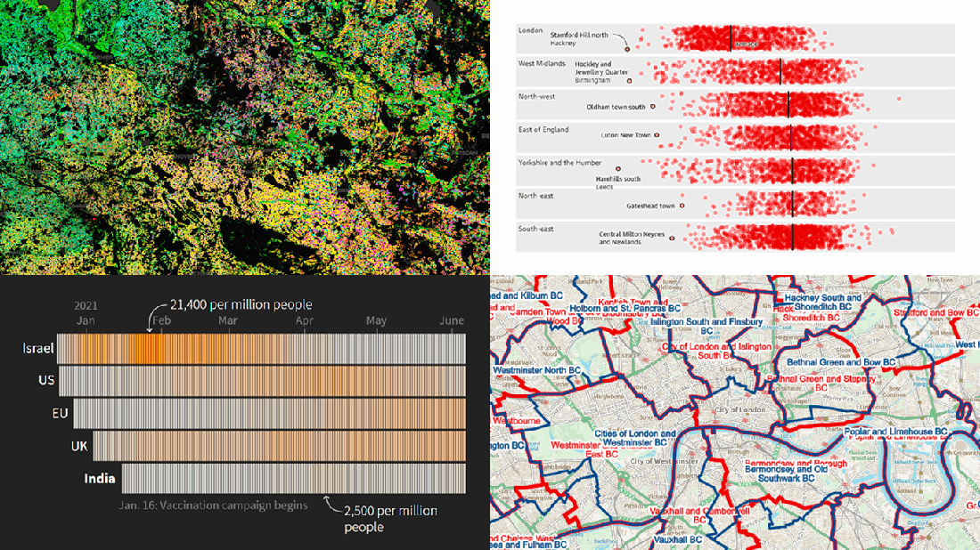 Hardly a day goes by without some cool new charts and maps being built and published, helping to make sense of various data. Every Friday, we tell you about those that have gripped our attention the most during the past few days, within the framework of DataViz Weekly. Come see our new selection!
- Proposed new parliamentary constituency boundaries for England — BCE
- Reasons behind the delay of lockdown reopening in England — The Guardian
- COVID-19 vaccination campaign in India — Reuters
- Agricultural land use in Germany by crop type — Earth Observation Lab at HU Berlin, ThEO, and ZALF
- Categories: Data Visualization Weekly
- No Comments »
How to Create Interactive Timeline Chart with JavaScript
June 17th, 2021 by Shachee Swadia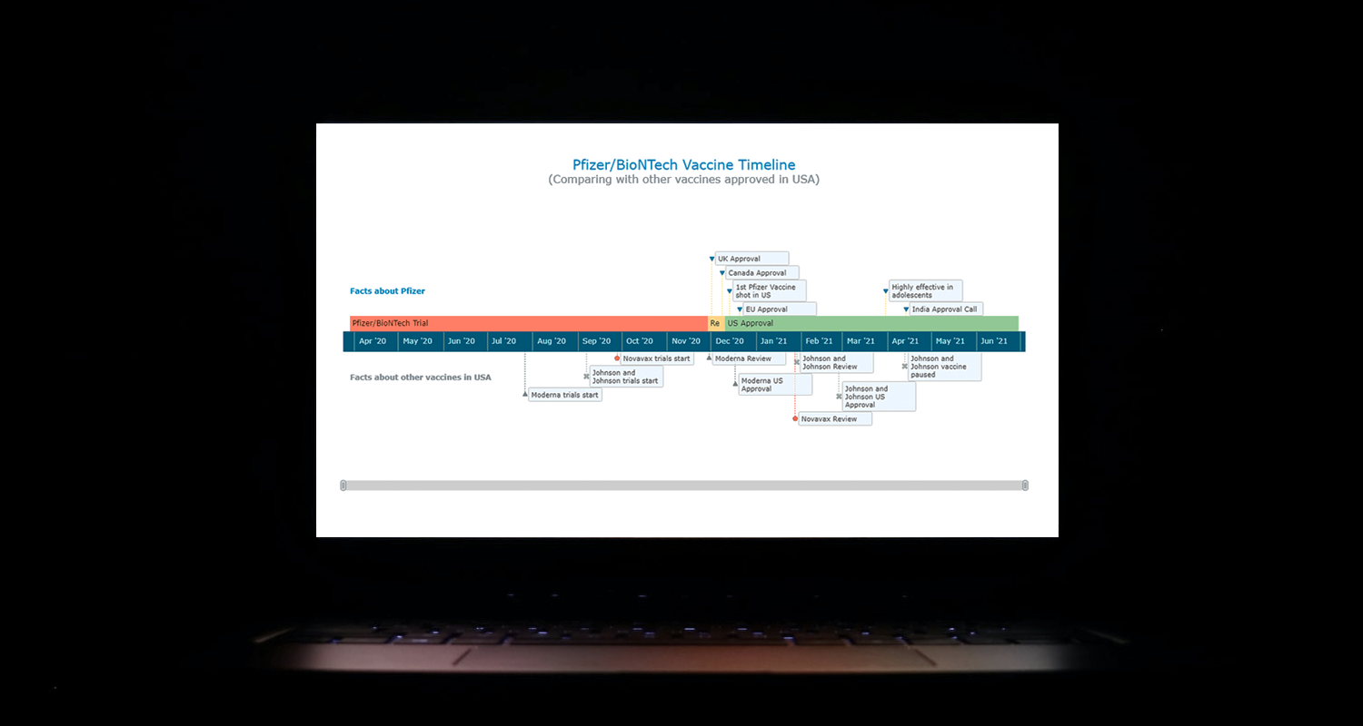 I think all of us have come across timelines somewhere or the other; as a means of conveying chronological information, the classic timeline is unmatched, both in the depth of information conveyed and the “cool” factor, when done with a deft creative touch. So, with that said, would you like to learn how to build a timeline chart using JavaScript that both looks great and is simple to create? (Of course, you do!) Follow along with me as I take you through the step-by-step breakdown for developing your own JS timeline with a practical example.
As the world continues to battle with COVID-19, the long-awaited good news is the development of vaccines across the globe. Here, I decided to build an interactive timeline that showcases the phases of Pfizer-BioNTech vaccine development in the United States. To add more contextual information, I also wanted to show approvals from other countries and some related facts, including the dates for the development of the 3 other vaccines approved for usage in the US.
Read the JS charting tutorial »
- Categories: AnyChart charting component, Big Data, Charts and Art, HTML5, JavaScript, JavaScript chart tutorials, Tips and tricks
- No Comments »
Visualizing Data on COVID-19, Deprivation, Chess, Fishing — DataViz Weekly
June 4th, 2021 by AnyChart Team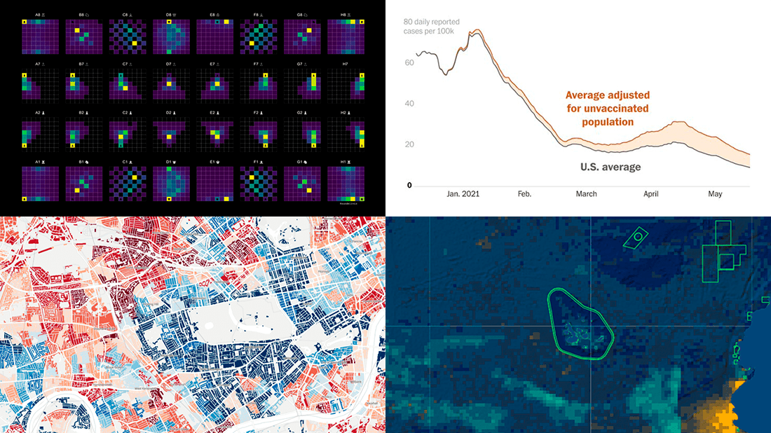 Each Friday, we pick the most compelling new data visualizations and show them in a quick overview. Take a look at our latest DataViz Weekly collection and feel the power of charts and maps!
- COVID-19 rates for unvaccinated people in the U.S. — The Washington Post
- Income deprivation within English local authorities — ONS
- Where chess pieces are usually captured — Anders Sundell
- Global Fishing Watch Marine Manager — Global Fishing Watch
- Categories: Data Visualization Weekly
- No Comments »
Overviewing Four Amazing New Data Visualization Projects — DataViz Weekly
May 21st, 2021 by AnyChart Team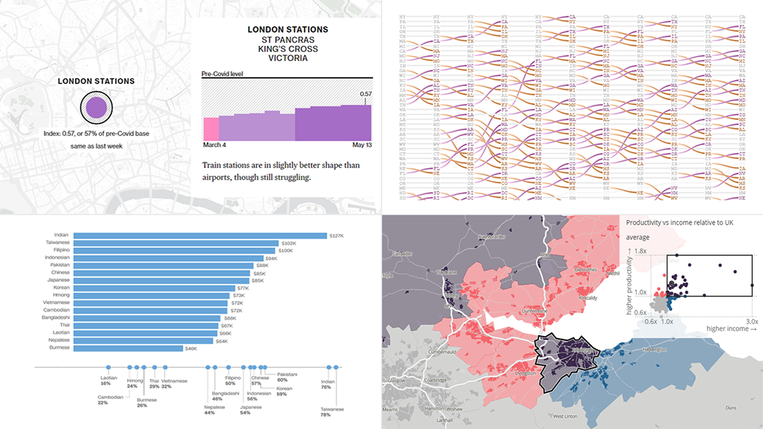 Not too long ago, visual communication skills were nice to have. But that has changed. Nowadays, the ability to visualize data in charts and maps is a must-have and not only for analysts. Stay tuned for DataViz Weekly to see the most interesting examples of smart graphics in action!
Join us today as we look at the following new data visualization projects worth checking out:
- Historical shifts in U.S. state population rankings — The Washington Post
- Diversity of Asian Americans — CNN
- Regional differences in income and productivity across the U.K. — ONS
- Pret A Manger sandwich sales as a proxy to measure pandemic recovery — Bloomberg
- Categories: Data Visualization Weekly
- 2 Comments »
Visualizing Vaccination Rates, Political Bubbles, Curry’s Stats, World Justified — DataViz Weekly
May 7th, 2021 by AnyChart Team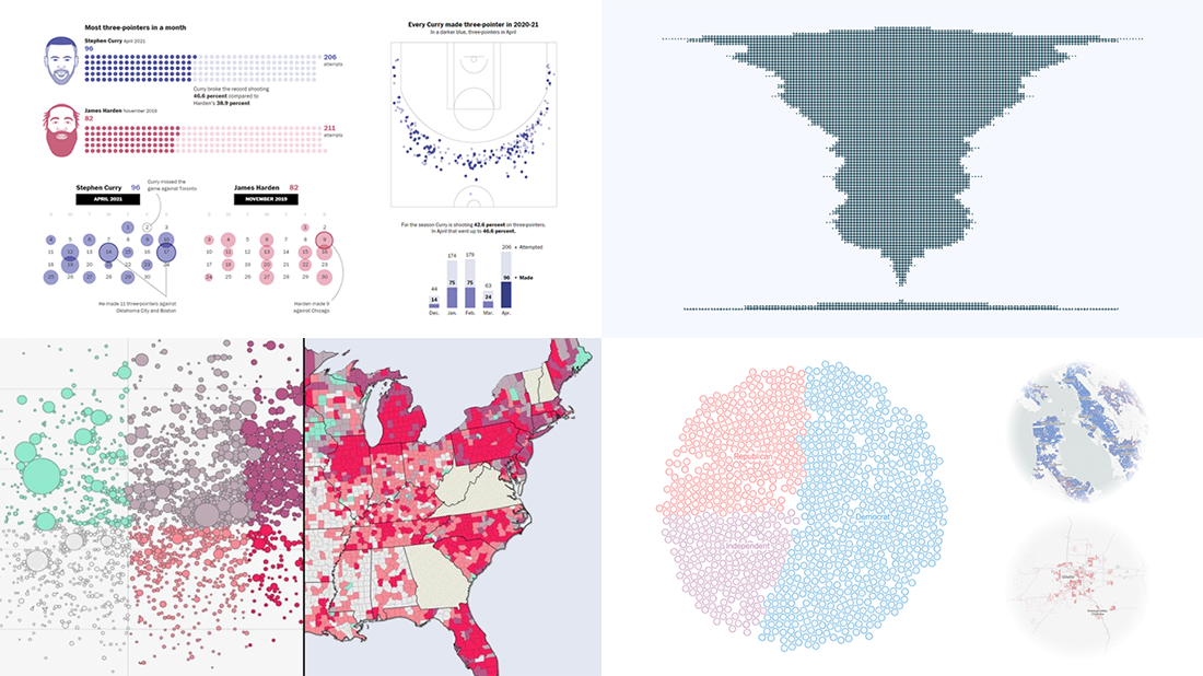 Every week, we choose the four most interesting visualizations from all we came across these days and present them to you in a quick review. Below is a list of the ones that made it to this new DataViz Weekly — take a glance and keep reading for a closer look at each!
- Vaccination rates in comparison with case metrics across the U.S. — McKinsey & Company
- Political bubbles across the U.S. — The New York Times Opinion
- Stephen Curry’s record-setting April scoring spree — The Washington Post
- World justified, left-aligned, centered, right-aligned — Nicolas Lambert
- Categories: Data Visualization Weekly
- No Comments »
New Stunning Charts and Maps in Weekly Roundup — DataViz Weekly
April 30th, 2021 by AnyChart Team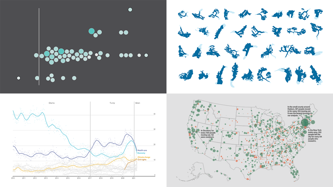 Continuing the series of weekly data visualization roundups, we’re glad to introduce you to our selection of new awesome charts and maps from around the web. Check out our latest picks!
- 2020 U.S. Census results — Nathan Yau
- American public opinion — The Economist
- Migration within the U.S. during the pandemic — Bloomberg CityLab
- Melting glaciers — The Guardian
- Categories: Data Visualization Weekly
- No Comments »
Engaging Data Graphics on Hobbies, Protests, Commute, and Reddit — DataViz Weekly
April 23rd, 2021 by AnyChart Team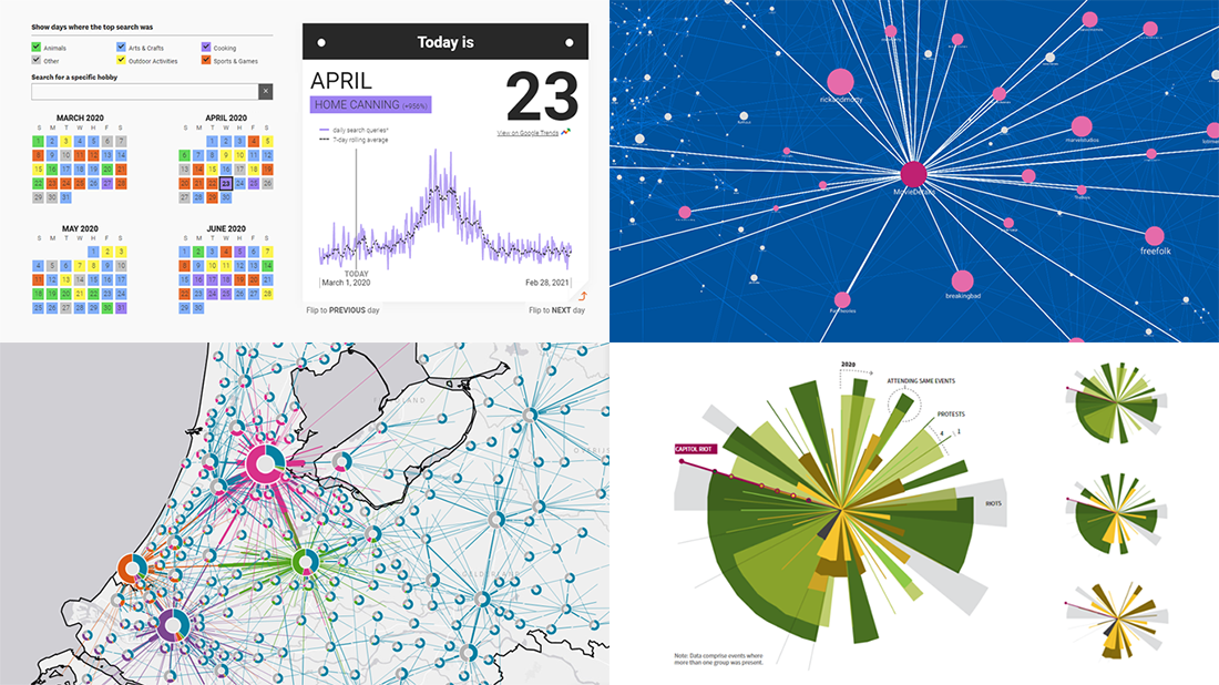 Can’t wait for a new portion of engaging data graphics? We’ve got it for you right here, right now! The following visualizations caught our eye this week, and DataViz Weekly is here to make sure you do not miss out on them:
- Top trending hobbies during the COVID-19 pandemic — Polygraph and Google Trends
- Right-wing protests in America in 2020-2021 — Reuters
- Commuting in the Netherlands — Statistics Netherlands
- Map of Reddit — Andrei Kashcha
- Categories: Data Visualization Weekly
- No Comments »
New Impressive Data Visualization Projects — DataViz Weekly
April 16th, 2021 by AnyChart Team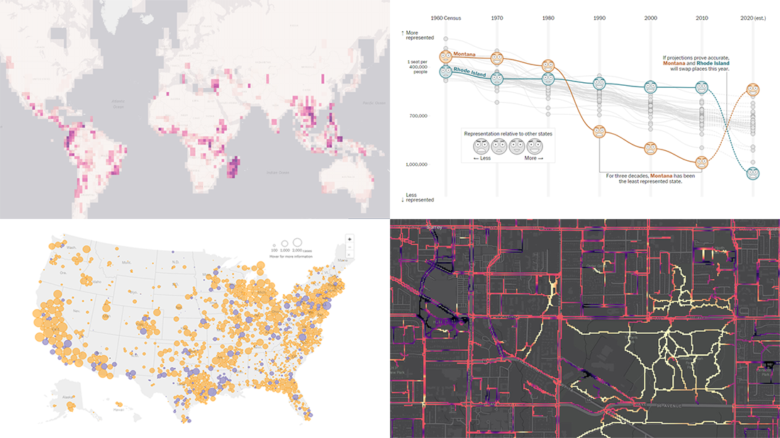 Hello and greetings to all who are fond of data visualization! We’ve curated a new collection of impressive maps and charts that came into existence just a little while ago. See what projects are praised this time on DataViz Weekly and read next to learn more about each:
- Reshuffling of the U.S. House seats after the 2020 Census — The Washington Post
- Runnability of streets — Simon Fraser University
- Probability of finding undiscovered species across the world — Map of Life
- Coronavirus in American prisons — The New York Times
- Categories: Data Visualization Weekly
- No Comments »
Data Visualization for COVID-19 Dashboard Tracker Using AnyChart JS Charts
April 12th, 2021 by AnyChart Team![]() Data visualization has played an important role during the COVID-19 pandemic, allowing governments, scientists, healthcare professionals, and the general public to better understand different aspects of the crisis. There are many illuminating projects all over the web that leverage charts and maps to effectively communicate what the coronavirus statistics have to say. Some of them are using our data visualization tools under a free license provided as part of the special initiative we announced last spring to support the global COVID-19 data analysis effort.
Data visualization has played an important role during the COVID-19 pandemic, allowing governments, scientists, healthcare professionals, and the general public to better understand different aspects of the crisis. There are many illuminating projects all over the web that leverage charts and maps to effectively communicate what the coronavirus statistics have to say. Some of them are using our data visualization tools under a free license provided as part of the special initiative we announced last spring to support the global COVID-19 data analysis effort.
We told you about two examples of such projects earlier: StopCorona and iConcepts SARS-CoV-2 Stats. Now let us introduce you to another interesting resource — COVID-19 Dashboard Tracker by Maxime des Touches. Launched more than a year ago, while Maxime was yet a computer science student, it has turned from a simple online data table into a complex interactive data visualization project offering up-to-date insight into how the pandemic unfolds in France and worldwide.
Maxime kindly agreed to talk to us about his COVID-19 tracker, experience using AnyChart, and the pandemic in general. Check out our quick interview, glance at a few screenshots, and try his open-source dashboard by yourself. (Stack: HTML/jQuery/JSON.)
- Categories: AnyChart charting component, AnyStock, Big Data, Dashboards, HTML5, JavaScript, Stock charts, Success stories
- No Comments »