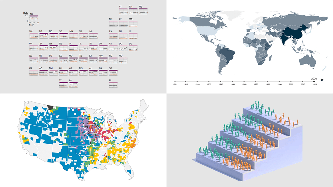
 Eager to see some great data visualizations? Your wait is over! DataViz Weekly is back to the AnyChart blog to make sure you have not missed these four new works as they are definitely worth checking out!
- Gun deaths in America — The Washington Post
- Health effects of climate change worldwide — Wellcome
- Economic success of the U.S. immigrants’ children — The New York Times Opinion
- Livestock vs human populations in the United States — Data Stuff
Data Visualization Weekly: July 8, 2022 — July 15, 2022
Gun Deaths in America
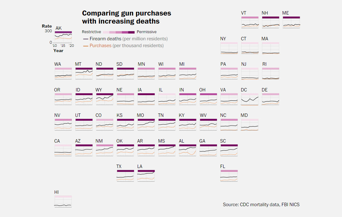
Mass shootings account for less than 1% of the overall firearm death toll in America. Most gunshot fatalities are homicides and suicides. At the same time, both firearm mortality rates and gun sales are on the rise.
The Washington Post analyzed data from the Centers for Disease Control and Prevention (CDC) and the FBI’s National Instant Criminal Background Check System (NICS) and provided an in-depth look at the problem of U.S. gun violence. In this article created by Mark Berman, Lenny Bernstein, Dan Keating, Andrew Ba Tran, and Artur Galocha, you will find multiple charts greatly showing trends (and correlations?) at a glance.
The visualization displayed above, for example, plots gun purchases along with firearm deaths from 2010 through 2020 in each state, representing the states with tighter gun laws in darker purple.
See what federal data says on gun violence in the United States, on The Post.
Health Effects of Climate Change Worldwide
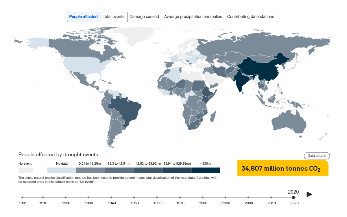
Climate change affects our health through the impacts of extreme weather events, threats to the quality (and the availability) of water and food, and so on. In some places, people appear to be especially vulnerable.
The Wellcome Trust foundation visualized over a century of climate data from the Université Catholique de Louvain’s International Disaster Database (EM-DAT) and the University of East Anglia’s Climatic Research Unit (CRE) to represent the health effects of climate change all over the globe. Four risks are taken into account: drought, flooding, extreme heat, and climate-sensitive disease.
An interactive map visualizes how each has affected individual countries. Select a country to see more details about it, in numbers and charts.
Explore the health effects of climate change worldwide, on the Wellcome website.
Economic Success of Children of U.S. Immigrants
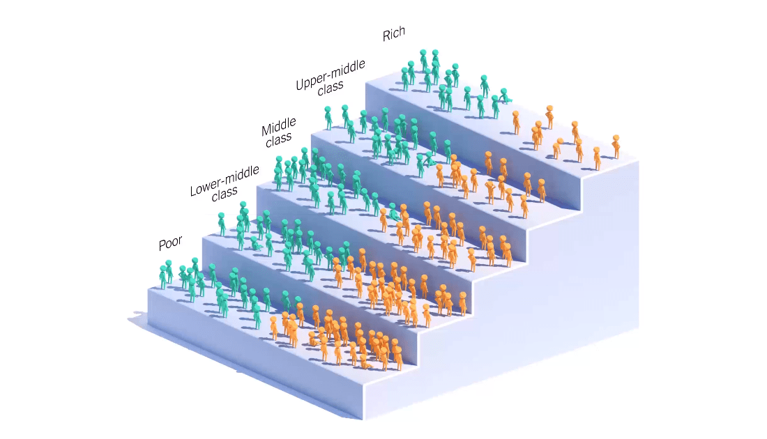
Immigrants’ children show more mobility moving up the economic ladder than those whose parents were born in the United States. The former are almost twice as likely to get rich than the latter.
A new book, written by economists Ran Abramitzky of Stanford University and Leah Boustan of Princeton University, delves into the success of immigrant families in America. Using their own data set collated based on census records, the authors managed to compare the income trajectories of second-generation immigrants with those of people whose parents were native-born Americans.
In Peter Coy’s write-up of the book on The New York Times Opinion section, you can quickly learn about their findings, in particular thanks to cool visual graphics made by Sara Chodosh, Zach Levitt, Gus Wezerek, and Guillaume Kurkdjian. The animation displaying how small people climb the income ladder deserves a special mention.
Check out the piece on NYT Opinion.
Livestock vs Human Populations in U.S.
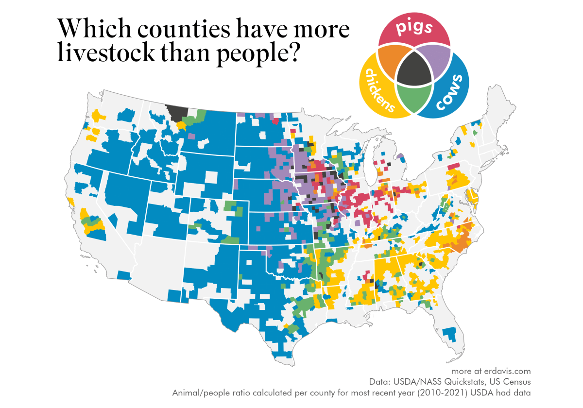
And now a fun thing. Have you ever wondered if there are more people than livestock in your area or vice versa? Well, anyway, now you can find that out!
Erin Davis used data from the Quick Stats database of the United States Department of Agriculture’s National Agricultural Statistics Service (USDA NASS) to compare the size of the livestock and human populations across the country. The series of maps she created on this topic begins with a multivariate map that displays counties with more animals than people. The awesome Venn diagram-like legend explains which colors stand for the prevalence of cows, pigs, chickens, and combinations thereof. The last map shows the most widespread type of livestock in each county. The other maps compare people with individual species.
Look at the maps on the Data Stuff blog by Erin Davis.
***
Stay tuned for Data Visualization Weekly where we showcase the most interesting data visualization and visual storytelling works for your inspiration! Follow us on LinkedIn, Facebook, Twitter, and Medium!
- Categories: Data Visualization Weekly
- No Comments »