 If you are into data visualization, one of the things that you might often need to do is represent a variable’s values over time. Or, you might need to compare multiple datasets in terms of how they are changing during a certain period. This is where area charts can be helpful.
Not sure how to build an elegant area chart? Now you will master a really easy way! In this step-by-step tutorial, we will be visualizing data on the military budgets of the USA and Russia over the past two decades in interactive area charts using JavaScript. All aboard!
What Is an Area Chart?
An area chart is a graphical representation of data that shows how numeric values of one or more datasets change relative to a second variable, which is typically the time.
The area chart type was introduced by William Playfair in 1786, who is also credited for the invention of line, bar, and pie charts. It consists of a line with the underlying area filled with a color. In multi-series area graphs, as you can imagine, there are several lines with shaded areas.
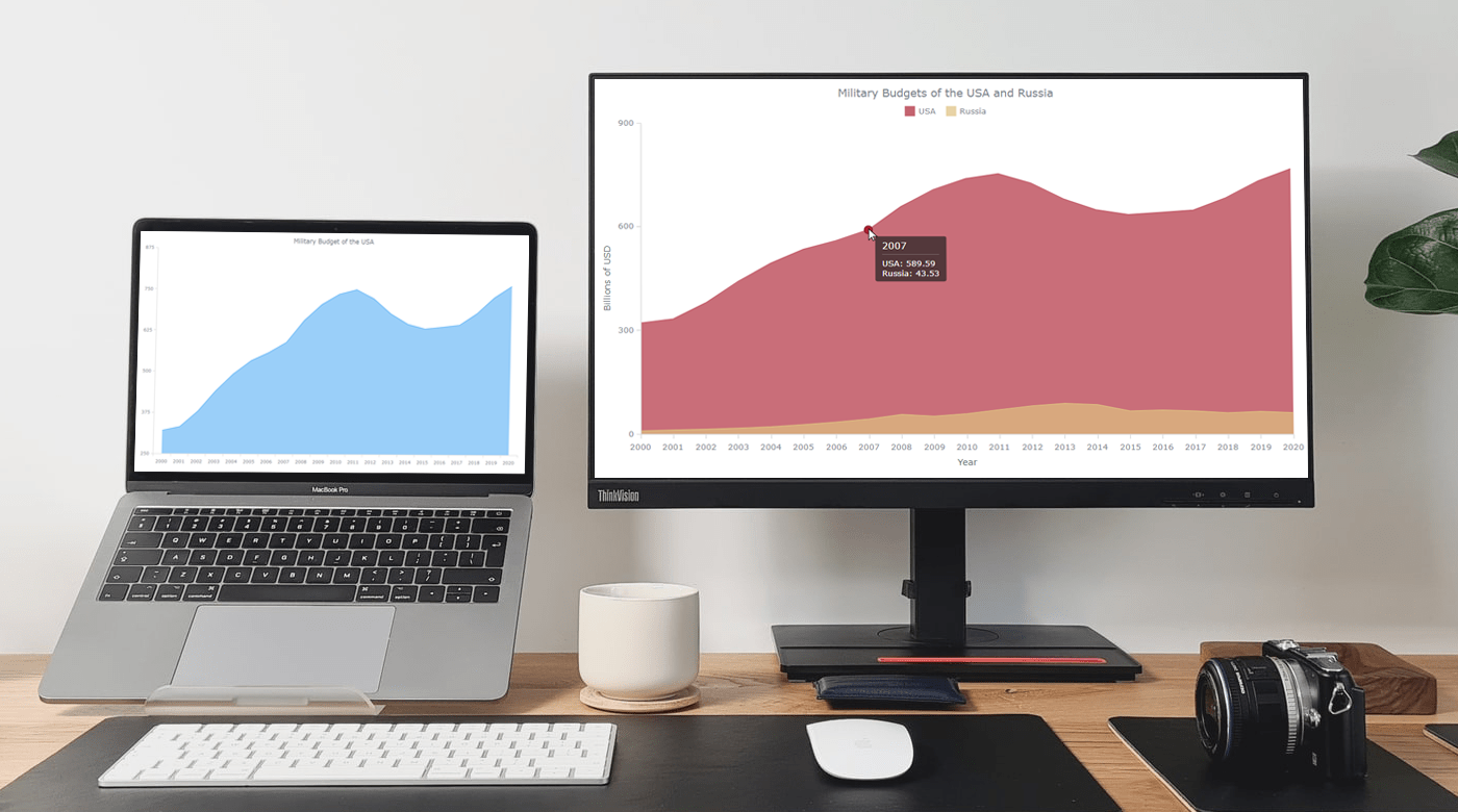
Area Chart That Will Be Created
In this tutorial, first, we will plot the military budget of the United States of America from the year 2000 to 2020. Then, we’ll turn that single-series JS area chart into a multi-series by adding the same kind of data for the Russian Federation.
Check out how the final JavaScript-based area chart will look, showing how many billions of dollars the two countries spent for defense purposes over the past two decades:
How to Build a Basic JS Area Chart
Building an interactive area chart from scratch might be intimidating and time-consuming. But there are quite a few helpful JavaScript charting libraries that can be helpful. Actually, no matter exactly which one you use, the entire process of creating any JS-based chart, including our area graph, can be split into four fundamental steps:
- Create a basic web page in HTML.
- Add the required JavaScript files.
- Load the data.
- Write some JavaScript code to draw the chart.
For an illustrative example in this tutorial, I opted for AnyChart. This JavaScript library looks not difficult to get started with as there are quite thorough documentation and many examples, and it’s free for any non-commercial use.
Although it’s not necessary, some background knowledge of HTML, CSS, and JavaScript would help to understand the concepts faster. But no need to worry even if you are a complete beginner. We will go through each step in detail, and by the end of this tutorial, you will have learned to build a JS area chart even if you are a novice with limited coding experience.
1. Create a basic web page in HTML
The first thing we need to do is create a basic HTML page for our area chart. We give it the title of “JavaScript Area Chart.”
On this page, we add an HTML block element, <div>. We give it a unique id attribute of “container” so that we can reference it later in the code.
We also add some CSS rules in the <style> block to display our chart over the entire screen and define the width and height properties as 100% and margin and padding as 0. Feel free to define all that as per your need.
<!DOCTYPE html>
<html lang="en">
  <head>
    <meta charset="utf-8">
    <title>JavaScript Area Chart</title>
    <style type="text/css">
      html, body, #container {
        width: 100%;
        height: 100%;
        margin: 0;
        padding: 0;
      }
    </style>
  </head>
  <body>
    <div id="container"></div>
  </body>
</html>
2. Add the required JavaScript files
Next, we need to add the JavaScript files of the charting library in the <head> section. We can either download them locally or use a CDN (Content Delivery Network).
For this tutorial, let’s add the necessary script files from AnyChart CDN. AnyChart has a modular structure which makes it easy to only connect the chart types and features that we require at the moment, reducing the size of the running JavaScript code.
For the area chart type, for example, we can include just one Base module.
Our HTML can now look something like this.
<!DOCTYPE html>
<html lang="en">
  <head>
    <meta charset="utf-8">
    <title>JavaScript Area Chart</title>
    <script src="https://cdn.anychart.com/releases/8.11.0/js/anychart-base.min.js"></script>
    <style type="text/css">
      html, body, #container {
        width: 100%;
        height: 100%;
        margin: 0;
        padding: 0;
      }
    </style>
  </head>
  <body>
    <div id="container"></div>
  </body>
</html>
3. Load the data
As previously stated, we will visualize the military budget data and start with a JavaScript area chart for the United States. I found an appropriate dataset on Statista.
In order to properly load the data into our chart, we create an array, where each element of the array consists of two elements. The first one is the year, and the second one is the military budget of the USA in billion dollars.
For example, in the year 2000, the military budget of the USA was 320.09 billion dollars. So, our first array becomes ["2000", 320.09].
var dataSet = [
  ["2000", 320.09],
  ["2001", 331.81],
  ["2002", 378.46],
  ["2003", 440.53],
  ["2004", 493],
  ["2005", 533.2],
  ["2006", 558.34],
  ["2007", 589.59],
  ["2008", 656.76],
  ["2009", 705.92],
  ["2010", 738.01],
  ["2011", 752.29],
  ["2012", 725.21],
  ["2013", 679.23],
  ["2014", 647.79],
  ["2015", 633.83],
  ["2016", 639.86],
  ["2017", 646.75],
  ["2018", 682.49],
  ["2019", 731.75],
  ["2020", 766.58]
];
4. Write some JavaScript code to draw the chart
Now, just a few lines of JavaScript code to get our area chat up and running.
The first thing we do here is add the anychart.onDocumentReady() function, which will enclose the whole JavaScript code of the area chart. This ensures that the code will not be executed till the page is fully loaded.
<script>

  anychart.onDocumentReady(function () {
    // The area chart's code will be written here.
  });

</script>
Next, we add our data from Step 3.
anychart.onDocumentReady(function () {

var dataSet = [
["2000", 320.09],
["2001", 331.81],
["2002", 378.46],
["2003", 440.53],
["2004", 493],
["2005", 533.2],
["2006", 558.34],
["2007", 589.59],
["2008", 656.76],
["2009", 705.92],
["2010", 738.01],
["2011", 752.29],
["2012", 725.21],
["2013", 679.23],
["2014", 647.79],
["2015", 633.83],
["2016", 639.86],
["2017", 646.75],
["2018", 682.49],
["2019", 731.75],
["2020", 766.58]
];

});

</script>
Then, we create our chart specifying the chart type as “area” and add the data.
var chart = anychart.area();
chart.data(dataSet);
Finally, we add a title, put the chart in the previously defined <div> container, and display it using the draw command.
chart.title("Military Budget of the USA");
chart.container("container");
chart.draw();
Eureka! Our area chart is ready.
The interactive version of this basic JavaScript area chart with the full code can be found on AnyChart Playground. Feel free to play around with it.
For your convenience, I put up the full code below.
<!DOCTYPE html>
<html lang="en">
  <head>
    <meta charset="utf-8">
    <title>JavaScript Area Chart</title>
    <script src="https://cdn.anychart.com/releases/8.11.0/js/anychart-base.min.js"></script>
    <style type="text/css">
      html, body, #container {
        width: 100%;
        height: 100%;
        margin: 0;
        padding: 0;
      }
    </style>
  </head>
  <body>
    <div id="container"></div>
    <script>

      anychart.onDocumentReady(function () {

        // add the data as an array
        var dataSet = [
          ["2000", 320.09],
          ["2001", 331.81],
          ["2002", 378.46],
          ["2003", 440.53],
          ["2004", 493],
          ["2005", 533.2],
          ["2006", 558.34],
          ["2007", 589.59],
          ["2008", 656.76],
          ["2009", 705.92],
          ["2010", 738.01],
          ["2011", 752.29],
          ["2012", 725.21],
          ["2013", 679.23],
          ["2014", 647.79],
          ["2015", 633.83],
          ["2016", 639.86],
          ["2017", 646.75],
          ["2018", 682.49],
          ["2019", 731.75],
          ["2020", 766.58]

        ];

        // create an area chart
        var chart= anychart.area();

        // set the chart title
        chart.title("Military Budget of the USA");

        // set the container id for the chart
        chart.container("container");

        // initiate drawing the chart
        chart.draw();

      });

    </script>

  </body>
</html>
Actually, this is just a basic, single-series version of an area chart. Now, let’s add a second series.
How to Create a Multi-Series JS Area Chart
Building a multi-series area chart with JavaScript is also not a big deal. For us, it will take only three simple steps to turn our single-series area chart into a multi-series one.
A. Add the data
First, let’s add the data for Russia’s military budget to our array. Again, we are using the dataset from Statista. Now, each line will consist of three elements: the year, the value for the USA, and the value for Russia.
For example, in the year 2000, the military budgets of the USA and Russia were 320.09 and 9.23 billion dollars, respectively. So, our first array becomes ["2000", 320.09, 9.23].
var dataSet = [
  ["2000", 320.09, 9.23],
  ["2001", 331.81, 11.68],
  ["2002", 378.46, 13.94],
  ["2003", 440.53, 16.97],
  ["2004", 493, 20.96],
  ["2005", 533.2, 27.34],
  ["2006", 558.34, 34.52],
  ["2007", 589.59, 43.53],
  ["2008", 656.76, 56.18],
  ["2009", 705.92, 51.53],
  ["2010", 738.01, 58.72],
  ["2011", 752.29, 70.24],
  ["2012", 725.21, 81.47],
  ["2013", 679.23, 88.35],
  ["2014", 647.79, 84.7],
  ["2015", 633.83, 66.42],
  ["2016", 639.86, 69.25],
  ["2017", 646.75, 66.53],
  ["2018", 682.49, 61.39],
  ["2019", 731.75, 65.1],
  ["2020", 766.58, 61.71]
];
B. Map the data
Second, let’s make use of the handy Data Sets feature of AnyChart: We will create a dataset from the data and then map it for each series:
var chart = anychart.area();

var seriesData_1 = budgetData.mapAs({ x: 0, value: 1 });
var seriesData_2 = budgetData.mapAs({ x: 0, value: 2 });
C. Configure the series
Finally, we create the series with the mapped data and also give them names.
var series1= chart.area(seriesData_1);
series1.name("USA");
var series2= chart.area(seriesData_2);
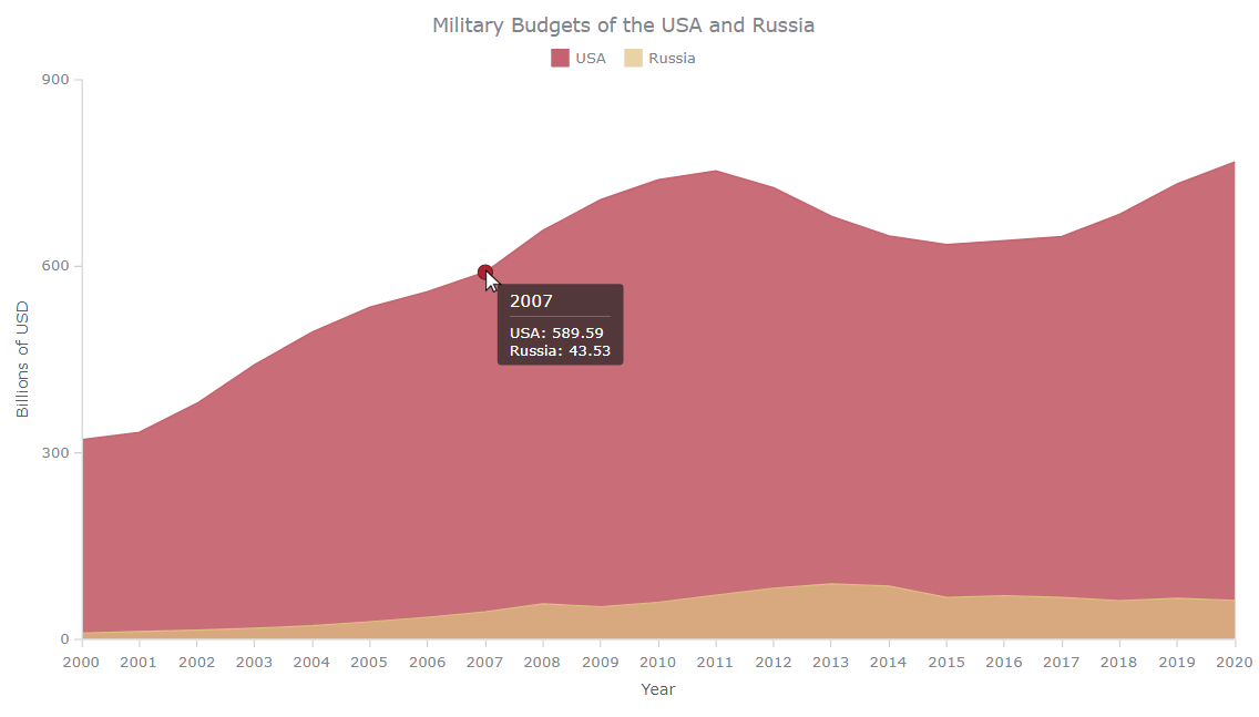
series2.name("Russia");That’s it, a cool JavaScript-based multi-series area chart is ready, providing an over-time view of the military budget of the USA along with Russia’s on the same plot.
Explore its full code on AnyChart Playground.
Our area chart is already looking good. But sometimes, good is not enough. And, there are times when you might need to tweak the functionalities and aesthetics of a chart. So now, let’s do more and see how you can customize such graphs to make them look even better.
How to Customize a JavaScript Area Chart
Luckily the JavaScript charts powered by AnyChart can be modified to suit your needs and preferences very easily.
I will show you how to do a few quick customizations to enhance our chart: fine-tune the X-scale, add a crosshair, change the color of areas, add a legend and axes titles, and configure the hover mode.
Fine-tune the X-scale
It will be great to begin with one quick adjustment — get rid of the gaps to the right and left of the area. We simply set the “continuous” mode for the X-scale.
chart.xScale().mode('continuous');Add a crosshair
Crosshairs are helpful in quickly understanding the X and Y values of a hovered data point. In our case, let’s leave a vertical crosshair line only.
var crosshair = chart.crosshair();
crosshair.enabled(true)
  .yStroke(null)
  .xStroke('#fff');
crosshair.yLabel().enabled(false);
Just a few lines of JS code, and there is our crosshair, which makes the area chart more aesthetic.
Change the color of areas
According to a study I remember, every four people in a group of ten have blue as their favorite color. But it doesn’t mean that we are going to leave the color of our chart as is, which is blue by default.
Let’s paint the USA series in red color and the Russia one in brown.
series1.fill("#AC2132", 0.7);
  .stroke("#AC2132", 1);

series2.fill("#DEC081", 0.7)
  .stroke("#DEC081", 1);
Here, we’ve added the fill and stroke methods to change the colors of our area chart. There are also many other appearance settings that can be applied to different states of your visualization.
The interactive version of this area chart is available on AnyChart Playground. Feel free to change the colors and see: “Butterfly, butterfly, which color do you like?”
Add a legend and axes titles
We can add a legend for our JavaScript area chart with a single line of code.
chart.legend(true);Similarly, we can easily provide the axes with titles. In our chart, there are years on the X-axis, and on the Y-axis, there are the military budget figures in billion dollars.
chart.xAxis().title("Year");
chart.yAxis().title("Billions of USD");
This is how our JS-based area chart looks now, with the legend and axes titles.
Configure the hover mode
Currently, when we hover over the chart, both series’ data points for the corresponding year are highlighted with a marker. But what if we want to separate them?
Let’s enable the “single” hover mode, and then when you hover over on an area, only markers on that particular series will be shown.
chart.interactivity().hoverMode("single");While we are in the “single” hover mode, the crosshair doesn’t make much sense. So, for configuring the hover mode, we can either remove or comment out the code that we wrote in the “Add a crosshair” section of this tutorial.
Check out the whole code of this final interactive JavaScript area chart below, and also on AnyChart Playground. Feel free to try some experimentation with it.
<!DOCTYPE html>
<html lang="en">
  <head>
    <meta charset="utf-8">
    <title>JavaScript Area Chart</title>
    <script src="https://cdn.anychart.com/releases/8.11.0/js/anychart-core.min.js"></script>
  <script src="https://cdn.anychart.com/releases/8.11.0/js/anychart-cartesian.min.js"></script>
    <style type="text/css">
      html, body, #container {
        width: 100%;
        height: 100%;
        margin: 0;
        padding: 0;
      }
    </style>
  </head>
  <body>
    <div id="container"></div>
    <script>

      anychart.onDocumentReady(function () {

        // add the data as an array
        var dataSet = [
          ["2000", 320.09, 9.23],
          ["2001", 331.81, 11.68],
          ["2002", 378.46, 13.94],
          ["2003", 440.53, 16.97],
          ["2004", 493, 20.96],
          ["2005", 533.2, 27.34],
          ["2006", 558.34, 34.52],
          ["2007", 589.59, 43.53],
          ["2008", 656.76, 56.18],
          ["2009", 705.92, 51.53],
          ["2010", 738.01, 58.72],
          ["2011", 752.29, 70.24],
          ["2012", 725.21, 81.47],
          ["2013", 679.23, 88.35],
          ["2014", 647.79, 84.7],
          ["2015", 633.83, 66.42],
          ["2016", 639.86, 69.25],
          ["2017", 646.75, 66.53],
          ["2018", 682.49, 61.39],
          ["2019", 731.75, 65.1],
          ["2020", 766.58, 61.71]
        ];

        // create an area chart
        var chart= anychart.area();

        // create a dataset for mapping
        var budgetData = anychart.data.set(dataSet);

        // map the data
        var seriesData_1 = budgetData.mapAs({ x: 0, value: 1 });
        var seriesData_2 = budgetData.mapAs({ x: 0, value: 2 });

        // create the first series, set the data and name
        var series1= chart.area(seriesData_1);
        series1.name("USA");

        // create the second series, set the data and name
        var series2= chart.area(seriesData_2);
        series2.name("Russia");

        // set the chart title
        chart.title("Military Budget of the USA and Russia");

        // add and configure the crosshair
        // var crosshair = chart.crosshair();
        // crosshair.enabled(true)
        //   .yStroke(null)
        //   .xStroke('#fff');
        // crosshair.yLabel().enabled(false);

        // configure the visual settings of the first series
        series1.fill("#AC2132", 0.7);
          .stroke("#AC2132", 1);

        // configure the visual settings of the second series
        series2.fill("#DEC081", 0.7)
          .stroke("#DEC081", 1);

        // add the legend
        chart.legend(true);

        // set the titles of the axes
        chart.xAxis().title("Year");
        chart.yAxis().title("Billions of US $");

        // set the hover mode as single
        chart.interactivity().hoverMode("single");

        // set the container id for the chart
        chart.container("container");

        // initiate drawing the chart
        chart.draw();

      });

    </script>
  </body>
</html>
Conclusion
Awesome! We have built our JavaScript area chart. And the process has been simple, hasn’t it? Go ahead and build your own JS-based area chart visualization.
Please don’t hesitate to look at the area chart documentation, and there are tons of other chart types that you might like to check out.
At last, feel free to ask me any questions or drop a suggestion. Can’t wait to see the JavaScript area chart you will build.
Published with the permission of Awan Shrestha. Originally appeared on Level Up Coding with the title “Building Area Charts with JavaScript” on May 10, 2022.
You may also like to check out our own basic JavaScript Area Chart Tutorial.
See more JavaScript charting tutorials.
Let us know if you want to contribute an awesome guest post.
- Categories: AnyChart charting component, HTML5, JavaScript, JavaScript chart tutorials, Tips and tricks
- No Comments »