AnyChart Recognized in Top 10 Business Intelligence and Analytics Companies of 2019
November 19th, 2019 by AnyChart Team We are excited to announce that Analytics Insight, a magazine that covers big data and business intelligence developments, included AnyChart in The 10 Next Generation BI and Analytics Companies of 2019 — “for providing the most advanced solutions and playing a significant role in shaping the future of these disruptive technologies.”
The list has been made public in the just-released November issue of the magazine and is accompanied by the stories about each featured company. With permission of Analytics Insight, today we are republishing the magazine’s story about us on our blog — “AnyChart: Turning Data into Actionable Insights with Award-Winning Data Visualization Solutions.”
Read the story of AnyChart as it appeared on Analytics Insight »
- Categories: AnyChart charting component, AnyGantt, AnyMap, AnyStock, Big Data, Business Intelligence, Charts and Art, Dashboards, Financial charts, Flash platform, Gantt Chart, GraphicsJS, HTML5, Interesting Facts, JavaScript, News, Success stories
- No Comments »
JavaScript Donut Charts: No Problems with Hole Size
April 22nd, 2016 by Margaret SkomorokhHow was the science of data visualization born? Maybe like this:
")
Sally L. Steinberg Collection of Doughnut Ephemera, Archives Center, National Museum of American History
We have no idea what it is and who it is, but this image is a part of Sally L. Steinberg Collection of Doughnut Ephemera of the Smithsonian Institution. You can read about the collection here and here. It includes a lot of nice pieces like this vintage donut-related infographic:
")
Sally L. Steinberg Collection of Doughnut Ephemera, Archives Center, National Museum of American History
So, does the mysterious chart tell the truth? Has donut hole size really shrunk over the years? It seems that this question is of great public interest! It is thoroughly discussed in this article on Vox.com: Have donut holes gotten smaller? There is also a fierce discussion on Reddit, where one of the participants wisely notes that “1927 was a sad time to be alive”.
However, our customers should not worry: when you work with AnyChart JavaScript donut charts, you can easily configure the size of the hole! Visit our Gallery to see some samples of our donut charts.
With AnyChart, you can create highly customized interactive donut charts like this one:

This chart was used in our Investment Portfolio Dashboard – we wrote about it earlier: Investment Portfolio Dashboard by AnyChart Charting Framework.
Stay tuned, we have something to say about pie charts too!
- Categories: AnyChart charting component, Charts and Art, HTML5, Humor, Interesting Facts, JavaScript
- 1 Comment »
First Ever Area Charts Created 200+ Years Ago
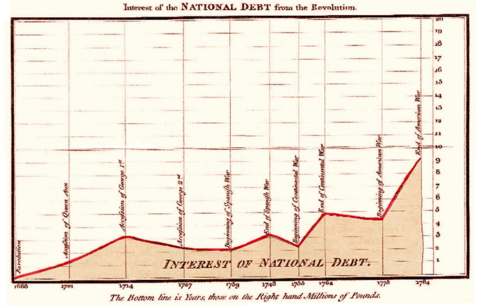
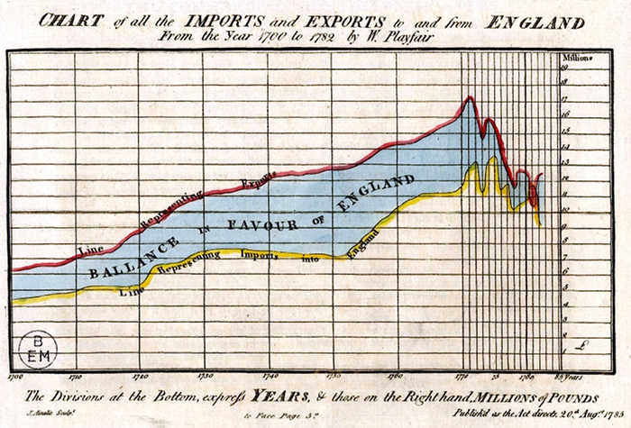
December 23rd, 2015 by AnyChart TeamScottish engineer and political economist William Playfair is credited with inventing not only the bar chart but also the area charts.
Generally speaking, Playfair’s publication The Commercial and Political Atlas, first appeared in 1786, contained many interesting time-series graphs. The following two of them are more particularly mentioned today as the first area charts in history.
1. Interest of the National Debt from the Revolution. Single-series.
2. Chart of all the Imports and Exports to and from England from the Year 1700 to 1782, originally dated August 20th, 1785. This chart can also be treated as at least one of the first multi-series area charts. The area between two curves shows the difference between them and is a great visual representation of the balance of trade.
- Categories: Interesting Facts
- 3 Comments »
First Ever Bar Charts Created in 14th Century
June 2nd, 2015 by AnyChart TeamSeveral experts and sources say William Playfair deserves credit for the development of the first bar chart in 1786. However, this statement appears to be misleading, or if not wrong, at least just a part of the truth.
If we get down to the bare facts, one of the greatest thinkers and scientists of the Middle Ages, Nicole Oresme, used a bar chart more than 300 years before Playfair, in his publication titled The Latitude of Forms (14th century). Oresme decided to plot velocity of a constantly accelerating object against time, and here is what he drew:
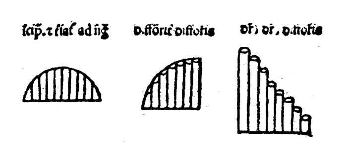
These were the first bar charts in history!
- Categories: Interesting Facts
- 3 Comments »