Deluxe Combo Chart & Versatile Circular Gauge for Qlik Sense
January 24th, 2023 by AnyChart Team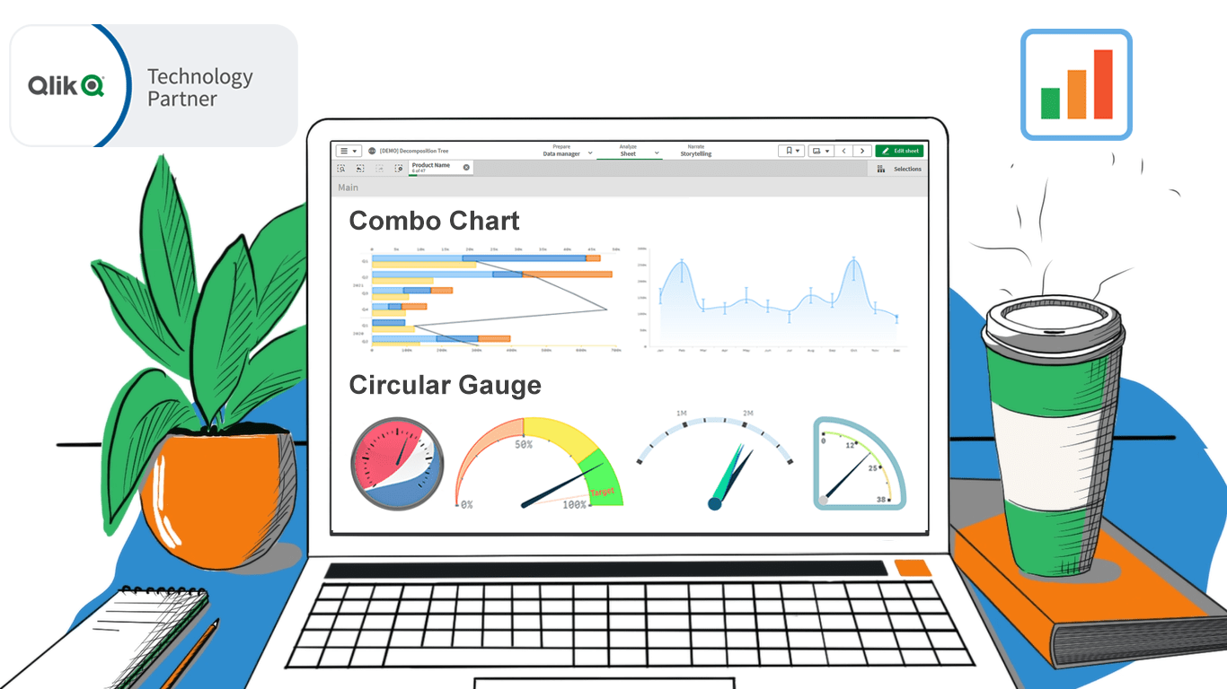 In addition to the Decomposition Tree and new Gantt Chart features, we are excited to release two astonishing extensions. Enjoy making sense of your metrics using the brand new approaches you never had in Qlik before — with our Deluxe Combo Chart and Versatile Circular Gauge for Qlik Sense!
Now, join us for a quick overview of these novel extensions and check them out right away!
Read more at qlik.anychart.com »
- Categories: AnyChart charting component, Big Data, Business Intelligence, Dashboards, News, Qlik
- No Comments »
New Progress Tracking Features for Gantt Charts in Qlik Sense
January 24th, 2023 by AnyChart Team![]() Tracking project progress using Gantt charts in Qlik Sense has become even easier with the latest update of our dedicated extension! Learn about the just-released features and improvements. Then update to the newest version of AnyGantt for Qlik and check them out in action!
Tracking project progress using Gantt charts in Qlik Sense has become even easier with the latest update of our dedicated extension! Learn about the just-released features and improvements. Then update to the newest version of AnyGantt for Qlik and check them out in action!
Read more at qlik.anychart.com »
- Categories: AnyChart charting component, AnyGantt, Big Data, Business Intelligence, Dashboards, Gantt Chart, News, Qlik
- No Comments »
COVID-19 Risk Assessment App Pandemonium Uses AnyChart for Data Visualization
January 26th, 2022 by AnyChart Team We continue to support initiatives addressing the pandemic crisis by providing them with a full-featured free license for any of our data visualization tools. Today we are honored to be among the first to talk about a new project that joined this program, an innovative COVID-19 risk assessment app and framework called Pandemonium where all charts and maps are powered by AnyChart.
Built by Quantum Risk Analytics, Inc., a charitable nonprofit founded by MIT alumni, Pandemonium uses sophisticated machine learning algorithms to more accurately model the disease spread and provide a highly personalized evaluation of infection risks. It’s not yet publicly launched as the developers want to add a few more major features and data sources before the official release. But the app is already in the testing phase that the team encourages anyone to join.
We asked Richard Hamlin, CEO at Quantum Risk Analytics, Inc., to tell us more about Pandemonium, how it works, and how our data visualization solutions are used. Read on to know all the details.
- Categories: AnyChart charting component, AnyMap, Big Data, Dashboards, HTML5, JavaScript, Success stories
- No Comments »
Cesefor Uses AnyChart to Visualize Forestry Data in Nemus System
August 31st, 2021 by AnyChart Team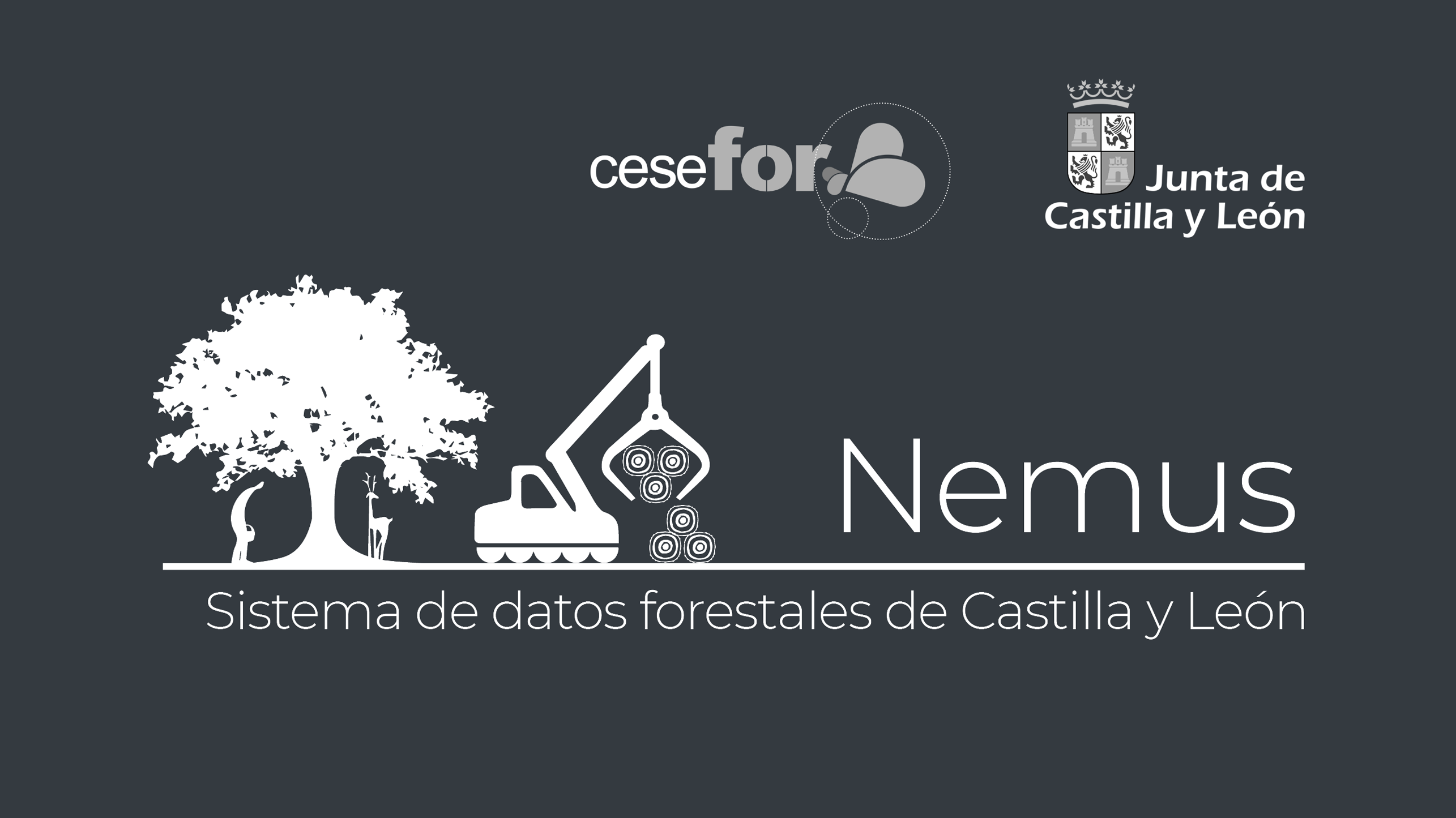 Many thousands of developers worldwide use our solutions for interactive data visualization. So it is hardly surprising to come across a graphic powered by AnyChart here or there. Some projects, however, deserve a showcase. Such a new interesting one demonstrating great use of AnyChart has recently come to our notice and we are happy to let you know about it.
A Spanish nonprofit, Cesefor used our JavaScript charting library to visualize forestry data for the Spanish region of Castile and León in a whole lot of different charts and maps, aiming to make relevant insights easily accessible and actionable for sustainability.
The project is called Nemus. Shh, it is still in beta, not yet officially launched. But Rodrigo Gómez Conejo, Head of ICT and Knowledge Management Area at Cesefor, allowed us to let you in and even gave us a brief interview disclosing some peculiar details about the system and how AnyChart is employed — check it out below. (Stack: jQuery/CodeIgniter/PostgreSQL.)
- Categories: AnyChart charting component, AnyMap, Big Data, Dashboards, HTML5, JavaScript, Success stories
- No Comments »
AnyChart JS 8.10.0 Released with Circle Packing & Calendar Charts, Waterfall Arrows, Marker Series in Surface Chart
May 24th, 2021 by AnyChart Team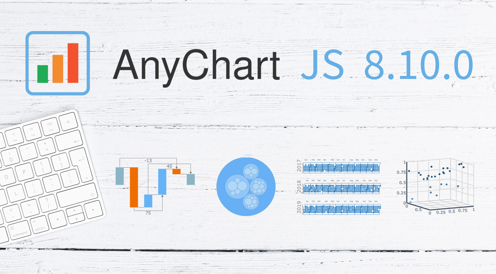 A new version of our JavaScript charting library is now out with a bunch of super wow updates! First, we’ve added two new chart types: Circle Packing and Calendar. Second, now you are more than welcome to make use of the pre-built Arrow Connectors in Waterfall Charts and Marker Series in 3D Surface Charts. Keep reading to learn more about the key new arrivals in AnyChart JS 8.10.0, and enjoy these just-added charts and features in our powerful data visualization tool!
»»» See What’s New in AnyChart 8.10.0! «««
- Categories: AnyChart charting component, Big Data, Business Intelligence, Dashboards, HTML5, JavaScript, News
- No Comments »
Data Visualization for COVID-19 Dashboard Tracker Using AnyChart JS Charts
April 12th, 2021 by AnyChart Team![]() Data visualization has played an important role during the COVID-19 pandemic, allowing governments, scientists, healthcare professionals, and the general public to better understand different aspects of the crisis. There are many illuminating projects all over the web that leverage charts and maps to effectively communicate what the coronavirus statistics have to say. Some of them are using our data visualization tools under a free license provided as part of the special initiative we announced last spring to support the global COVID-19 data analysis effort.
Data visualization has played an important role during the COVID-19 pandemic, allowing governments, scientists, healthcare professionals, and the general public to better understand different aspects of the crisis. There are many illuminating projects all over the web that leverage charts and maps to effectively communicate what the coronavirus statistics have to say. Some of them are using our data visualization tools under a free license provided as part of the special initiative we announced last spring to support the global COVID-19 data analysis effort.
We told you about two examples of such projects earlier: StopCorona and iConcepts SARS-CoV-2 Stats. Now let us introduce you to another interesting resource — COVID-19 Dashboard Tracker by Maxime des Touches. Launched more than a year ago, while Maxime was yet a computer science student, it has turned from a simple online data table into a complex interactive data visualization project offering up-to-date insight into how the pandemic unfolds in France and worldwide.
Maxime kindly agreed to talk to us about his COVID-19 tracker, experience using AnyChart, and the pandemic in general. Check out our quick interview, glance at a few screenshots, and try his open-source dashboard by yourself. (Stack: HTML/jQuery/JSON.)
- Categories: AnyChart charting component, AnyStock, Big Data, Dashboards, HTML5, JavaScript, Stock charts, Success stories
- No Comments »
New JavaScript Chart Features in AnyChart 8.9.0
September 29th, 2020 by AnyChart Team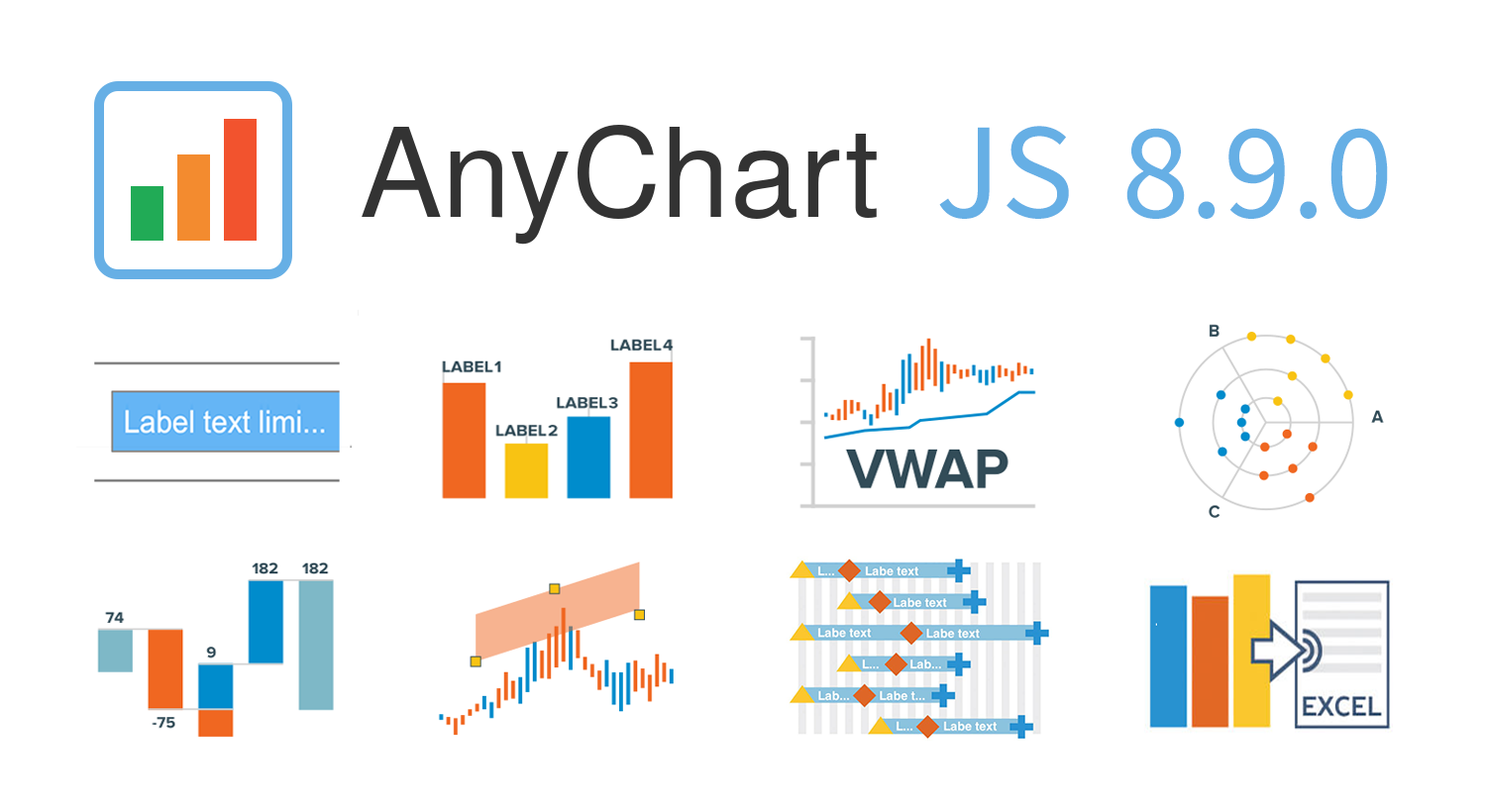 AnyChart 8.9.0 is out! The latest major update brings new exciting out-of-the-box features to our award-winning JavaScript charting library product family — AnyChart, AnyStock, AnyGantt, and AnyMap. Enjoy the improved functionality and build even more compelling data visualizations for your web sites and apps in less time!
»»» See What’s New in AnyChart 8.9.0! «««
- Categories: AnyChart charting component, AnyGantt, AnyMap, AnyStock, Big Data, Business Intelligence, Dashboards, Financial charts, Gantt Chart, HTML5, JavaScript, News, Stock charts
- 2 Comments »
JavaScript Charting Library 8.8.0 Released with New Exciting Data Viz Features
May 22nd, 2020 by AnyChart Team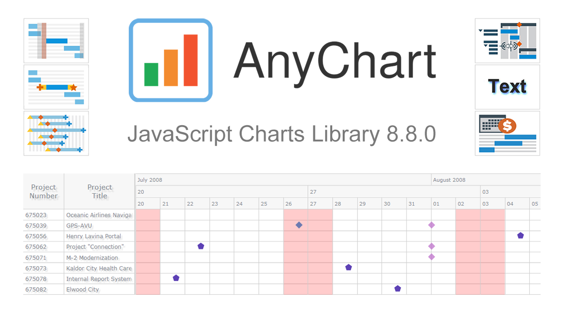 We’ve just updated our JavaScript charting library with new exciting features and improvements! In the 8.8.0 release of AnyChart JS, the focus is put on enhancements for Gantt charts. They will be helpful in making your project and resource data visualizations even more insightful with ease. We’ve also upgraded basic and time-series charts as well as maps. Below is an overview of the new key arrivals. Be sure to check it out, download the updated builds, and enjoy!
»»» See What’s New in AnyChart 8.8.0! «««
- Categories: AnyChart charting component, AnyGantt, AnyMap, AnyStock, Big Data, Business Intelligence, Dashboards, Financial charts, Gantt Chart, HTML5, JavaScript, News, Stock charts
- 1 Comment »
COVID Tracker StopCorona.info Adds AnyChart JS Charts to Visualize Coronavirus Statistics
May 18th, 2020 by AnyChart Team![]() COVID tracker StopCorona.info is using our JavaScript data visualization library to display up-to-date coronavirus statistics in compelling and insightful charts. (Read our interview with its creator to learn how.)
COVID tracker StopCorona.info is using our JavaScript data visualization library to display up-to-date coronavirus statistics in compelling and insightful charts. (Read our interview with its creator to learn how.)
COVID-19 is a global emergency and the fight against it requires a joint effort. We at AnyChart cannot stay aside, too. With a lot of pandemic data out there, from numerous sources and with constant updates, it’s difficult to keep up with how the situation unfolds, let alone making sense of all relevant information in due course. But this is exactly where we can help, with our established charting solutions that can visualize any data on the fly.
We thought you should know we’re ready to give a full-featured non-profit license to all initiatives aiming to tackle the novel coronavirus outbreak. Moreover, we’ve already allowed one project – StopCorona.info – to use our JavaScript charting library for free.
Developed as a not-for-profit initiative by Diffco, a top Silicon Valley app development company, StopCorona is designed to bring transparency to the pandemic situation worldwide. To achieve that, it collects COVID-19 statistics from more than 20 reliable public open data sources, including WHO, CDC, ECDC, CCDC, and NHC to name a few. Now this enormous (and ever-expanding) set of coronavirus data is graphically represented in an analyst-friendly interface powered by AnyChart JS Charts.
As a global leader of data visualization and reporting tools, we at AnyChart were more than happy to support StopCorona by letting them use our award-winning JS charting library absolutely free, under a full-featured non-profit license.
If you guys are building a useful resource for COVID-19 data analytics, try AnyChart and apply for a free license, too. We will gladly provide you with complimentary access to our flexible data visualization solutions. In this way you will get the industry’s best charts for the web or mobile fully at your service, empowering your website visitors or app users to make sense of the myriad COVID numbers at a glance, with great ease.
- Categories: AnyChart charting component, AnyStock, Big Data, Business Intelligence, Dashboards, HTML5, JavaScript, Success stories
- 5 Comments »
AnyGantt Extension NOW Available in Qlik Sense Cloud Edition! [+ How-to-Install Video]
March 12th, 2020 by AnyChart Team Great news for Qlik users! AnyGantt Extension for Qlik Sense is now available in the cloud!
As of February 2020, customers using Qlik Sense in the cloud can benefit from 3rd party extensions such as those by AnyChart, a trusted Qlik Technology Partner.
Read more at qlik.anychart.com »
- Categories: AnyChart charting component, AnyGantt, Big Data, Business Intelligence, Dashboards, Gantt Chart, News, Qlik
- No Comments »