Choose Right Chart Type for Data Visualization. Part 7: Geovisualization with Maps (Geo-Related Data)
May 24th, 2017 by AnyChart Team Geovisualization and map-based analysis of geo-data sets related to given territories or spatial environments can provide significant insight into trends and assist greatly in exploring and associating the impacts of variables. Nowadays, maps are used for data visualization very frequently, both as standalone geovisualizations and part of complex dashboards.
In this new article within the framework of our Choose Right Chart Type for Data Visualization series, we’ll write about map charts and explain how (when) to properly use each of corresponding types.
- Categories: Choosing Chart Type, Tips and tricks
- No Comments »
Choose Right Chart Type for Data Visualization. Part 6: Resource/Project Management
May 17th, 2017 by AnyChart Team Achieving and maintaining effective Project Management is one of the most important challenges for every company. And high-quality visualization of resource usage and activity processes is a great tool for significantly improving the overall performance of a project. Keeping that in mind, we cannot omit the information on how to properly represent projects and resource data.
Read this article to learn what (specific) chart types you can choose to use in such cases.
- Categories: Choosing Chart Type, Tips and tricks
- 1 Comment »
Choose Right Chart Type for Data Visualization. Part 5: Single-Value Data (Indicators)
May 10th, 2017 by AnyChart Team In the previous articles from the Choose Chart Type for Data Visualization series, we covered the ways to visually represent information for data comparison, composition and distribution analysis, and observing trends over time. The current post sheds light on a situation when you only have Single-Value Data that can serve as Indicators of the current performance. In this quite widespread case, plotting each value on a separate chart often makes sense. That is where Gauges and Bullet charts come into play.
- Categories: Choosing Chart Type, Tips and tricks
- No Comments »
Choose Right Chart Type for Data Visualization. Part 4: Data Distribution
May 4th, 2017 by AnyChart Team Displaying and researching some Data Distribution and relationship between data sets instead of studying precise values in each category is a quite common task in data analysis. It can be solved with the help of the chart types that we are going to identify and explain in this article.
Depending on a situation – the kind of data you have and the specific questions you’d like it to provide answers to – you can pick one approach or another. Just be careful when choosing between one chart type and another for the subsequent data distribution analysis. You want the visualization to clarify data, not obscure it or deliver any sort of confusion. Well, simply make sure you understand the following aspects, mind all the details of your situation, and you will have no problem with visualizing data distribution correctly.
- Categories: Choosing Chart Type, Tips and tricks
- 1 Comment »
Choose Right Chart Type for Data Visualization. Part 3: Data Over Time (Trend Context)
April 26th, 2017 by AnyChart Team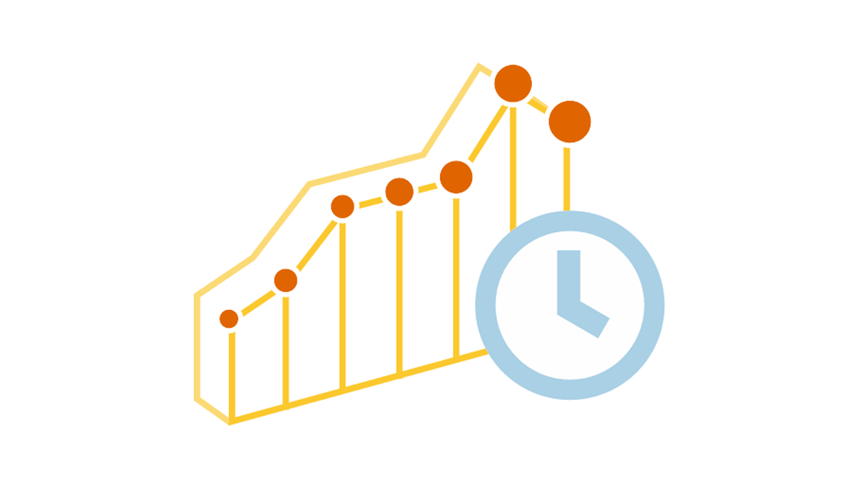 We are continuing the effort to better familiarize you with the world of chart types. This time let’s talk about good ways to visualize and explore Data Over Time.
Watching the change in data over time helps identify trends and dynamics in diverse timeline-based sets of values. Needless to say, choosing a right chart type is very important here. When applying an inappropriate form of visualization to your data, you might end up with an inaccurate idea of what happened in the past, what’s taking place now, and/or what will occur in the future. But we’ll do our best to help you avoid any mistakes in this field so you always make only right decisions based on your date/time data.
So, let’s get to the gist now.
- Categories: Choosing Chart Type, Tips and tricks
- No Comments »
Choose Right Chart Type for Data Visualization. Part 2: Data Composition, Parts to Whole
April 20th, 2017 by AnyChart Team Illustrating part-to-whole relationships for further analysis is a very popular objective in data visualization. Basically, it is one of the most widespread ones, e.g. along with data comparison. With that in mind, the second part of the Choose Right Chart Type for Data Visualization series on our blog focuses on how to display Data Composition properly.
In particular, this article will show you the best ways to present the share percentages of simple values, compositional patterns in large data sets and hierarchical data (also with subordination), and stages in a process.
- Categories: Choosing Chart Type, Tips and tricks
- 1 Comment »
Choose Right Chart Type for Data Visualization. Part 1: Data Comparison
April 12th, 2017 by AnyChart Team When it comes to creating data analytics and reporting solutions, choosing the right chart type for a certain data visualization task remains a common challenge. What do you pick for data comparison, studying distribution, observing data over time, or some other purpose? It can be very tricky! To help you overcome this challenge to the best effect, today we are launching a series of articles titled Choose Right Chart Type for Data Visualization. The series is designed to quickly explain what chart types you should pick for different purposes of data analysis. With that said, each article here will be devoted to a specific, yet still big question that you want your data to answer.
The current (first) guide of the series is all about chart types that work best for finding out the differences in data: Data Comparison. In fact, it is one of the most frequently established purposes of data analytics. And sometimes many people use wrong chart types to fulfil it correctly. Now, finally, let’s get to the very point and see what visualization forms work best for comparing data.
- Categories: Choosing Chart Type, Tips and tricks
- 4 Comments »