Remembering 2023, Welcoming 2024
January 10th, 2024 by AnyChart Team Happy New Year! As the last echoes of festive celebrations fade away and we dive into the adventures of 2024, let’s bid a final farewell to 2023 by reflecting on its best moments.
For us at AnyChart, it was a remarkable year:
- Celebrated our 20th anniversary — indeed, we’ve been innovating since 2003.
- Awarded as the Best in Data Analytics & Visualization.
- Introduced more cool features and tweaks to our JavaScript charting library and other solutions.
- Launched new powerful extensions for Qlik Sense, with the Decomposition Tree taking center stage — join us in reviewing our year in the Qlik ecosystem.
- Reached some noteworthy milestones — now boasting over 80 JS charting tutorials on our blog, our Android charting library gleaming with over 2K stars on GitHub, and our social media family expanded to over 20K followers.
Looking ahead, our dedication remains unwavering: to empower your data viz and analytics journey with new and better tools. Thank you for growing with us, and cheers to your continued success, brighter and bolder in 2024!
- Categories: AnyChart charting component, AnyGantt, AnyMap, AnyStock, Big Data, Blogroll, Business Intelligence, Charts and Art, Dashboards, Financial charts, Gantt Chart, HTML5, JavaScript, News, Qlik, Stock charts
- No Comments »
Creating Dynamic Linear Gauge for Real-Time Typing Speed Test Data Visualization: Using JavaScript
August 17th, 2023 by Nick Gogin From clocks to weight scales, speedometers to thermostats, and even the battery charge icon on your phone, Gauge Charts are widely used to represent a value on a scale or range, providing a clear visual indication of the represented measurement. Gauges can be circular or linear, and in this article, our focus will be on the latter style. I will guide you on how to create a cool linear gauge using JavaScript.
Specifically, we will explore the demonstration of linear gauges using an example of a real-time typing speed test. Throughout the article, we will delve into the structure of linear gauges, discuss styling options, explore how they can be connected to data, and show how you can easily build your Linear Gauges using JavaScript in just a matter of minutes. By the end of the tutorial, you’ll have an awesome example of a linear gauge used to dynamically illustrate typing speed test results or whichever data you want.
So, let’s dive in and elevate your web-based interactive data visualization game!
Read the JS charting tutorial »
- Categories: AnyChart charting component, Big Data, Charts and Art, HTML5, JavaScript, JavaScript chart tutorials, Tips and tricks
- No Comments »
William Dibbern Uses AnyChart JS Charts to Visualize Wedding Guest Data
August 14th, 2023 by AnyChart Team The world’s leader in data visualization, AnyChart has a proven track record of empowering enterprises with robust charting solutions. However, the true essence of AnyChart lies in its versatility — it extends beyond corporate analytics, to making data meaningful in our everyday lives.
For example, meet William Dibbern, an Engineering Manager based in Chicago, who ingeniously applied our JavaScript charting library to his upcoming wedding plans, turning them into a heartfelt blend of technology and emotion.
Join us for an insightful interview with Will as we delve into his journey, exploring how he harnessed the power of AnyChart JS Charts to craft a delightful experience that celebrates love and data in a refreshingly personal way.
- Categories: AnyChart charting component, AnyMap, Charts and Art, HTML5, JavaScript, Success stories, Third-party developers
- No Comments »
How to Build Venn Diagram Using JavaScript
March 2nd, 2023 by Shachee Swadia Humans are visual beings, and charts are widely used to boost the UX when it comes to showing a lot of information. Take Venn diagrams, for example, which are great at displaying commonalities and differences between several sets of items. And it’s possible to create a nice interactive one for a web page or app without much hassle.
Scrolling through Twitter before Christmas, I came across a cool Venn diagram comparing Santa Claus, Sauron, Gandolf, and Tom Bombadil. For fun, I reproduced it using JavaScript. That appeared to be easy enough to give me an idea of a tutorial on how to quickly build JS-based Venn diagrams, which I hoped could be helpful to both designers and developers.
So, here I am with the article! The original graphic by Tea with Tolkien that inspired me is used as an illustrative example — let’s build this Venn diagram in JavaScript step by step right now!
Read the JS charting tutorial »
- Categories: AnyChart charting component, Charts and Art, HTML5, JavaScript, JavaScript chart tutorials, Tips and tricks
- No Comments »
Vasari Diagram Visualizes Wikipedia Networks of Painters with AnyChart JS
September 29th, 2022 by AnyChart Team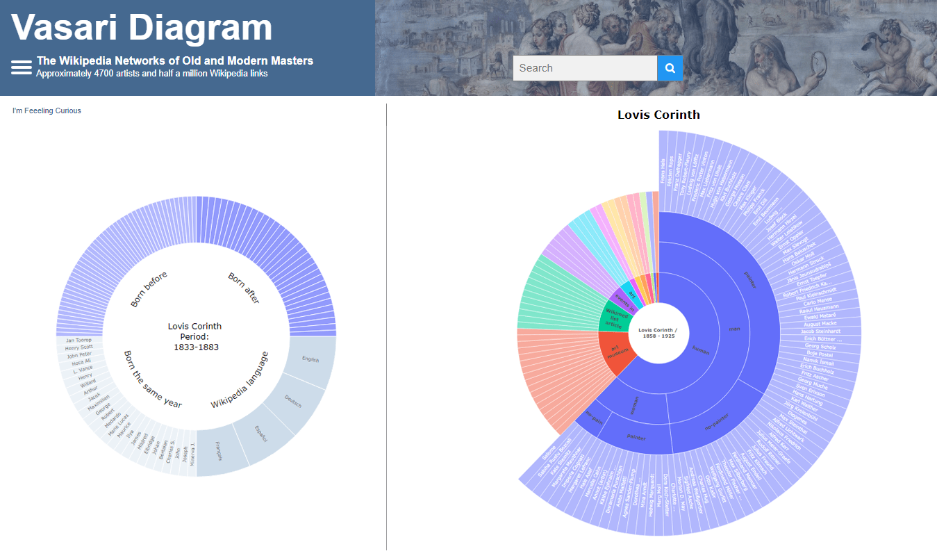 There are numerous cases where our customers first picked a different JavaScript charting library to operate data visualization in their projects but then could not get absolutely what they wanted, and in the end, switched to AnyChart and are happy with their new and final choice. Here is one of such examples.
Francis Lapique and Temenuzhka Dimova ended up using our Sunburst Chart solution in their Vasari Diagram, a fascinating asset for art history researchers and enthusiasts. This project lets anyone explore which people and topics various painters are connected with.
Read our interview where Francis describes the Vasari Diagram project and how AnyChart is used, and check it out!
- Categories: AnyChart charting component, Big Data, Charts and Art, HTML5, JavaScript, Success stories
- No Comments »
AnyChart JS Charts Used to Visualize Data on Ancient French Riddles
June 30th, 2021 by AnyChart Team As global leaders in data visualization solutions, we feel it is part of our mission to support educational and research projects by granting their authors a free license to use our products. Les Énigmes de Mercure (The Riddles of Mercury) by Timothée Léchot from the University of Neuchâtel (UniNE) is one such initiative we are proud to back on non-commercial terms.
Recently, we had a quick talk with Timothée and asked him a few questions to learn more about his project and experience visualizing data with the AnyChart JS charting library. Read our quick interview below. (Stack: PHP/MySQL.)
- Categories: AnyChart charting component, Big Data, Charts and Art, HTML5, JavaScript, Success stories
- No Comments »
How to Create Interactive Timeline Chart with JavaScript
June 17th, 2021 by Shachee Swadia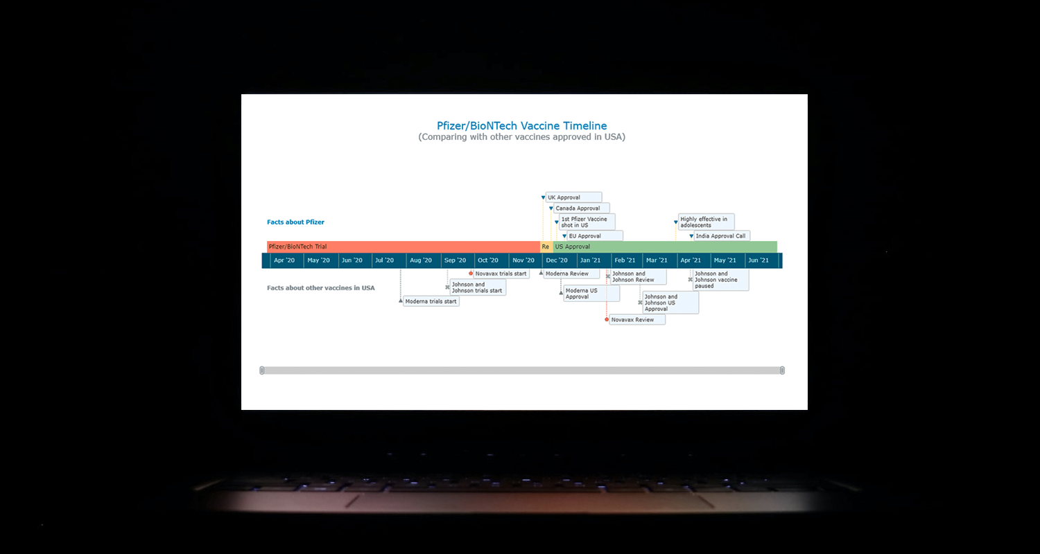 I think all of us have come across timelines somewhere or the other; as a means of conveying chronological information, the classic timeline is unmatched, both in the depth of information conveyed and the “cool” factor, when done with a deft creative touch. So, with that said, would you like to learn how to build a timeline chart using JavaScript that both looks great and is simple to create? (Of course, you do!) Follow along with me as I take you through the step-by-step breakdown for developing your own JS timeline with a practical example.
As the world continues to battle with COVID-19, the long-awaited good news is the development of vaccines across the globe. Here, I decided to build an interactive timeline that showcases the phases of Pfizer-BioNTech vaccine development in the United States. To add more contextual information, I also wanted to show approvals from other countries and some related facts, including the dates for the development of the 3 other vaccines approved for usage in the US.
Read the JS charting tutorial »
- Categories: AnyChart charting component, Big Data, Charts and Art, HTML5, JavaScript, JavaScript chart tutorials, Tips and tricks
- No Comments »
How to Create Bubble Map with JavaScript to Visualize Election Results
January 25th, 2021 by Shachee Swadia In these times of exponentially growing data, visualization is a necessary skillset to have in your tool box. Popular techniques include bar charts, line graphs, pie charts, and bubble maps among others.
Building interactive charts from scratch with JavaScript can be a difficult endeavor for any developer, especially someone starting out new. That is exactly why we have JS charting libraries which make it much easier and quicker to conjure up insightful visualizations!
Read on to see how I create a JavaScript Bubble Map with one of these libraries.
Read the JS charting tutorial »
- Categories: AnyChart charting component, AnyMap, Big Data, Charts and Art, HTML5, JavaScript, JavaScript chart tutorials, Tips and tricks
- No Comments »
Building JavaScript Radar Chart
July 7th, 2020 by Wayde Herman Radar charts, which are also referred to as spider charts or radar plots, are a data visualization used to compare observations with multiple quantitative variables. Each variable is encoded to a spoke which are equidistant apart. The higher the value, the further away from the center of the chart the point is made. Radar charts are best used to compare the ‘profile’ of observations and to detect outliers within the data. They are therefore used quite a bit in sports, most notably in basketball and soccer for profiling players.
In this tutorial I will be teaching you how to build your own radar chart with JavaScript and how to use them to help with one of the toughest decisions in gaming history: which starting pokemon to choose!
That’s right, we will be building radar charts to perform data analysis on Bulbasaur, Charmander and Squirtle to determine, once and for all, which is the best choice.
Read the JS charting tutorial »
- Categories: AnyChart charting component, Charts and Art, HTML5, JavaScript, JavaScript chart tutorials, Tips and tricks
- No Comments »
StopCorona Creator Shares How They Visualize COVID-19 Data Using AnyChart
May 21st, 2020 by AnyChart Team![]() Earlier, we introduced you to a new, ever-updating COVID tracker that uses AnyChart to visualize the latest pandemic data in insightful charts, StopCorona.info. To let you know more, we also talked to Vadim Peskov, CEO at Diffco, the app development company behind StopCorona, and asked him a few questions.
Earlier, we introduced you to a new, ever-updating COVID tracker that uses AnyChart to visualize the latest pandemic data in insightful charts, StopCorona.info. To let you know more, we also talked to Vadim Peskov, CEO at Diffco, the app development company behind StopCorona, and asked him a few questions.
Read our quick interview to learn more about StopCorona and their experience using our JavaScript charting library for interactive data visualization. (Stack: MySQL/Symfony/Angular.)
- Categories: AnyChart charting component, Big Data, Charts and Art, HTML5, JavaScript, Success stories
- 3 Comments »