 Data visualization techniques help us people analyze and communicate data in a much more convenient and effective manner than raw digits or spreadsheets. We’ve been proving this for years by publishing DataViz Weekly, our regular blog feature in which we show you some of the best new data graphics-based projects from all over the web.
This week, we’ve run across and decided to highlight new interesting charts on the following subjects:
- connections in the Mueller investigation;
- partisan bias as a metric to reveal a partisan gerrymander;
- light pollution;
- women in politics.
Look at these nice examples of data visualization in action.
Visualization Techniques in Action: March 15, 2019 — March 22, 2019
Visualizing Connections in Mueller Investigation
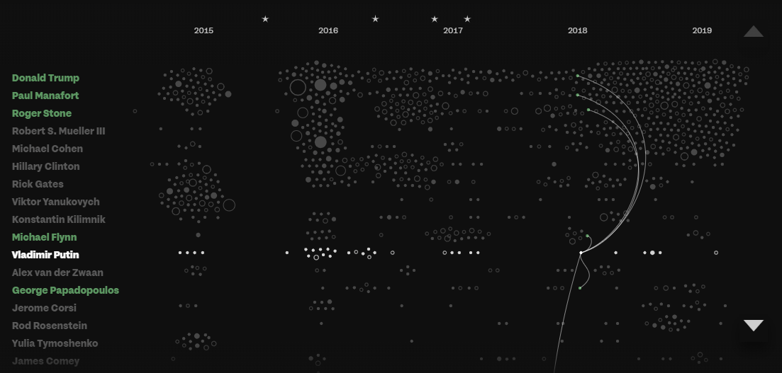
Lead by Special Counsel Robert Mueller, a vast investigation of whether Russia really interfered in the 2016 presidential election in the United States is still ongoing and has already resulted in multiple indictments, guilty pleas, and even prison sentences.
To shed more light and discover hidden connections between the individuals allegedly involved — such as Donald Trump, Vladimir Putin, Paul Manafort, Hillary Clinton, Viktor Yanukovich, and many, many others — Fathom Information Design, building tools for understanding data, analyzed numerous official documents from the Mueller investigation and news about it using custom machine learning algorithms. Check out an interactive data visualization project the team made, Porfiry, and explore the connections.
Evaluating “Partisan Bias” to Reveal Partisan Gerrymander
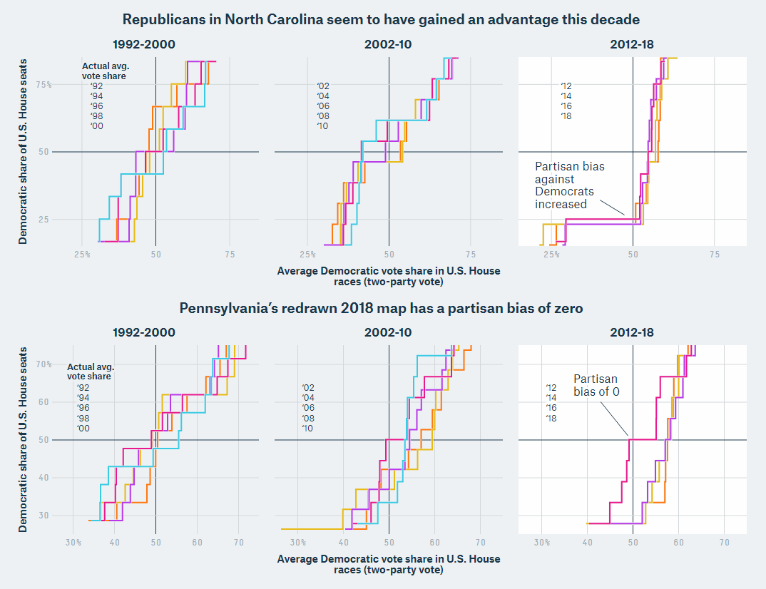
In just a few days, challengers to the congressional map of North Carolina are going to argue before the Supreme Court of the U.S. that it’s actually a partisan gerrymander, meaning that the district boundaries are beneficial for only one party, the Republicans. Meanwhile, William T. Adler, Ella Koeze and Laura Bronner did a great job in explaining on FiveThirtyEight how the “partisan bias” metric works — one of the multiple quantitative tools used by the challengers to prove their point.
While this may be not too easy to understand from the first glance and read, especially if you are not too well into statistics, the principle and the visual story itself look very interesting, especially when it comes to comparing the outcome of the 2018 U.S. House election to earlier ones from this perspective. Take a look.
Mapping Light Pollution Worldwide
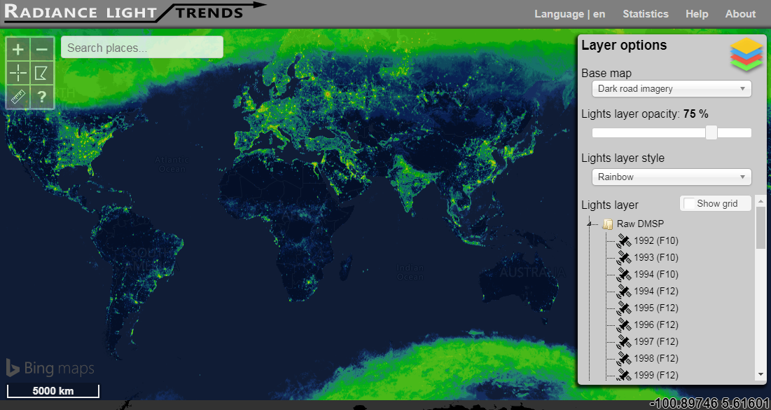
Christopher Kyba from The Helmholtz Centre Potsdam — GFZ German Research Centre for Geosciences, created an awesome data visualization tool that displays the light pollution worldwide during the night and how it has changed since 1992. For this project, data was taken from the Operational Linescan System of the Defense Meteorological Satellite Program (DMSP) satellites and from the Day/Night Band of the Visible Infrared Imaging Radiometer Suite instrument (VIIRS DNB).
Find out what cities produce the most light emissions, as well as general and regional trends around the globe.
Visualizing Data About Women’s Participation in Politics Worldwide
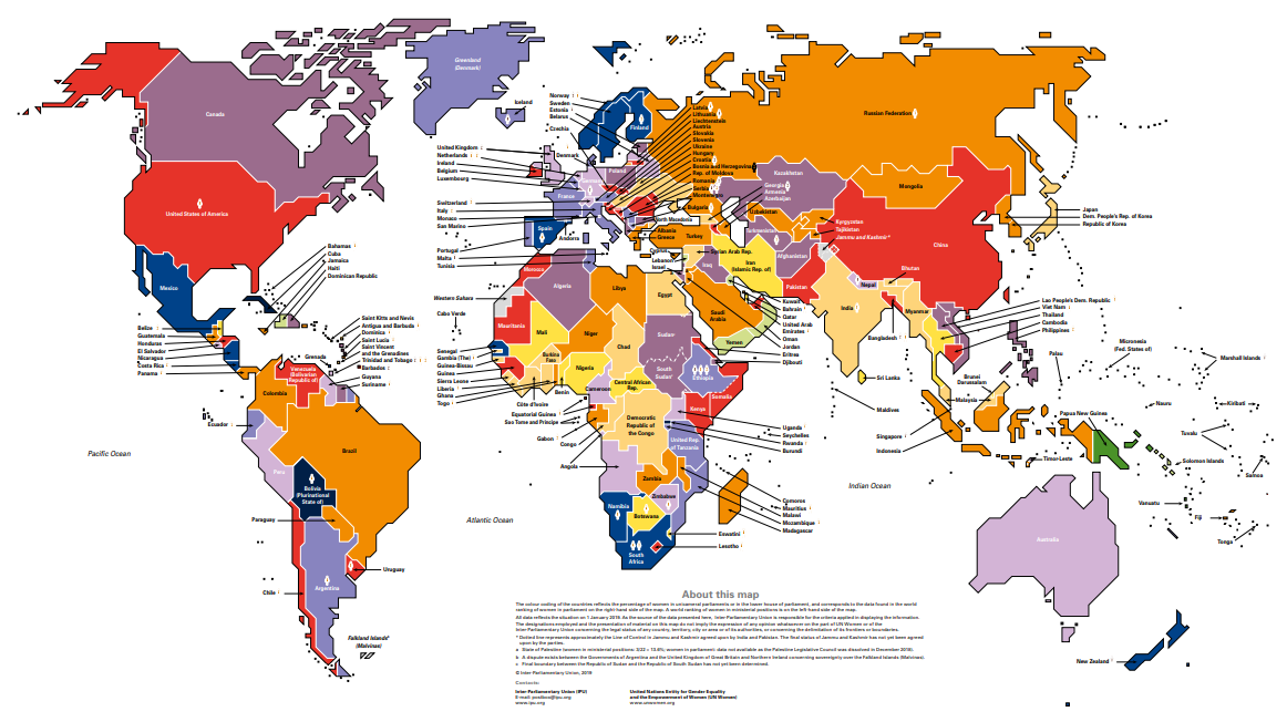
During the 63rd session of the Commission on the Status of Women (CSW63), taking place at the headquarters of the UN in NYC from May 11 through today, the Inter-Parliamentary Union (IPU) and the UN Entity for Gender Equality and the Empowerment of Women (UN Women) presented a new (biennial) Women in Politics map.
The map visualizes a ranking of countries based on data about women’s participation in governments and parliaments, also demonstrating statistics on women in political leadership positions. For example, it’s interesting to note that globally, one in five ministers is a woman.
Explore the map and find out where women are most and least involved in big politics.
***
There are various visualization techniques that you can use to graphically represent your data. If you want to learn how it all works, make sure you understand the data visualization basics and then proceed to study the chart types. For more examples of cool dataviz projects, take a look at our previous Data Visualization Weekly articles and stay tuned.
- Categories: Data Visualization Weekly
- No Comments »