 Amazing charts are everywhere around us. We continue sharing the most interesting visualizations that have just recently seen the light and stayed popular around the Web within the past few days. And we are welcoming you to the new issue of the Data Visualization Weekly article series on our blog.
Before getting to another four amazing charts, we are glad to remind you of the biggest data visualization news of the week here in case you missed it: AnyChart JS Charts 7.14.0 was released just a few days ago! So, go ahead and check out the new cool features and improvements that are now available in the new versions of our JavaScript (HTML5) charting libraries – AnyChart, AnyMap, AnyStock, and AnyGantt – if you have not yet done so.
DataViz Weekly: May 26, 2017 – June 2, 2017
Amazing Charts of Canada’s Energy Future
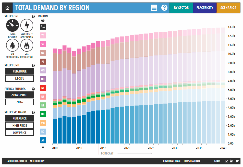
Exploring Canada’s Energy Future is an interactive web project lead by Canada’s National Energy Board (NEB). These amazing charts visualize data included in their Energy Futures reports to reveal and explore the trends in production and consumption of energy in Canada.
When Straight Americans Lost Their Virginity
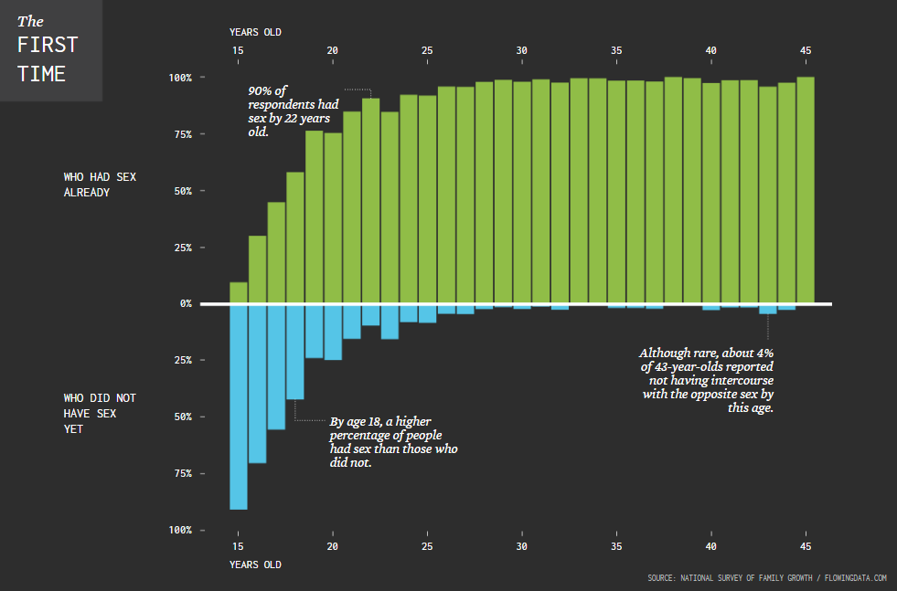
Nathan Yau (FlowingData) visualized data from the National Survey of Family Growth to see (and let us all know) at what age respondents – straight Americans – lost their virginity. Check out this chart to understand the whole picture.
“Bitcoin” Google Search Trend vs Bitcoin Value
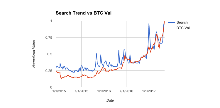
Amazing charts are allowed to be simple in terms of both data and visualization. But then they must be kind of mind-blowing when it comes to conclusions drawn from them; otherwise, they cannot be considered amazing charts.
If we put it just like that, then this Bitcoin data visualization is an amazing chart. Otherwise, it would not make a lot of people around the world tear their hair out because of not having got themselves some bitcoins, say, a couple of years ago. Seeing this chart is definitely something completely different than just raw figures day by day. 🙂 Well, Bitcoin stays on the rise, so everything here is still likely to be in your hands.
Another great thing here – and, basically, the main point – is the correlation between the value of Bitcoin and the Google Search trend of the word “Bitcoin”.
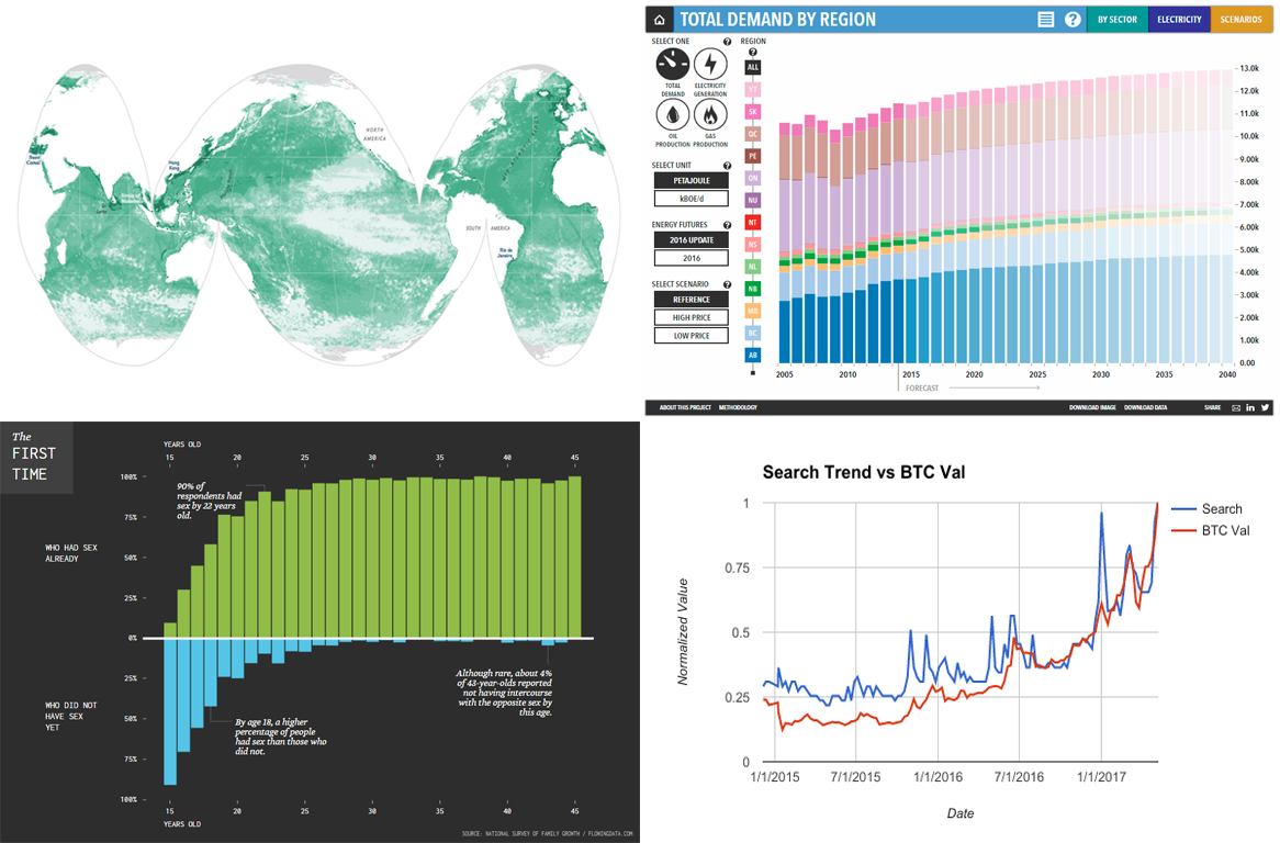
X-Ray of Ocean: Human Impact
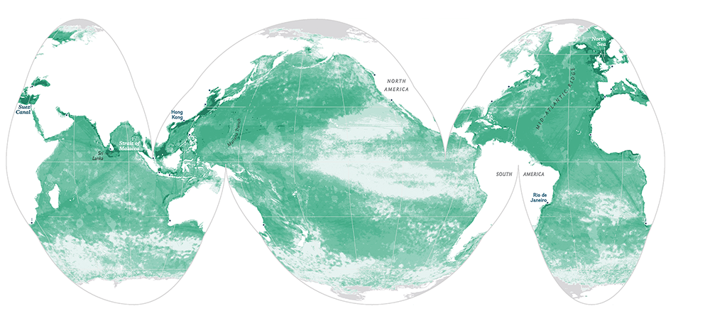
Researchers revealed that approximately two-thirds of the whole global ocean show strain from climate change and fishing. This map – basically, sort of X-ray of the global ocean, is published and explained on National Geographic.
That’s all for now, folks. We hope you like the new Data Visualization Weekly post, highlighting some of the amazing charts out there. See you next week!
- Categories: Data Visualization Weekly
- No Comments »