Cool Data Visualizations of the Week: “Drugs and Porn Charts” Edition
June 30th, 2017 by AnyChart Team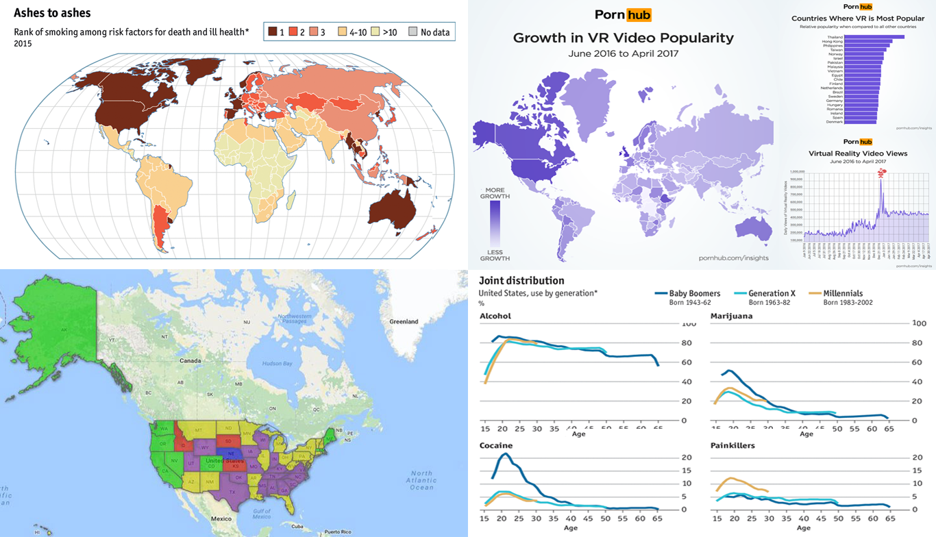 Weekly digests of cool data visualizations have become a wonderful tradition on our blog. This time, we’ve highlighted charts and maps that graphically represent peculiar data about drugs and porn. Here you’ll find visualizations recently shared on The Economist, Forbes, and Cannabis Business Times. They are about:
- Pornhub insights on VR videos,
- drug use in the US by generation,
- interactive map of marijuana legislation in the US, and
- map of smoking as a risk factor for death and ill health.
So, let’s take a look at them now.
- Categories: Data Visualization Weekly
- No Comments »
Data Visualization Blog Weekly: Roundup of Latest Cool Charts and Maps
June 23rd, 2017 by AnyChart Team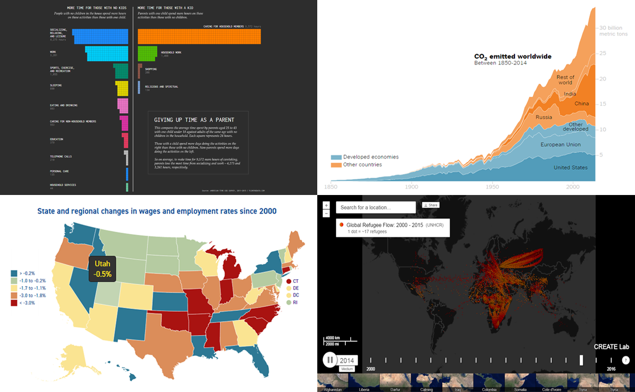 Greetings to all readers of our data visualization blog DataViz Weekly! We’ve collected four more charts and maps that should be worth getting your attention. Our today’s choice of cool recent data visualizations includes:
- patterns of how parents and adults without kids use their time,
- global CO2 emission since 1850,
- wages and employment rates in the US (by state), and
- global refugee flow since 2000.
Let’s get down to these now!
- Categories: Data Visualization Weekly
- No Comments »
Most Interesting Examples of Data Visualization – DataViz Weekly
June 16th, 2017 by AnyChart Team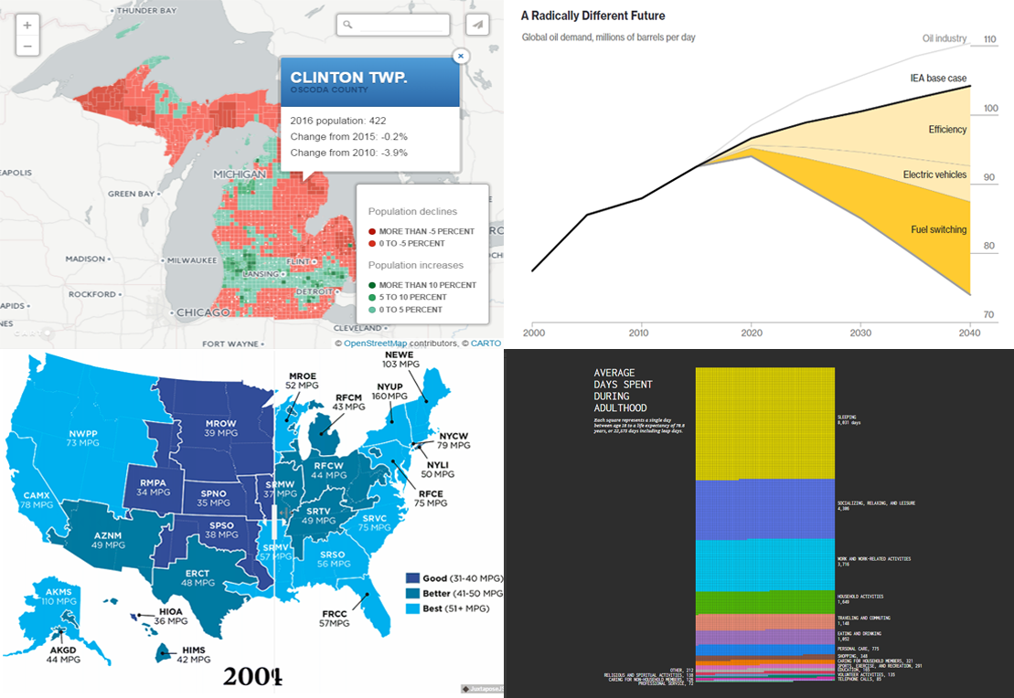 It is no exaggeration to say that we encounter various examples of data visualization all the time, maybe even multiples times per day. Indeed, charts and infographics are a great tool to explore (and explain) diverse kinds of information. Data Visualization Weekly aims to highlight some peculiar examples of data visualization every week to let you quickly learn more about topical issues, funny life revelations, and so forth, not to mention getting inspiration for making your own visual presentations of data.
The new article in this series will show you four more of worth seeing examples that shed light on oil demand forecast, population change in Michigan, adult lifetime, and EV emissions data. Here they are.
- Categories: Data Visualization Weekly
- No Comments »
Data Is Beautiful: New Interesting Visualizations in DataViz Weekly
June 9th, 2017 by AnyChart Team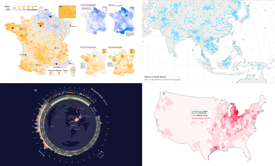 Data is beautiful. And the Data Visualization Weekly series brought to you by AnyChart JS Charts is designed to prove that every time. Today we’ll take a look at another four cool visualizations of peculiar. They have seen the light just recently but are already famous.
This article introduces the following stunning data visualization masterpieces:
- charts (and a map) of the relationship between robotic automation and unemployment;
- French presidential election results in five maps;
- interactive visualization of international trips of POTUS and US SecState in 1905-2016;
- map of 1,746 adults’ guesses on where North Korea is located (and what they think should be done about it).
- Categories: Data Visualization Weekly
- No Comments »
Amazing Charts in New Data Visualization Weekly Collection
June 2nd, 2017 by AnyChart Team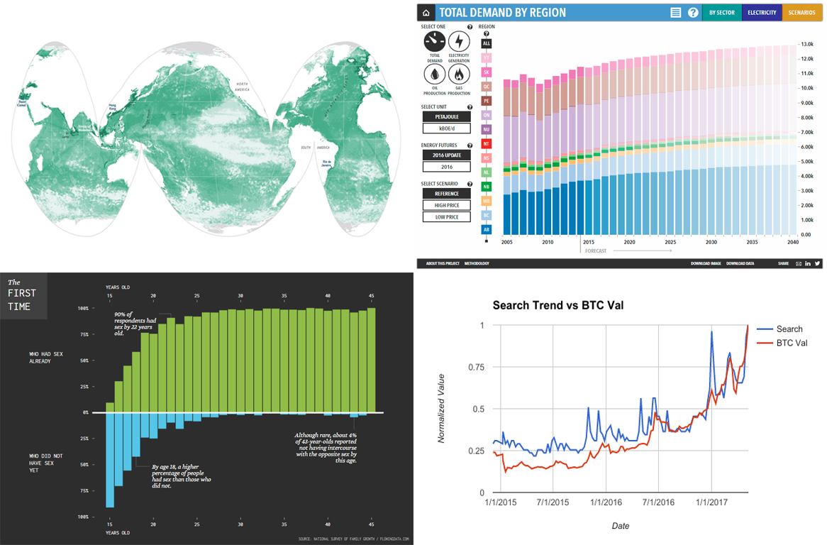 Amazing charts are everywhere around us. We continue sharing the most interesting visualizations that have just recently seen the light and stayed popular around the Web within the past few days. And we are welcoming you to the new issue of the Data Visualization Weekly article series on our blog.
Before getting to another four amazing charts, we are glad to remind you of the biggest data visualization news of the week here in case you missed it: AnyChart JS Charts 7.14.0 was released just a few days ago! So, go ahead and check out the new cool features and improvements that are now available in the new versions of our JavaScript (HTML5) charting libraries – AnyChart, AnyMap, AnyStock, and AnyGantt – if you have not yet done so.
- Categories: Data Visualization Weekly
- No Comments »