 Visualizing data is a great way to facilitate its exploration and explanation. The new Data Visualization Weekly issue brings you, as always, some peculiar charts, maps, and other nice examples of how that can look. Today let’s see another cool set of carefully selected visualizations, four of those that we noticed and shared on social media over the past few days:
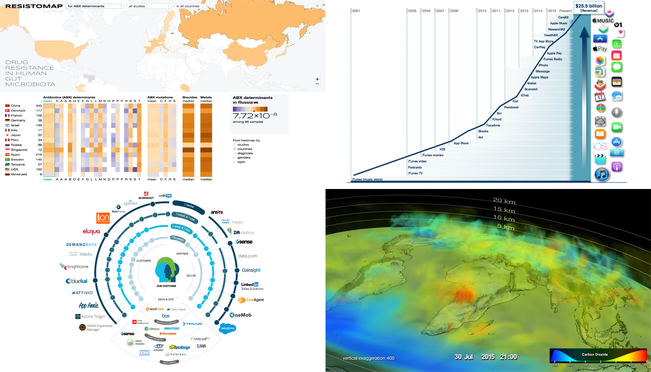
- ResistoMap: drug resistance in human gut microbiota in different countries;
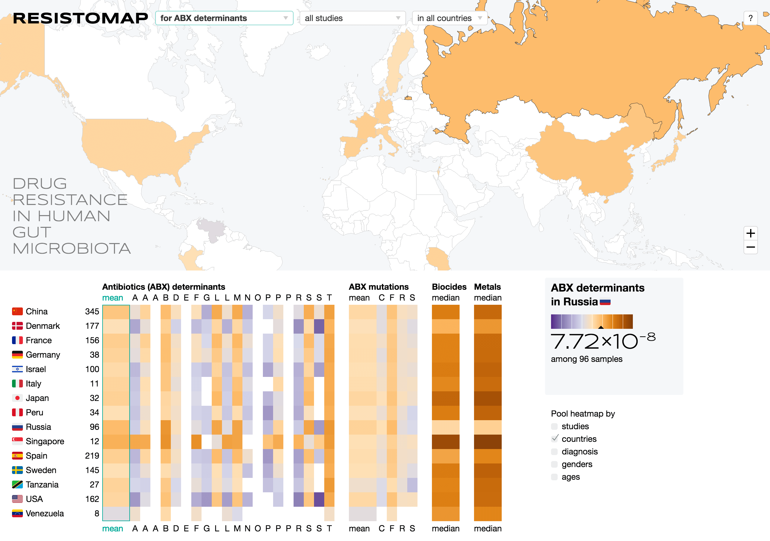
- Diagram of tools that Cisco uses for enhancing digital engagement;
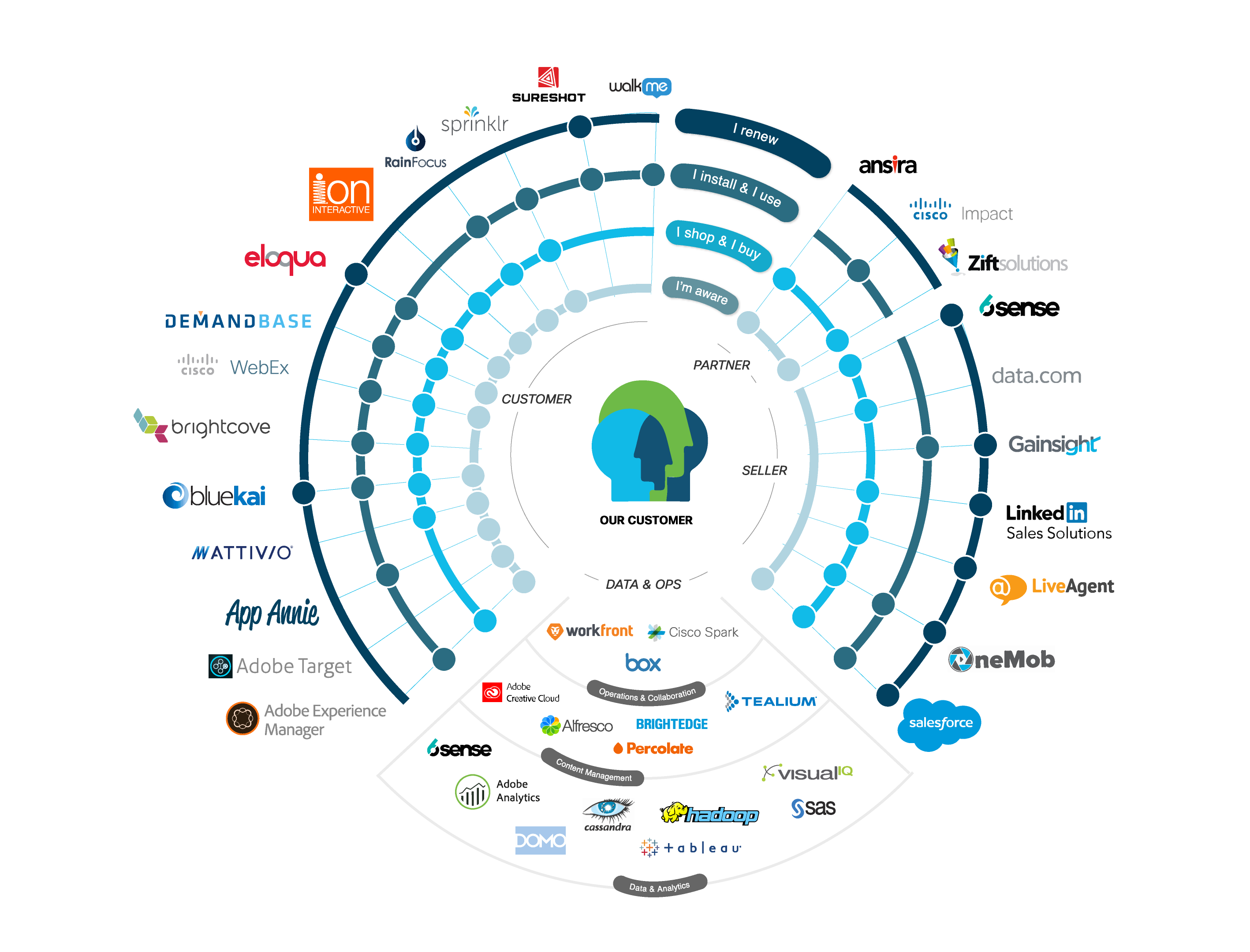
- Chart of Apple Services’ revenue growth;
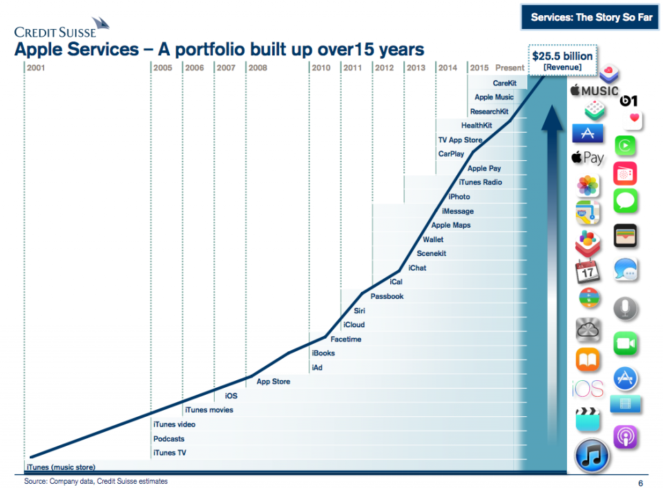
- Video visualization of carbon dioxide’s behavior in the Northern Hemisphere.
DataViz Weekly: May 5, 2017 – May 12, 2017
Resistomap: Visualizing Data on Drug Resistance in Human Gut Microbiota by Country
ResistoMap is an interactive visualization that shows how drug-resistant human gut microbiota is around the world. It consists of a world map and a heatmap that allow you to see in what countries people’s gut microbiota is more (or less) resistant to antibiotics, heavy metals and biocides, notice geographic trends, etc. You can learn more about this visualization here.
Cisco’s Marketing Technology Stack Visualized
Cisco uses 39 marketing technologies for establishing, maintaining and enhancing digital engagement. It is cool that now we know even more as all of those solutions are not only disclosed but also nicely visualized on this infographic. It looks impressive, and the information might be useful for your own business – check it out.
Rise of Apple Services as Business: Visualizing Revenue Data
“Services are becoming a larger part of our business, and we expect the revenues to be the size of a Fortune 100 company this year,” Tim Cook, CEO at Apple, is quoted by saying by Yahoo Finance. Indeed, the Apple Services business is exploding. And this chart, visualizing data about their revenue from 2001 to present, is a great illustration of that.
Visualizing Data on Seasonal Changes in Carbon Dioxide
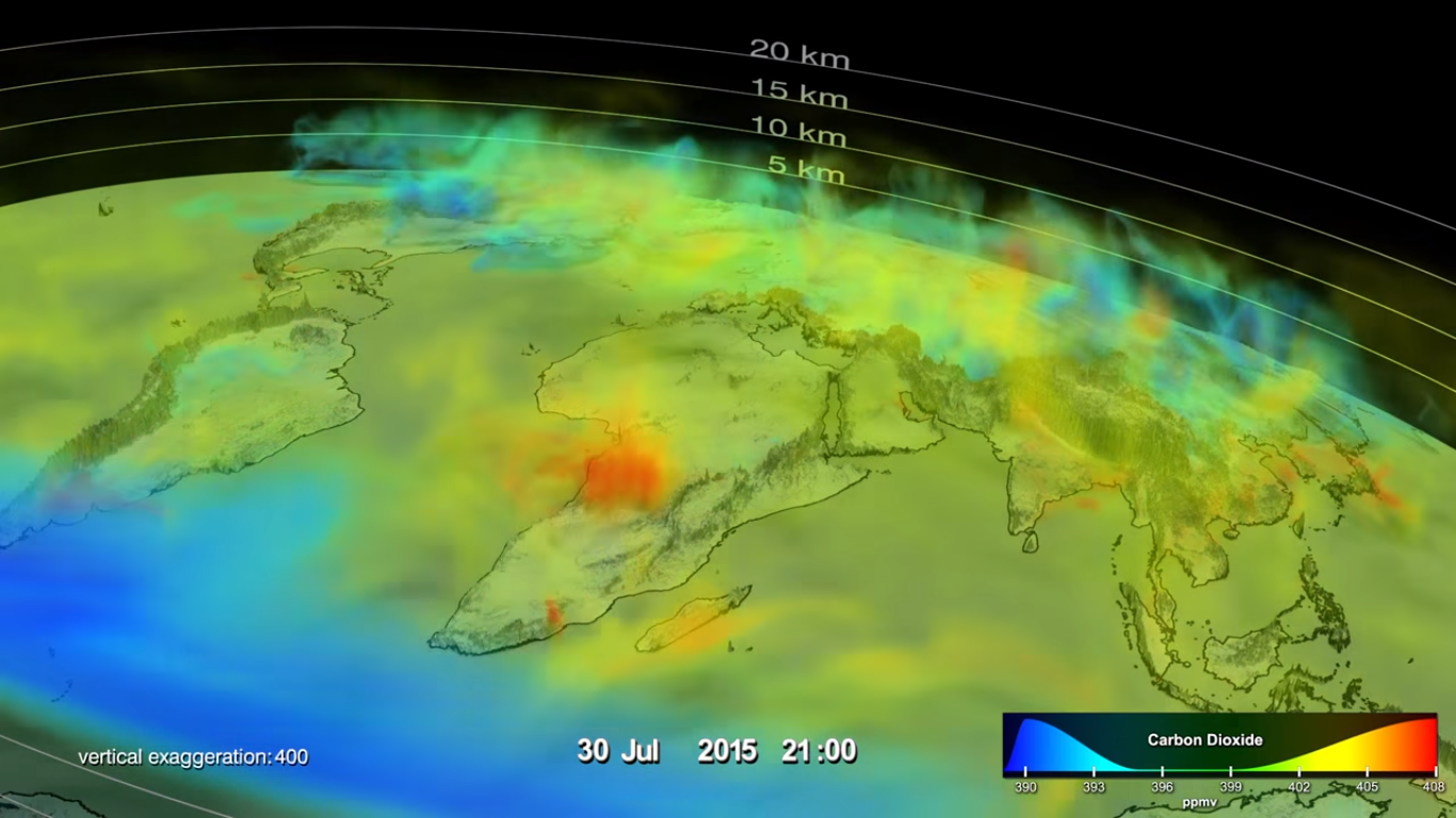
This colorful visualization of carbon dioxide and seasonal changes in its behavior in the Northern Hemisphere became a winner of the Data Stories contest held by Science. It received the top prize for the category “Professional Entry”. Well, visualizing data like this is always a specific challenge, which makes such animations especially worth seeing. Here’s the video presentation, just in case you’d like to check it out right now:
That’s all about visualizations of the week for now. However, we also cannot help mentioning the Getting Started with AnyChart: 10 Practical Examples article published earlier this week on SitePoint, with demo-based explanation of visualizing data in virtually any format with the help of our JavaScript charting library AnyChart.
And now, may all of you have a wonderful weekend!
- Categories: Data Visualization Weekly
- No Comments »