In this post you will find a recap of the cool data visualizations that we have shared with you this week on AnyChart Facebook Page and in Twitter (including an HTML5 Connector Map by AnyChart):
- The Year that Music Died from Polygraph is an animated timeline that shows the Billboard top 5 songs since 1956, all the while playing the top song during a given week (via FlowingData).
- David Rumsey Map Center is a collection of more than 150,000 maps, atlases, globes and other historical treasures. Read more in the article on Smithsonian.com (and check out eight awesome maps from the collection). is a collection of more than 150,000 maps, atlases, globes and other historical treasures donated by the retired San Francisco real estate developer. Read more in the article on Smithsonian (and check out eight awesome maps from the collection).
- The Atlas of Economic Complexity is a great interactive tool that enables users to play around with international trade data. You can visualize a country’s total trade, track how these dynamics change over time, and explore growth opportunities for more than a hundred countries worldwide. As a dynamic resource, The Atlas is continually evolving with new data and features to help analyze economic growth and development.
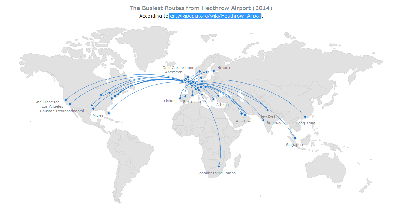
- Busiest Routes From Heathrow Airport – this interactive HTML5 Connector Map by AnyChart shows the most popular flight destinations from Heathrow Airport in London, UK (based on Wikipedia data). Connector Maps can be used used to create Flight Maps, Route Maps, Demarcation Maps, and in many other cases. To take a look at other AnyChart Connector Maps, visit our Gallery, and to read about other new features in AnyMap 7.10.0, see its version history.
- Categories: AnyChart charting component, AnyMap, HTML5, JavaScript, News
- No Comments »
