AnyChart JavaScript Charts: Integration Samples
December 25th, 2015 by Margaret SkomorokhAnyChart JavaScript Charts: Integration with PHP, MySQL, iOS, SQLite, Clojure, Clojurescript, NodeJs, and MongoDB
AnyChart JavaScript charts run on any platform and with any database. To make integration of AnyChart into your application as easy as possible, we have created several samples demonstrating how to integrate our component into the most popular platforms and databases. With the help of these tutorials, you will be able to start developing a prototype of your application right now.
Below you will find the samples that are currently available. Please note that all of them are repositories on GitHub, distributed under an Apache 2.0 License, and you can fork and change them as you like. Do not hesitate to pull requests or raise issues if you want to suggest an improvement or think that there is a bug in the code. We are going to expand this list and improve the samples, but if right now you are interested in a particular integration not listed here, please contact us.
|
|
Simple PHP Integration Sample PHP is one of the most popular tools for creating web applications and web pages. If you are a beginner developer or you need the simplest base for your charting application, this sample will help you. It shows Bar, Column, and Pie JavaScript charts created with PHP and displayed on a web page using AnyChart. |
|
|
PHP Integration Sample, Based on Slim If you are using the MySQL database (which is widely used with PHP applications) and the Slim PHP framework (a very convenient PHP microframework), this sample will help you to create a proof of concept of your charting application in a matter of minutes. You will see how to get data from MySQL, convert them into a format that can be used with AnyChart, and display as interactive JavaScript charts. You will also learn how to update your data without refreshing the page and how to customize different chart types, tooltips, labels, axes, and so on. |
|
|
iOS Objective-C Integration Sample Nowadays iPhone and iPad are used not only for making phone calls and entertainment. Phones and tablet computers are the integral part of an entrepreneur’s everyday life, and iOS apps serve business. Though AnyChart is a JavaScript charting library, you can easily combine it with the native Objective-C code and make any iOS app display big or small data as charts, with all great big and small features of AnyChart: from continuous real-time updates and multi-level drill-downs to the ability to customize the color of a particular axis label. Run our sample charting application in XCode, and you will get an iOS project where data are stored in the SQLite database management system and displayed as HTML5 charts on the screens of mobile devices. |
|
|
Clojure and ClojureScript Integration Sample Clojure is a dialect of the Lisp programming language, which is a very popular choice for creating server/backend applications. ClojureScript and the Postgresql database together make an excellent combination of tools, suitable for the most wide range of applications including data visualization solutions of any kind. Today there is rarely just one or two charts in an application – usually you see a dashboard with many interrelated elements. In this sample you will find a sales dashboard with such common chart types as Line, Bar, and Pie, and you will be surprised to realize how well AnyChart’s ideology fit the principles of Closure: simple modules will allow you to quickly get all the things that users expect to see on an up-to-date HTML5 website. |
|
|
NodeJs and MongoDB Integration Sample The NoSQL database is an integral part of the modern world, and MongoDB is a good choice if you decide to go this way. And when MongoDB is in play, a Node.js server is a logical choice to go with. So, if you are breaking the ground with your scalable application where run-time performance is paramount, use our sample to see how AnyChart JavaScript charts fit into this environment (and they fit perfectly). We are confident that you will not be disappointed with AnyChart in this case – its client-side performance will compliment your server-side performance, and users will be glad to see their data seamlessly updated on-the-fly. |


AnyChart charting library is a number one choice for anyone who is going into the world of data visualization and wants to excel in the fast-evolving world of BI solutions. When we develop our charts, one of our aims is providing users with the best result in any browser, but we also do our best to make the process of creating and supporting applications easier for developers.
We maintain a clear system of versions, each version being saved at AnyChart CDN. The API of each version is available at https://api.anychart.com/, and the documentation is available here: https://docs.anychart.com/. There are thousands of samples in our API and documentation, and you can see and try any method and any feature of AnyChart JavaScript charts on our website. Still, if there is no answer to your question neither in API, nor in our documentation, nor in the FAQ, just contact AnyChart Support Center, and our engineers will solve your problem.
We hope that these integration samples will help you to jump-start your project, and you will become one of the lucky ones who enjoy the power and flexibility of our JavaScript charts.
PS: If you are already convinced and none of the standard licenses fits your needs, our sales team is dying to hear from you and work out the best deal ever. You will be amazed to discover how fair our Support, OEM, and SaaS contracts are.
- Categories: AnyChart charting component, Business Intelligence, Dashboards, HTML5, JavaScript, Tips and tricks
- 1 Comment »
First Ever Area Charts Created 200+ Years Ago
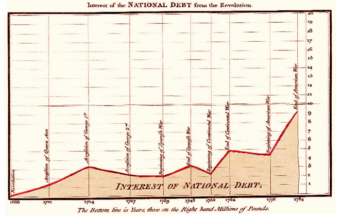
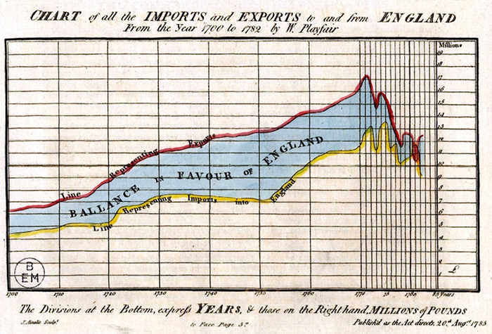
December 23rd, 2015 by AnyChart TeamScottish engineer and political economist William Playfair is credited with inventing not only the bar chart but also the area charts.
Generally speaking, Playfair’s publication The Commercial and Political Atlas, first appeared in 1786, contained many interesting time-series graphs. The following two of them are more particularly mentioned today as the first area charts in history.
1. Interest of the National Debt from the Revolution. Single-series.
2. Chart of all the Imports and Exports to and from England from the Year 1700 to 1782, originally dated August 20th, 1785. This chart can also be treated as at least one of the first multi-series area charts. The area between two curves shows the difference between them and is a great visual representation of the balance of trade.
- Categories: Interesting Facts
- 3 Comments »
Bubble JavaScript Map by AnyChart, Abolitionist infographic, and more
December 13th, 2015 by Margaret Skomorokh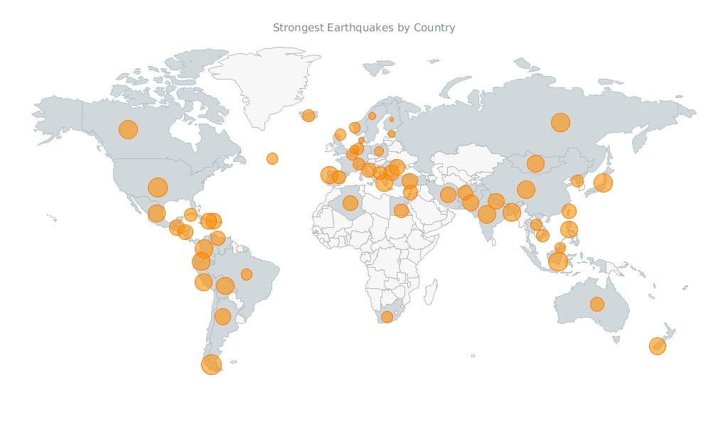
Javascript Map by AnyChart
Have you seen the cool data visualizations (including an interactive JavaScript map by AnyChart) that we have shared this week on AnyChart Facebook Page and Twitter? Here is a quick recap of these posts:
- This abolitionist infographic (1788) shows deck plans and cross sections of British slave ship Brookes. It is a strange, unexamined feature of the bicentenary that this image has still served to shape perceptions over two hundred years since its publication. Its continued usage cannot be explained away with traditional assumptions of its ‘innate power’ or ‘effective communication’. Read more about the poster in this article.
- NARKOZ/hacker-scripts – Hate to waste your time on routine tasks like waiting for the coffee-machine to make your latte? Use scripts to hack your life! LOL “The coffee machines uses telnet not SSH!!! this one waits exactly 17 seconds (!), then opens a telnet session to our coffee-machine (we had no frikin idea the coffee machine is on the network, runs linux and has a TCP socket up and running) and sends something like
sys brew…” - Bubble Earthquakes Map – Visit our gallery and check out this interactive bubble JavaScript map created with AnyMap. It shows where the world’s strongest earthquakes occurred. AnyMap is ideal for interactive dashboards and side-by-side reporting. This JavaScript mapping solution will help you to build interactive maps and display them in any browser on any platform. AnyMap is useful when you need to display sales by region, election results, population density, or any other information related to a geographic area.
- 15 Years of Terror – a time-lapse of all terrorist attacks with more than 20 fatalities between 1.12.2000 and 13.11.2015.
- Categories: AnyChart charting component, AnyMap, Charts and Art, HTML5, JavaScript, News
- No Comments »
Recap of the Week – 12/6/2015
December 7th, 2015 by Margaret Skomorokh
In this post you will find a quick recap of the information on data visualization and AnyChart we have shared this week on AnyChart Facebook Page and Twitter:
- Kepler Orrery IV – This awesome data visualization is a new version of the Kepler Orrery animation. It shows all of the Kepler multi-planet systems on the same scale as the Solar System.
- CIO Dashboard – This complex JavaScript dashboard was created with AnyChart. Check it out in our sample gallery! (The dashboard is based on a sample from the book “Information Dashboard Design: Displaying Data for At-a-Glance Monitoring” by Stephen Few.)
- Tor Flow is a fascinating data visualization showing information flow in the Tor network – a group of volunteer-operated servers that allows people to improve their privacy and security on the Internet.
- GOP early debate: candidates ranked – a cool interactive visualization based on Google search.
- Categories: AnyChart charting component, HTML5, JavaScript, News
- No Comments »