Recap of the Week – 11/29/2015
November 30th, 2015 by Margaret SkomorokhThis week we have shared on AnyChart Facebook Page and Twitter the following data visualizations:
- GitHut is an attempt to visualize and explore the complexity of the universe of programming languages used across the repositories hosted on GitHub.
- Analyzing 1.1 Billion NYC Taxi and Uber Trips – Check out these data visualizations and article: it is an open-source exploration of New York neighborhoods, nightlife, airport traffic, and more, through the lens of publicly available taxi and Uber data (1.1 trips).
- No Ceilings: The Full Participation Project – See the interactive data visualization on the main page, showing the gap between the number of women and men in the workforce (and how it changed from 1995 to 2012).
- Mapping how the United States generates its electricity – How does the United States generate its electricity? These cool maps will tell you everything.
- Categories: News
- No Comments »
Recap of the Week – 11/22/2015
November 22nd, 2015 by Margaret SkomorokhHere is some interesting stuff we’ve encountered this week and posted on AnyChart Facebook Page and Twitter:
- Gasoline vs Electric – Who wins on lifetime global warming emissions? You’ll find the answer in this article (and map).
- People-Powered Data Visualization – Through crowdsourcing and citizen science projects, the general public is making profound contributions to research. Can data visualization help make sense of this wealth of new information? Read the article by National Geographic.
- height | weight | age – London 2012 Women Gold Medalists – This unusual interactive infographic demonstrates the vast variety in body size and shape amongst the elite female athletes (it is based on the data from the London Olympics 2012 website).
- These beautiful animated wind maps let you explore the variety of wind patterns in the U.S. You can see both a live map with current data and a number of historical snapshots.
- Categories: News
- No Comments »
Recap of the Week – 11/15/2015
November 16th, 2015 by Margaret SkomorokhIn this post you will find a recap of the cool data visualizations that we have shared with you this week on AnyChart Facebook Page and Twitter:
- A Needle in the Connectome: Neural ‘Fingerprint’ Identifies Individuals with ~93% accuracy.
- According to a Harvard study, September 16 is the most popular for birthdays. How popular is your birth date? See this infographic showing the most common birth dates.
- My Premier League Life – an excellent interactive dashboard by BBC Sport: “Your club, your lifetime, like you’ve never seen it before”.
- Check out these ‘steampunk’ infographics beautifully combining past and present.
- Categories: News
- No Comments »
Recap of the Week – 11/8/2015
November 9th, 2015 by Margaret SkomorokhHere is a quick recap of AnyChart news and interesting information on data vsualization, which we have shared with you this week on AnyChart Facebook Page and Twitter:
- AnyChart 7.8.0 – Good News! We have updated all our products, and now #AnyChart, #AnyGantt, #AnyStock, and #AnyMap 7.8.0 are available for download. We have added a number of important features, including JavaScript Heat Map charts and Zoom & Scroll in AnyChart as well as Editing Mode and UI in AnyGantt.
- Bond v Bond: the return of 007 – The history of Bond… James Bond!
- Data Cycles is a simulated real-time visualization using a year’s worth of Bay Area Bike Share data – just click Play and enjoy all these bikes riding from station to station. You can also see a few nice interactive charts in the Statistics section.
- A Nation of Poverty – Concentrated poverty in the neighborhoods of the largest urban cores in the United States has exploded since the 1970s. Check out the charts illustrating this process.
- Categories: AnyChart charting component, AnyGantt, AnyMap, AnyStock, HTML5, JavaScript, News
- No Comments »
Heat Maps, Scrolling, Live Gantt Charts – 7.8.0 Release
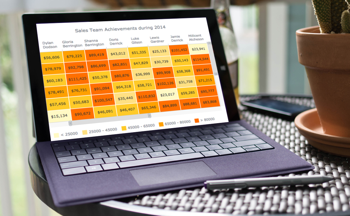
November 4th, 2015 by Margaret SkomorokhGood News! We have updated all our products, and now AnyChart, AnyGantt, AnyStock, and AnyMap 7.8.0 are available for download. We have added a number of important features, including JavaScript Heat Map charts and Zoom & Scroll in AnyChart as well as Editing Mode and UI in AnyGantt (see Gantt Interactivity and Gantt Live Edit API and UI).

AnyChart 7.8.0 New Features
 |
Heat Map Chart A Heat Map chart is a graphical representation of data where the individual values contained in a matrix are represented as colors. Take a look at Heat Maps in the Gallery >> Learn more about Heat Maps >> |
 |
Zoom and Scroll (All Basic Chart Types) The Scroller feature works with all basic chart types. It allows users to zoom and scroll. Take a look at the Gallery Sample >> Learn more about the Scroller Feature >> |
- Categories: AnyChart charting component, AnyGantt, AnyMap, AnyStock, News
- No Comments »
Recap of the Week – 11/1/2015
November 1st, 2015 by Margaret SkomorokhHere are some interesting data visualizations we have encoutered this week and covered on AnyChart Facebook Page and Twitter:
- In search of food deserts – This unusual map visualizes food deserts (places without ready access to fresh, healthy, and affordable food) in the United States.
- See 21 wonderful infografics in the season brochure by the Bavarian Radio Symphony Orchestra.
- Bloomberg Billionaires: Today’s ranking of the world’s richest people – This interactive index (updated daily) presents the data in a very simple yet insightful manner.
- Should You Ever Use a Pie Chart? – A big question needs a big answer.
- Categories: News
- No Comments »