Working with Event Markers in AnyStock
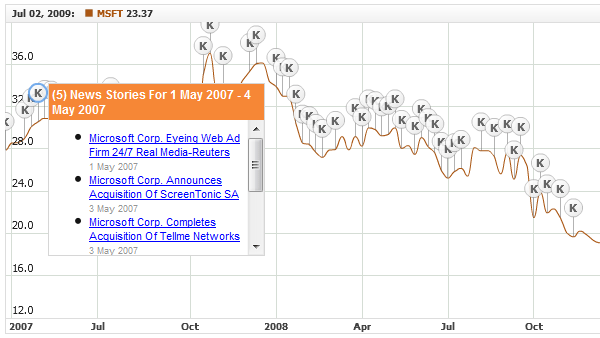
March 25th, 2012 by Margaret Skomorokh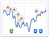 One of the most exciting features of AnyChart Stock are Event Markers – a special type of chart markers that are designed to provide the best experience in showing various events on financial charts: Key Developments, Dividends, Splits, Insider Transactions, Analyst Opinion Changes and so on. This information is very important for financial analysis and have to be properly visualized. That is why our component has a very flexible and convenient set of tools for working with Event Markers.
Event Markers in AnyStock can be added to a chart series or to a timeline. Due to the stacking and merging systems, you can put as many markers as necessary and at the same time keep your chart clean and readable. Rich interactivity improves the perception of events by users, and the opportunity to bind Event Markers to additional data turns them into a highly informative tool.
Available options include:
- complete control over all visual settings
- rich interactivity and the opportunity for users to select Event Markers
- grouping markers that hit the same date into stacks or into a single marker
- binding additional data (e.g URL links) to each Event Marker
- built-in elegant tooltip with the support of HTML formatting
- full range of supported external events and methods for controlling Event Markers from the outside
- four special marker shapes
and many, many more…
You can learn how to work with Event Markers from our documentation, gallery, and online demos, each of them containing a sample chart, its source code and description. Here is the full list of these demos:
- Adding/Removing Event Markers
- Navigating to an URL on Event Markers Click
- HTML Tooltips for Event Markers
- HTML Tooltips for Event Markers with Hyperlinks
- Simple HTML Tooltips for Event Markers
- Getting Event Markers List in a Time Range
- Merged Event Markers Events Handling
- Selecting Event Markers Using JavaScript
- Showing/Hiding Event Markers Groups
- Showing/Hiding Event Markers using JavaScript
- Updating Event Markers Visual Settings Using JavaScript
- Event Markers Events Handling
We want you to pay special attention to the following three samples because they can be used in real applications as ready-made building blocks. These samples also demonstrate a number of important characteristics of Event Markers. For example, as it is clear from the two RSS examples, Event Markers can be loaded and removed during runtime, which means that they can be equally as dynamic as data thought not being a part of it.
We hope that we succeeded to throw some light on this useful feature and this article will help you to implement new functionality in your applications, but if anything is still not clear, do not hesitate to contact our support team. We will do our best to help you.
- Categories: AnyChart charting component, Tips and tricks
- No Comments »
How to Choose Chart/Graph Type for Seeing Data Over Time
March 13th, 2012 by Margaret SkomorokhWe continue publishing tips for choosing between different types of charts. Last time we were talking about comparing data, and today we will focus on seeing data over time.
The most popular and adequate ways to visualize time-based data are bar graphs and line graphs. What is the difference between them? First, large sets of data are better visualized via line graphs since line graphs are good in showing trends, and bar graphs in this case just look overcomplicated. Second, bar graphs emphasize the magnitude of changes, so they are an excellent way to demonstrate data with sharp fluctuations.
Example 1.
The following graph shows the number of deaths per year in Cambodia between 1960 and 1990 according to UN estimates:
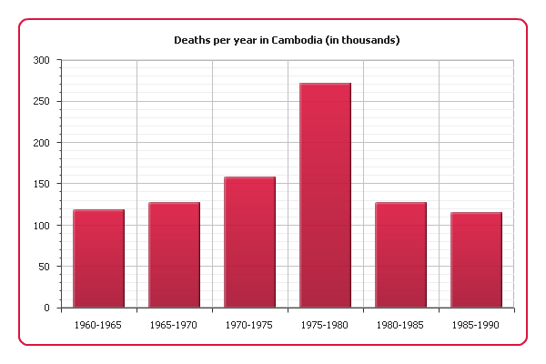
As you can see, there was a sharp increase of mortality in 1975-1980, which is almost the same period when Cambodia was under the Pol Pot regime (1975-1979). Our graph clearly shows the scale of the genocide this regime is responsible for.
Example 2.
And now we are going to demonstrate demographic data about Cambodia for a longer period: since 1950 and including modernity. A bar graph is not the best choice in this situation. Instead, we will use a line graph:
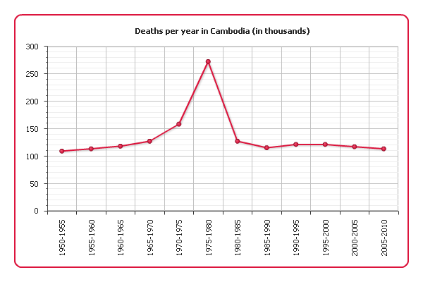
This visualization still shows the increase of mortality in 1975 quite well and at the same time comprehensively represents the long-term trend.
Example 3.
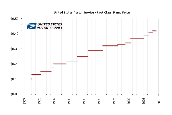
Sometimes a value we are interested in changes discreetly, i.e. stays constant between change points. For example, stamp prices change only in the rare moments when new stamps with new denominations are emitted. In this case we can choose a bar graph since it represents data discreetly, but what if our data covers a long period of time? A bar graph would be difficult to read, but a line graph should not be used either because to connect two points with a line would mean to distort the real picture.
Fortunately, there is one useful variation of line graphs – step line graphs. To connect data points they use only vertical and horizontal segments instead of straight lines. Here is such a graph demonstrating the US Postal Service prices for first class stamps from 1975 to 2008:

Step line graphs combine advantages of bar and line charts, being good at both showing trends and making the magnitude of changes explicit. And by omitting change points you can focus on the periods when the represented value is constant:
See also: Creating Step Line Chart with AnyChart and Line, Spline, Step Line Charts Gallery
That is all for today, more tips are coming soon.
Check the updated article on how to choose chart/graph type for seeing data over time published within the framework of the new 7-part Choose Chart Type feature on our blog.
- Categories: AnyChart charting component, Tips and tricks
- 1 Comment »