Today we start publishing basic tips for choosing between different types of graphs. Visualization can be a very powerful and convincing instrument to present your data – the only thing needed is to use it correctly. One should always clearly understand what exactly he or she wants to show and what is the best way to do it.
There are three main situations when visualizations are made: comparing data, seeing data over time, and breaking data into parts, plus some mixed cases. We will consider them one by one and figure out what type of graphs fits each case. The first post will be about comparing data.
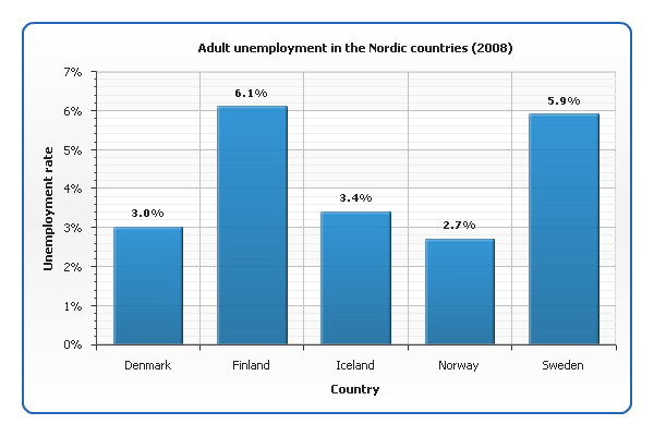
Example 1.
The most common tool for comparing data are bar graphs. For example, here is an AnyChart visualization showing men unemployment rate in the Nordic countries:
See also our documentation and gallery: Creating Bar/Column Chart with AnyChart, Bar/Column Charts Gallery
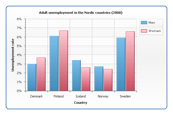
Example 2.
What if we want to show not only men but also women unemployment rate? Now we have two sets of data for each country, and to distinguish them, we need to use different colors:
Example 3.
When one needs to represent the correlation between two related values (which can be viewed as a kind of comparison too), a scatter graph is used. Take a look at a chart showing the correlation between religiosity index and suicide rate in different countries:
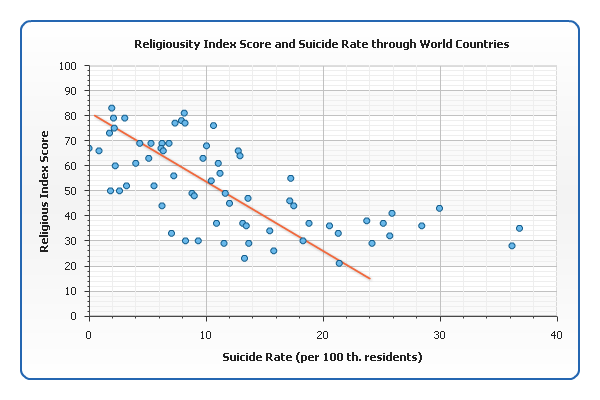
While bar charts are good for emphasizing the difference between individual entities, scatter graphs are good for generalizing. The information about particular countries is hardly readable from our graph, but it perfectly shows that more religious countries tend to have lower suicide rates: the points group around an imaginary line that falls down from left to right (sometimes called line of best fit, or trend line). It is considered that the closer the points are to this line, the stronger the correlation is.
See also: Creating Scatter Chart with AnyChart, Scatter Charts Gallery
Check the updated article on how to choose chart/graph type for comparing data published within the framework of the new 7-part Choose Chart Type feature on our blog.
- Categories: AnyChart charting component, Tips and tricks
- 1 Comment »